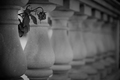
DPChallenge: A Digital Photography Contest You are not logged in. (log in or register
 
Browse Settings
Currently viewing:
Registered UserPedro

Show comments:

Per page:

Order:

Comments:


Comments Made by Pedro
Pages:   ... ... [155]
Showing 191 - 200 of ~1547
Image Comment
Black & White
02/06/2007 09:25:12 AM
Black & White1st Place
by DrJOnes

Comment:
This is all-pro, man...figured it had to be you :)

After reading your challenge details I'd say you succeeded with flying colours - well done, my friend.

P
Photographer found comment helpful.
There Are Dead Among Us
02/02/2007 12:36:15 AM
There Are Dead Among Us
by breadfan35

Comment:
Overall it's a very nice image. one that would look very nice when presented well (in a frame on a wall i mean). from a DP perspective (or any other type of online contest for that matter) I can offer a few opinions.

First off, conceptually it's a solid idea. it really could have gone into shallow DOF or minimalism quite nicely as well. in fact as a shallow DOF entry you'd likely get more attention, since the field is so huge and diverse in this one.

With regards to the composition, there are a few minor adjustments that would make it flow better i think. To stick with the 'rules' of photography, I'd like to see the rose a little lower and a bit to the right. The real subject is the flower, so using the rule of thirds makes sense to me. It sits so high in the frame it's out of the viewers natural gaze and almost acts as a distraction rather than a focal point (in theory we naturally look at the intersections of the 1/3 lines in a photo - in case you haven't seen it, draw a tic-tac-toe board over the picture; where the lines intersect is where you put the intended focal point of the photo).

You've created some great leading lines in this photo, which end rather abruptly at the left. it's kind of hard to tell, but i think if you backed the crop out a little and made it taller (same width) it would continue with a bit more flow with the inclusion of the square part at the top of the leftmost column. (coincidentally that would put the rose on the third-line as well)

the technicals of the shot are pretty good, though the focus almost seems to be a bit short - as if it's on the first column and not the rose (though that could easily be a result of the reduction in size for submitting it). Where an image like this will fail to grab the attention of the voters (hence the lack of comments, and the score of 5.3 - just a guess) is in it's subtlety. The prevailing theory is that you have 5 seconds to impress the voters enough to move them to look deeper or give it a high score off the bat. Low contrast images like this one need to have a really compelling subject or they'll get passed over without further inspection. one objective way to check your contrast is to look at the histogram (in photoshop under the window menu check 'histogram'). Your image has a histogram that shows most of the tones in the mid-range - no whites at all, and very little true black. Try using curves or levels to increase the contrast so that the histogram stretches out a little and presents the full range of tones from black to white (check your e-mail in a few minutes). the contrast will keep their attention a little longer and give them time to absorb the rest of the shot.

all in all i quite like this and with a few minor changes you have a better shot at getting the masses to like it too.

good luck with it - I like where you're going with it.

P
Photographer found comment helpful.
Smoke Calla Lily
02/01/2007 11:42:07 PM
Smoke Calla Lily
by levyj413

Comment:
ok this is just genius. in the thumb i thought it WAS a calla lily that you'd done a horrific hue shift to. a one-in-a-million capture. very well done
Photographer found comment helpful.
Psilocibe cubensis
02/01/2007 11:39:58 PM
Psilocibe cubensis
by labuds

Comment:
what unusual timing for this photo to appear. One of my recent entries was on the same subject (so to speak) ;)

fabulous lighting, and you gave it the surreal quality in processing that it deserves.

P
Untitled
02/01/2007 11:29:02 PM
Untitled
by kanaj

Comment:
yes. yes i like it a lot. a busy-ish scene, but still fits the minimalist bill quite nicely. don't listen to those who tell you not to cut his feet off :)
Wild Eyed Wonder
02/01/2007 11:23:58 PM
Wild Eyed Wonder
by rossbilly

Comment:
a familiar face from the 'other' challenge. another difficult perspective you've chosen. again somewhat disorienting, but a technically superior image nonetheless. your lighting and processing are excellent.

P
Photographer found comment helpful.
Little fairy
02/01/2007 11:22:06 PM
Little fairy
by Arti-Elvi

Comment:
holy smack, is that kid adorable - daddy better get a gun for when she's older.

interesting perspective, bold processing, creative setup. may not go over so well with the DP crowd, but that's one I'd be proud to have hanging in my house if I were her parents.

P
Photographer found comment helpful.
Alcohol + Camera = This
02/01/2007 11:18:48 PM
Alcohol + Camera = This
by GueDesigns

Comment:
clearly not enough alcohol since it's all in focus and stuff.

great character study here. I'm picturing it framed in a gold ostentatious frame Kramer-Style above the living room couch.

nicely done.
Photographer found comment helpful.
Unwritten
02/01/2007 11:14:06 PM
Unwritten
by jenesis

Comment:
I'd know that face anywhere. :) adorable expression and one of the better uses of shallow DOF in the crowd. nicely done.

P
Photographer found comment helpful.
Quietly Waiting
01/31/2007 02:05:11 PM
Quietly Waiting
by hanneke

Comment:
ah yes...from my "Photographs Rated 7:" group.

I like this image very much, but I can tell you a few things that voters won't like (doesn't mean they're right).

The pose looks a bit uncomfortable - both how she's sitting and her position in the frame. With a title like "Quietly Waiting" you're implying a softer moment, and the pose doesn't represent that. Her hands are the focal point, and they're right in your face in the middle of the frame. had you shifted her further to the left of the frame and left some more negative space on the right, it would guide your eye in a gentle way to the focal point, rather than throwing it right at you. Now - if you were GOING for an uncomfortable look, then it works - but doesn't jive with the title.

Her hands are a bit blown out...some of the detail is lost on the skin on her fingers, and we all know that at DP your exposure must be perfect, or the anal-ysts will ding your score.

there appears to be a slight duotone to the image, but it's not very obvious and it's fairly pink. I appreciate subtlety, but not everyone does. usually if i'm going to tone an image, I make sure it's obvious enough that they know its intentional, and i make sure it's consistent - in this case it seems to have affected her skin, but not the red in her hair.

Forum comments about 'how much skin' is showing might have had an affect as well...while she IS nude, it may not be perceived as such by voters looking for boobies.

now...beyond the voters:

i love the soft focus, and personally i LIKE the pose. at first i was a little unsure about both hands being there - wondered if they were both hers or if someone else was involved (i can't bend my arms like that :)). I think conceptually it works well, and couldn't care less if there are folds in the waist - very few people wouldn't have them there while sitting. The composition is good, though i'd have done what i mentioned above with adding some negative space on the right - but that's a personal preference...i really LIKE negative space on these types of shots.

To me it's a very personal image, and a very appealing one. I stick with my 7.

as always, these are just my opinions...doesn't make me right - they're just my thoughts as I look at it.

P
Photographer found comment helpful.
Pages:   ... ... [155]
Showing 191 - 200 of ~1547


Home - Challenges - Community - League - Photos - Cameras - Lenses - Learn - Help - Terms of Use - Privacy - Top ^
DPChallenge, and website content and design, Copyright © 2001-2025 Challenging Technologies, LLC.
All digital photo copyrights belong to the photographers and may not be used without permission.
Current Server Time: 09/12/2025 08:01:26 AM EDT.