DPChallenge: A Digital Photography Contest You are not logged in. (log in or register
 
Browse Settings
Currently viewing:
Registered UserPedro

Show comments:

Per page:

Order:

Comments:


Comments Made by Pedro
Pages:   ... ... [155]
Showing 171 - 180 of ~1547
Image Comment
The Gum Chewer
02/13/2007 12:24:46 AM
The Gum Chewer
by jenesis

Comment:
he he. There it is :)

nice lighting, tack sharp, fun concept...all spells a decent score if you ask me :)

P
Photographer found comment helpful.
Angie
02/12/2007 02:54:26 AM
Angie2nd Place
by Pedro

Comment:
don't get me wrong - I'm not denying that at all. Obviously she was chosen with a purpose. Of course I want you to *think* that when you see it. However, my interest still lies in the photograph when it comes to the comments I receive. I don't need someone to point out her finer features - I'm fully aware of what they are. I want to know if I presented them well - is it well lit? Is it sharp enough to satisfy people around here? Could I have done it any better? I know what i'm trying to represent, and I want to know if I did it successfully. A simple two words telling me what they think about her does nothing to help me with that. If it were a horrific photo, she'd still have nice ones.

And IF they're only compelled to make comments about the subject and ignore the photo, I'd hope they would have a bit tact than the comment in question. I believe your assessment of the photo is correct - but i still don't care if someone thinks she has nice tits. I appreciate your input either way. :)

P
Angie
02/11/2007 07:48:17 PM
Angie2nd Place
by Pedro

Comment:
Originally posted by OmanOtter:


I have to disagree. In this case, with this particular picture, "Nice tits!" is probably the most apt and honest comment a heterosexual man could make. The nature of this picture is such that "Beautiful breasts" "wonderful model" "nice hair" etc... would all just be euphemisms for what any heterosexual man would really be thinking -- "Nice tits!" Yes, that's what this shot is all about. And I think that's what it's purpose was -- not that there's anything wrong with that. It's a fantastic photo, and, yes, those are some damn nice tits!


I appreciate the point you're trying to make...and IF it were a tit-judging contest, then yes - that would be an apt comment (and yes...they ARE :)). however, in a photography competition I'm more interested in how they're presented photographically than I am in how they're formed structurally.

Frankly I'm not that concerned with how anyone feels about her glandular appointment.
A Dandy Afternoon
02/09/2007 02:44:17 PM
A Dandy Afternoon
by Transit

Comment:


ditto to some of the other comments - when you have a face as fabulous as your daughter's...make in the focal point of the image. you're lucky to have such a beautiful and willing resident model :)
Photographer found comment helpful.
Mink
02/09/2007 02:42:27 PM
Mink
by Transit

Comment:


same comment as the cigar one - tightened the crop to put her eyes on the third-lines, and bring her more in touch with the viewer, without losing any necessary information. Love the angle that you approached this one with - this is one of my favourites in your portfolio.
Photographer found comment helpful.
It's A Girl !!!
02/09/2007 02:39:51 PM
It's A Girl !!!
by Transit

Comment:


Like the Pond photo...adding some space on the right gives the picture some flow by giving the cigar a place to explode into. an even crop around the outside contains the dynamics of the shot.

the whole idea behind the rule of thirds is to address the viewers natural line of sight. when we first view an image our gaze tends to go to the four intersections of a tic-tac-toe board if you were to draw one over the image. by putting the focal point of the image on one of those intersections, you immediately draw the eye to the impact part of the image - which in this case is your face and the cigar.
Photographer found comment helpful.
It's Cold Outside
02/09/2007 02:26:35 PM
It's Cold Outside
by Transit

Comment:


again I just tightened this one up a bit, which brings you closer in touch with her, without losing any of the elements of the photo - you can still see she's wearing a fuzzy hat and coat, you can still see the cigar, but the tighter crop gives you a tighter connection to her. As an aside I tend to shoot models (especially women) from slightly above their eyeline so they're looking up a little - it tends to be a little more flattering to their facial structure, and it opens their eyes up a little more - as i'm sure you've guessed i consider eyes to be the main thing that connects someone to an image.

Message edited by author 2007-02-09 14:35:23.
Photographer found comment helpful.
At-the-pond
02/09/2007 02:26:01 PM
At-the-pond
by Transit

Comment:


just shifted the crop a little to get her out of the centre of the image, and to give her gaze some direction. by putting her to the right of the frame, her gaze gives the photo some flow and opens it up to the left, rather than boxing her in (not sure if that makes sense).


Message edited by author 2007-02-09 14:31:10.
Photographer found comment helpful.
"We've come for your liver."
02/09/2007 05:33:55 AM
"We've come for your liver."
by sher

Comment:
he he...they're hilarious - love it :)
Photographer found comment helpful.
Fun House
02/09/2007 04:16:33 AM
Fun House
by Transit

Comment:
ok, well first of all Mike - 34/557 and a 6.55 score is nothing to be unhappy about. I'm always satisfied anytime i score over a 6.5, since over 90% of the photos in any contest won't score that high. Reading the comments I'd say voters agree, since every one of the 18 comments is positive.

what's stopping it from winning a ribbon? tough to say. DP is a tough crowd to satisfy - you have to be unique enough to stand out, but still appeal to the masses enough that you don't alienate some of them. One of my favourite ribbon shots (Disturbed - the fishing line one) ended up with 13 votes of 3 or lower, but 75 favourites - go figure.

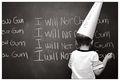
conceptually, you've got a great idea here. using the mirror and the black cloth gives it a surreal funhouse quality, that you were obviously trying for. Ideas like this that are a little less conventional won't fly with everyone - taste vary a ton on the site 0 but your voting pattern is pretty standard, and you only had 3 votes under 3...that's pretty good.

Technically I'd say your lighting is spot on, and it's tack sharp - critical if you want high scores here. her skin looks unnaturally smooth - i'm guessing neat image or noise ninja - that tends to bother some people, but I can see why you'd do it with a surreal image like this. that would require more than 5 seconds of thinking though, so it may be lost on some ;)

I'll tell you what throws me a little in this one - just an opinion...not saying i'm right or anything. having your daughter wear a black sweater on a black backdrop is a little disorienting; it looks as though her heads are floating...and while i'm sure that's what you were going for, it leaves the image without an anchor. i usually feel the same way about all white backdrops where the backdrop and floor disappear entirely...you start to wonder whether they're floating or not. having her in something a bit lighter could anchor her in the photo, but still maintain the funhouse effect.

all said i think it's a well done image, and the score is nothing to sneeze at. Keep playing along these lines and you'll start hitting on ones that grab more voters than they miss, and the 6.5s will turn into 7s.

You've obviously got the skills - your last 10 entries have all score over a 6. About your portraits in general, the only thing i might suggest is being a little more decisive about your crops. I think a portrait either needs to show context or not - so either really tight, or loose enough to show some environment. the ones that fall in between aren't quite tight enough to really connect you to the subject OR the environment.

Not sure if that makes sense or not - i tend to stop making sense after 2am. hope it helps a little, either way.

P
Photographer found comment helpful.
Pages:   ... ... [155]
Showing 171 - 180 of ~1547


Home - Challenges - Community - League - Photos - Cameras - Lenses - Learn - Help - Terms of Use - Privacy - Top ^
DPChallenge, and website content and design, Copyright © 2001-2025 Challenging Technologies, LLC.
All digital photo copyrights belong to the photographers and may not be used without permission.
Current Server Time: 09/12/2025 06:09:13 AM EDT.