| Image |
Comment |
| 02/26/2007 06:53:55 PM |
|
 Photographer found comment helpful. Photographer found comment helpful. |
| 02/26/2007 04:56:11 AM |
|
| Photographer found comment helpful. |
| 02/21/2007 05:44:30 PM |
featherby hannekeComment: you're like a chameleon...completely different in every pic - i love that :) |
| Photographer found comment helpful. |
| 02/17/2007 05:50:43 AM |
Fruity Bumboby PBearComment: superb perspective and intelligent cropping. The vibrant colours perfectly complement the symmetry and flow of this. love it.
P |
| 02/16/2007 10:09:21 AM |
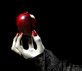
An Apple for My Prettyby IvoryComment: a very nice image with lots of impact. Partial desaturation isn't my favourite technique, but it seems to work well enough on this one. the little bits of colour left in the hand detract from the impact a bit, as does the slight oversaturation of the reds. I'd also like to see the catchlights on the apple a diffused a little so they're less prominent. Other than that I think you made a very nice image. The concept is well thought out and executed.
P |
| Photographer found comment helpful. |
| 02/16/2007 10:01:57 AM |
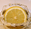
Refreshing!by shadowdoc31Comment: a nice clean capture - good focus with only a few hotspots from the flash. I believe a lightly looser crop would increase the impact by adding a little context, and it seems your white balance was off a little, as the entire image seems to have a pinkish hue to it. I'd have thought it was just the colour of the background, but when i see it in the 'whites' in the lemon too, I'm lead to believe it's the white balance.
overall i think you made a nice image, and that's a great looking splash :)
P |
| 02/15/2007 03:16:12 PM |
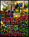
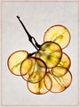
Grape Bouquet by FalcComment: completely impressed with the effort and precision on the grape. no clue if the idea is yours or not, but the effect it top shelf.
P |
| Photographer found comment helpful. |
| 02/15/2007 03:15:02 PM |
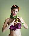
Avo Coutureby escapetoozComment: Nice use of vegetables AND a fruit. solid lighting, and sharp focus. the reds seemed to get a little oversaturated in parts of the lipstick, so they lose their texture a bit, but that's minor. a great entry, should score well with the DP crowd.
P |
| Photographer found comment helpful. |
| 02/14/2007 12:13:36 AM |
|
| Photographer found comment helpful. |
| 02/13/2007 03:17:55 AM |
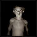
Rescripting Nightmaresby PedroComment: @Roz - it's a Quadtone - mine adapted from Ken Lee's (random aside - I talked to Ken over the weekend...what a great guy - his personality seems as brilliant as his quadtones ;))
I like the depth the additional colours give it...though on the less accurate monitor of my laptop the colours are far more pronounced and doesn't look nearly as rich as on my PC. As a pure duotone it didn't seem to have the same eerie quality it found like this. I appreciate the input though, Mark - many thanks :) |
Home -
Challenges -
Community -
League -
Photos -
Cameras -
Lenses -
Learn -
Help -
Terms of Use -
Privacy -
Top ^
DPChallenge, and website content and design, Copyright © 2001-2026 Challenging Technologies, LLC.
All digital photo copyrights belong to the photographers and may not be used without permission.
Current Server Time: 06/22/2026 01:22:58 AM EDT.