| Image |
Comment |
| 08/08/2003 11:50:08 PM |
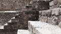
Holocaust Memorial by Rachel Whitereadby ramoneComment: interesting. i think I'd have liked to see you take the bottom of the pic right to the floor - i think it would have added some power to the shot. i really like the lines though. |
 Photographer found comment helpful. Photographer found comment helpful. |
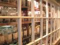
| 08/08/2003 11:47:37 PM |
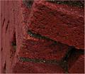
Right into the Candy Storeby Lee31Comment: the lighting is a little harsh, and it's a bit blurry. shooting glass can be hard like that - a polarizing filter would have done wonders. you can clean some up with photoshop, but the filter is the best way to go. also, I might have cropped the image more on the right - being able to see the bottom of the window takes some of the flow out of the pic. good effort. |
| 08/08/2003 11:45:39 PM |
Beautiful right angles of a girl :)by csokaComment: don't listen to those who complain about nudes. This is a great shot that fits the challenge well. To add a little depth, I might have added a few more right angles - her shoulder, elbow, knees...sometimes you gotta smack these guys in the face so they get it :) |
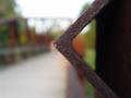
| 08/08/2003 11:43:32 PM |
Grinstone Bridgeby dustin03Comment: i love stuff like this. nice feel to it. I might have cropped out a bit of the dead space on the right, but that's just me - nothing wrong with your crop as is. |
| Photographer found comment helpful. |
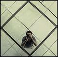
| 08/08/2003 11:42:23 PM |
Looking Up To Look Downby RefocusedComment: I know, stupid nitpicking, but too bad you didn't have shorter hair. then you'd get your whole head in the square. not gonna mark you down for it mind you. :) neat idea, excellent crop. Pedro |
| Photographer found comment helpful. |
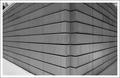
| 08/08/2003 11:40:59 PM |
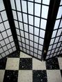
Symphony of Light and Shadowby La-LunaComment: who cares if the front is blown out a little. this is fantastic. beautiful texture, great composition. i like the feeling of depth, although I might like it a bit more if you used a wider lens...were you zoomed all the way out? If you were, it would bring the far wall into focus a bit better. Who knows, maybe your cam doesn't do that...if that's the case, double congrats on a great shot. |
| Photographer found comment helpful. |
| 08/08/2003 11:37:57 PM |
The Corner of the Corner Storeby fleenkComment: your border colour is off, but i like the rest. good perspective and nice depth. really nice texture to this as well. when in doubt, subtle black or white border (a hard lesson learned here - probably lost a ribbon because of it) |
| 08/08/2003 11:36:07 PM |
Made in Taiwanby GeorgesBogaertComment: I'd have made this black and white or some duotone, to compensate for the yellowish tinge to the floor; it clashes a bit with the cleaner colour of the screen. Nice capture though |
| Photographer found comment helpful. |
| 08/08/2003 11:34:56 PM |
My Corner of the Worldby LeahStephenComment: colour looks really flat - almost like you desturated it, or tried for a sepia tone that missed the mark by a bit. lighting is good, and some definite strength in the angles. |
| Photographer found comment helpful. |
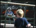
| 08/08/2003 11:33:38 PM |
Generationsby arnitComment: almost too subtle for most DPCers. bet you're getting comments like "where're the right angles?" I like it, either way. only thing I'd change if I could is the flare onthe blurry kid's head. It's a bit distracting, taking away from the cool old guy on the bench. I like the presence of the kid, he's just a bit too prominent with the sun on his head. |
Home -
Challenges -
Community -
League -
Photos -
Cameras -
Lenses -
Learn -
Help -
Terms of Use -
Privacy -
Top ^
DPChallenge, and website content and design, Copyright © 2001-2026 Challenging Technologies, LLC.
All digital photo copyrights belong to the photographers and may not be used without permission.
Current Server Time: 06/22/2026 09:28:05 AM EDT.