| Image |
Comment |
| 11/12/2003 12:02:24 AM |
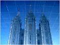
Reflections on Eternityby dsidwellComment: nice reflection everybody thought it was photoshop I guess :) i really like this. assuming people treat it fairly, you should score quite well. beautiful colours, and a crisp image. -Pedro |
 Photographer found comment helpful. Photographer found comment helpful. |
| 11/11/2003 11:56:43 PM |
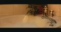
The Bathby svitalComment: other than the border, i like this. simple and soft. the border however does not add to the image,and actually throws the perspective off a bit. -Pedro |
| 11/11/2003 11:51:25 PM |
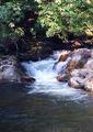
special trout holeby wetlandComment: this is nice. i like the slightly slower shutter to get the motion in the water, but it also seems to have a bit of blur from camera shake...did you use a tripod? If not, that would solve it. the colours are nice, but seem a little too much. a little less saturation would help i think. good shot. -Pedro |
| Photographer found comment helpful. |
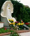
| 11/11/2003 11:48:33 PM |
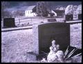
Sacred Resting Placeby BAMartinComment: I'm going to start out by saying that i think this is a little too contrasty...the shadows obscure some of what i think are important details (like the face of the monument). the sky is great. i might have cropped a little off the left to simplify it a bit (only my preference, of course). Having said all that I'm using a pretty dark monitor, so I'm going to check back when i get home to see if i still feel the same way. -Pedro |
| Photographer found comment helpful. |
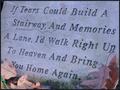
| 11/11/2003 11:38:55 PM |
Remembrance Dayby PatztComment: i like it. simple. at first i thought it looked a little flat, but the softness is actually quite compelling. the subtle sunbeam is helpful. nice simple border. -Pedro |
| Photographer found comment helpful. |
| 11/11/2003 11:36:02 PM |
Relaxing In God's Creationby DrakeComment: i like the idea, but it seems a little too busy to be relaxing to me ;). try this same shot on a tree by itself...I'd be interested to see how it comes out. -Pedro |
| 11/11/2003 11:34:21 PM |
Evening Lightby stuartComment: I'm sure I'm not the first to mention the compression artifacts (pixely appearance) of this. The composition is very nice, and the light works well, but the quality detracts from it. Let me know if you want help fixing that in the future...I'd love to help if I can. - Pedro |
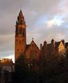
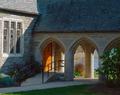
| 11/11/2003 11:30:10 PM |
Entryby karmatComment: i would absolutely love this if you shot it at a different time of day. the light hitting the left part of the building is just too overpowering to ignore. that beautiful archway entry should be the focal point, in my opinion. try it again at dusk or on a cloudy day :) nice job. -Pedro |
| Photographer found comment helpful. |
| 11/11/2003 11:27:03 PM |
Uplifting!by trainComment: a little too much black in the foreground for my tastes, i might have cropped a little higher were it mine :) nice rich colours, and i love the presence of the big tree up front. -Pedro |
| 11/11/2003 11:25:39 PM |
Altered Imageby jfaulknerComment: this is a hard angle to shoot from, given the shape of the bricks at the bottom. cropping a little off the bottom might balance the image better (personal preference of course). the colour is nice, but the sky flattens it out a little...a little fill-flash might have helped. good job. -Pedro |
| Photographer found comment helpful. |
Home -
Challenges -
Community -
League -
Photos -
Cameras -
Lenses -
Learn -
Help -
Terms of Use -
Privacy -
Top ^
DPChallenge, and website content and design, Copyright © 2001-2026 Challenging Technologies, LLC.
All digital photo copyrights belong to the photographers and may not be used without permission.
Current Server Time: 06/23/2026 12:48:10 AM EDT.