| Image |
Comment |
| 06/11/2003 06:18:14 AM |
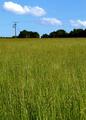
The Ecologistby UberFishComment: I would have preferred it cropped from the bottom and the right side.
This is justed my taste. |
 Photographer found comment helpful. Photographer found comment helpful. |
| 06/11/2003 06:11:16 AM |
Rubber Loverby ish36Comment: A little blurred for my taste. The dimensions don't seem to work for a magazine. |
| 06/11/2003 06:09:23 AM |
LIFEby swaroskjiComment: Black and white for a cover page. Hummmmm.
You left a lot of room on the top and left little room on the side for sub-titles.
The hand is a little blurred. |
| Photographer found comment helpful. |
| 06/11/2003 06:07:17 AM |
The Faceby kate_rioComment: It looks a little to cropped for me.
You left no room for Title and and sub-titles |
| 06/11/2003 06:06:03 AM |
Reptilesby Krawf47Comment: Composition look good.
You left enough room for Title and sub-titles.
Focus is good.
I like the photo. |
| 06/11/2003 06:01:17 AM |
|
| 06/11/2003 05:59:05 AM |
Better Gardensby pitsamanComment: The top flower bothers me a little since the title usually goes on top.
Good shot of the flowers. |
| Photographer found comment helpful. |
| 06/11/2003 05:55:57 AM |
|
| Photographer found comment helpful. |
| 06/11/2003 05:54:27 AM |
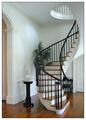
Home and Design by sherComment: I like the photo. lighting seems to be good. One thing I did notice which was miner was the angle of the shot. It is not vertically straight. Even with that, I still like it. |
| Photographer found comment helpful. |
| 06/11/2003 05:50:26 AM |
New Scientistby PaulkComment: I wish the beaker was on the lower half of the cover page. Leaving it up high leaves a lot of dead space on the bottom. |
| Photographer found comment helpful. |
Home -
Challenges -
Community -
League -
Photos -
Cameras -
Lenses -
Learn -
Help -
Terms of Use -
Privacy -
Top ^
DPChallenge, and website content and design, Copyright © 2001-2026 Challenging Technologies, LLC.
All digital photo copyrights belong to the photographers and may not be used without permission.
Current Server Time: 04/02/2026 05:22:11 AM EDT.