| Image |
Comment |
| 02/27/2004 04:25:07 PM |
Knife vs. Baloonby ArmadilloComment: I like that you can see the reflection in the balloon. You spelled balloon wrong. Good idea for the challenge. It has an artistic minimalist feel to it. 7 |
| 02/27/2004 04:23:06 PM |
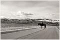
old ways, highwaysby ursulaComment: Georgeous shot (is that how you spell georgeous?)
Anyway, this is wonderfully well composed and exposed. The leading lines of the road and fence and layers of background mountains make this a top shot. This probably won't get the score it deserves because people are looking for more obvious physical or even emotional conflict, rather than conflict between elements of the photo. That's just my guess though and I hope I'm wrong. 9 |
 Photographer found comment helpful. Photographer found comment helpful. |
| 02/27/2004 04:20:04 PM |
Conflict between black and whiteby YugiohComment: I don't think this really shows conflict, although it is a well thought out bit of design. Technically it could benefit from a lot of things. The middle line should be straight, the points of the pencils should not overlap eachother, they should meet, and better lighting should be used to eliminate the shadow that you can only see on the white side. I think this would also do better if you hadn't rotated it. 4 |
| 02/27/2004 04:17:12 PM |
Indiana Jones and the Conflict of Doomby nrootComment: To open it or not to open it, huh. Taking photos of your tv is not allowed! Just kidding, I'll assume you didn't. I really the idea, pose, and lighitng, but it suffers from being too out of focus and a bit too small. Effective nonetheless. 6 |
| Photographer found comment helpful. |
| 02/27/2004 04:15:22 PM |
Escalated Conflictby relgraphicsComment: I find this image very funny and appealing. It seems posed but that adds to the humor. It has been neat-imaged a little too much in my opinion. I'd crop it a little lower on the top to get rid of the piece of hair sticking down. Effective for the challenge if not the most original idea... 6 |
| Photographer found comment helpful. |
| 02/27/2004 04:11:49 PM |
What's Winning?by GPComment: I find this image very odd. Nothing seems to go together! I guess that was your "conflict," but I don't see exactly what two things I am supposed to be comparing to see who is winning. I am feeling a bit dense at the moment. Nature vs man, mother earth vs god, fractals vs straight lines, blue vs hideous orange pink? Something needs to be done about the blue cast... My favorite thing about this image is what I think is a bird. 5 |
| Photographer found comment helpful. |
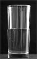
| 02/27/2004 04:08:21 PM |
Half full, or half empty?by The WizardComment: I find the water line very interesting in this shot. The way the light is playing off the glass to make it almost look like there is another glass inside is very cool. The exposure is good although the highlights are a little bright. I like the choice of black and white and the grainyness/scratches and or bubbles on the glass. However, I don't think this conveys conflict very strongly although I do see the connection to conflicting states of mind. This is a good example of a well centered shot with a reason behind it. 6 |
| 02/25/2004 12:57:26 AM |
|
| Photographer found comment helpful. |
| 02/25/2004 12:56:11 AM |
WWJD? WWYD...by jjbates4Comment: I like this idea behind this and the image as well. Nice work. Hope it scores well. |
| Photographer found comment helpful. |
| 02/25/2004 12:51:01 AM |
|
| Photographer found comment helpful. |
Home -
Challenges -
Community -
League -
Photos -
Cameras -
Lenses -
Learn -
Help -
Terms of Use -
Privacy -
Top ^
DPChallenge, and website content and design, Copyright © 2001-2026 Challenging Technologies, LLC.
All digital photo copyrights belong to the photographers and may not be used without permission.
Current Server Time: 07/25/2026 03:09:44 AM EDT.