| Image |
Comment |
| 04/16/2007 12:20:37 PM |
|
 Photographer found comment helpful. Photographer found comment helpful. |
| 04/16/2007 12:19:32 PM |
bokeh outtake 0116.jpgby hideoutComment: Cool! I think the composition is kind of neat, but unfortunately it doesn't lead the viewer to any specific subject. My eyes are tempted to just wander around insteda of being led one of the ladybugs. Nice colors and focus though! Good shot! |
| Photographer found comment helpful. |
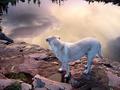
| 04/16/2007 12:12:05 PM |
Dusk & Labradorby hideoutComment: Wow! Amazing... This is a beautiful shot. I love the color harmony - the way the dog's fur almost matches the water reflections. When I first saw this, I thought the dog was on a very tall cliff, looking down into the clouds! But then I saw the trees. I wonder how it would look if you cropped the trees out? A fantastic photo! Good job! |
| Photographer found comment helpful. |
| 04/15/2007 04:37:04 PM |
|
| Photographer found comment helpful. |
| 04/15/2007 04:34:53 PM |
Lexie on her Ponyby w0fcmComment: Cool shot! The focus is perfect; the only thing I might have done differently is perhaps change the lighting. From the highlights on the girl's hair, it looks like maybe the light is behind them. It might have been nicer if the light was on her face instead. But I'm just being picky! :) It's a really sweet photo! all the brown shades are very pretty. |
| Photographer found comment helpful. |
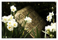
| 04/15/2007 04:32:51 PM |
Mary Elizabethby elemessComment: I personally don't care much for the border... but I love everything else! :) I like how the flowers are bright and cheery, while the tombstone almost looks like it's in sepia - giving the whole picture kind of a contrasting moodiness. Lovely shot! |
| Photographer found comment helpful. |
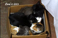
| 04/15/2007 04:30:42 PM |
Five Cats in a Boxby loriprophotoComment: Aww, too cute! I might suggest changing the composition and POV around a little, to make the photo more artistic. :) |
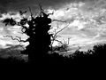
| 04/15/2007 01:49:49 PM |
oakby idpComment: Awesome! I love the contrasty-ness. |
| Photographer found comment helpful. |
| 04/15/2007 01:49:22 PM |
huntby idpComment: It looks like the saturation is a little too high - though those reds are really great. I also like the neat point of view you used - good job! |
| Photographer found comment helpful. |
| 04/15/2007 11:54:26 AM |
|
Home -
Challenges -
Community -
League -
Photos -
Cameras -
Lenses -
Learn -
Help -
Terms of Use -
Privacy -
Top ^
DPChallenge, and website content and design, Copyright © 2001-2026 Challenging Technologies, LLC.
All digital photo copyrights belong to the photographers and may not be used without permission.
Current Server Time: 07/22/2026 07:42:44 AM EDT.