| Image |
Comment |
| 04/20/2007 12:20:28 PM |
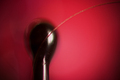
Just One (On a Brush)by freakin_hilariousComment: Cool idea! Not sure I like the red background very much, and it almost looks like the saturation is too high... but an interesting, unique shot! |
 Photographer found comment helpful. Photographer found comment helpful. |
| 04/20/2007 12:19:42 PM |
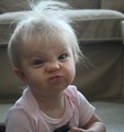
Crib Coiffeby OmanOtterComment: haha! A hilarious expression! The lighitng is very nice here, but it looks a little grainy. Maybe lowering the ISO would help that a little bit. Cute shot! |
| Photographer found comment helpful. |
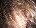
| 04/20/2007 12:18:34 PM |
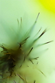
macro hairby valioooComment: wow! VERY awesome! A really unique idea. Not sure I like the green/yellow colors all that much, nut everything else here is really neat. |
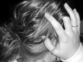
| 04/20/2007 12:17:47 PM |
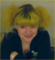
happy hairby tnunComment: Well, it's a little bit to dark, and it looks like the saturation was too high. Maybe the biggest problem here though, is the grain. If you look in areas like her face for example, you'll see blotchy spots of color. I've had that same problem when my ISO was too high. Try lowering it a bit, and you'll end up with a smoother, less grainy image. Very good try though! I like how the subject's eyes aren't looking strait at the camera! |
| Photographer found comment helpful. |
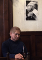
| 04/20/2007 12:15:41 PM |
bad hair dayby messerschmittComment: A neat portrait! The only thing that I can think of that might improve the shot a little, is if there was some more light on the lower, darker half of the photo. I like the added detail of the photo on the wall! |
| Photographer found comment helpful. |
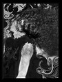
| 04/20/2007 12:14:09 PM |
Head Banger's Ballby libertyComment: A little bit too confusing for me - the composition is so busy I realy don't know what's going on. Interesting idea though! |
| Photographer found comment helpful. |
| 04/20/2007 12:13:21 PM |
hairby cal_russellComment: This is kind of a cool idea! Here's my two cents on what might help this photo out a little. :)
From what I can make out, it LOOKs like you focused on the face, instead of the hair. This is very good! But since there is so much unfocused hair in front of the focused face, it's hard to tell, and it looks like the whole picture is out of focus. :( It might be really cool if you had moved some of the hair away so there was no hair in front of the eye.
Secondly, the lighting is rather harsh. Many of the highlights look blown out and too white. I'm guessing that you used a flash? I don't know all that much about using the flash, but I think that if you use it too close, things get too bright and washed out, like in this shot.
Well, I hope that was helpful. Keep shooting! :) |
| Photographer found comment helpful. |
| 04/20/2007 12:08:01 PM |
|
| 04/20/2007 12:02:11 PM |
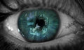
Human Lensby breadfan35Comment: This is amazing. I LOVE the blue-green colors, and the selective desaturation. At first it looks like it's just a cool shot of an eye, then you see the reflection. Something about the selective desaturation does that I think - it's like two different worlds that are separate, and yet one and the same.
I almost want to say that it would be nice if you could spot-edit out all the veins (particularly the really squigly one in the right - it makes me squirm!) but I'm not sure. They sort of add something to the shot.
My conclusion: This is an absolutely wonderful, phenomenal shot. It's so unique and unusual! Awesome! |
| Photographer found comment helpful. |
| 04/19/2007 06:06:37 PM |
Unnatural Habitatby OmniComment: Very interesting! I like the colors here... and the way they are reflected. |
Home -
Challenges -
Community -
League -
Photos -
Cameras -
Lenses -
Learn -
Help -
Terms of Use -
Privacy -
Top ^
DPChallenge, and website content and design, Copyright © 2001-2026 Challenging Technologies, LLC.
All digital photo copyrights belong to the photographers and may not be used without permission.
Current Server Time: 07/22/2026 09:17:32 PM EDT.