|
|
|
Showing 611 - 620 of ~822 |
| Image |
Comment |
| 04/16/2007 05:43:28 PM | Cinched Tightby WickedBComment: Greetings from the Critique Club.
Interesting image. As someone commented on already, it does seem to have a sort of 60s feel to it. Whether it's because of the thick black belt, that shade of pink in the background, or the tone of the almost doll-like skin... I've been trying to figure it out, and this was the closest I found to it: //www.uncrate.com/men/images/golden-age-ads-60s.jpg
I think the composition is interesting. The way the picture has been cropped seems to make the person look kind of non-human - the basics of the female form are there, but the skin looks smooth, the body looks plastic and artificial, you get the impression it could easily be a manequin in a shop window. Except not, because next you notice the detail of the skin, the hips, etc. The opposite happens with the vase - the belt emphasises the resemblance to female curves.
So yeah, successful objectification of a human and humanisation of an object - how twisted :)
Technical stuff is pretty good, the light on the skin is very nice. The only objection would be the light glare on shiny surfaces (probably solvable using a polarizing lens, or somehow playing around with the light sources).
No idea what PP you did, so can't really comment. Can't see anything wrong with it.
Totally random image. How odd. Seems to work though. Well done on the score and top 10 (and getting it in on time!)
Jelena
|  Photographer found comment helpful. Photographer found comment helpful. |
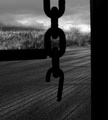
| 04/16/2007 03:33:08 PM | The Weak Link Sets Us Freeby posthumousComment: Greetings from the Critique Club.
Fantastic photo. I gave it a 7 during voting, and having now been made to sit and think about it a lot more, I would have bumped it up a lot. I think it's too subtle to score well.
The photo seems reminiscent of 1930s Great Depression photos, it has that same barren feel to it. Combined with the title, this makes it seem like an outcry against the industrial revolution, with workers being trapped in conditions close to slave labour, and removed from nature and freedom. The OOF actually works fantastically for this - the viewer is drawn towards the far edges of the picture, but is frustrated by the chains and barriers in the way. Very strong symbolic value. On a similar note, I love the lines of shadow on the ground, which appear to make a cage, but then dissolve near the top right, as the viewer moves away from the cage, and further towards light and freedom.
Technically, I think the photo is very well done. The textures of the ground and of the plants in the background are fantastic. The B&W conversion is perfect. Yes, the line on the left is in the way, but that adds to the caged in feeling of the photo, I'm sure removing it would have gotten you higher marks, but imo wouldn't necessarily make the photo better.
Powerful and original. Well done.
Jelena | | Photographer found comment helpful. |
| 04/16/2007 12:41:46 PM | It is better to be in chains with friends than to be in a garden with strangersby NuzzerComment: Greetings from the Critique Club.
Ah, we meet again :)
First reaction: oh no, I have to critique one of these now. Basically, I thought the challenge had a lot of creative potential that most people, unfortunately, didn't seem to tap into - I started voting with a hope for elaborate metaphors involving relations, society, etc., or at least decent S&M shots, and instead I came across chain close-up after chain close-up, normally named something original like 'Chains' or 'Linked'. I gave this one a 5, which was actually above average compared to what I was giving the rest of them.
That's sort of a necessary explanation - I think a lot of voters would have felt the same way, and the marks given are therefore often unfair to the individual photograph in question. This being a good example. It's a very good picture of a chain. The bokeh works fantastically, the background is a nice, pleasant green, which compliments the rusty bits of the chain nicely, the lighting is just right, there's nice subtle use of the rule of thirds, it's well post-processed - it's a technically very well done photo.
I'm not sure the title really fits the picture that well, but I do believe I marked it up because you didn't call it 'linked'.
You obviously have both skill and aesthetic sense, but I do wish you'd gotten around to shooting some of the more non-chainy chain photos...
Jelena | | Photographer found comment helpful. |
| 04/16/2007 05:58:28 AM | Addictionby JuliBocComment: 150th?! I gave this a 10!
Never mind, some of us like it :) | | Photographer found comment helpful. |
| 04/16/2007 05:55:26 AM | Tough Loveby UbersteinyComment: I gave you a 10. No idea why it didn't score higher, I love the shot :) | | Photographer found comment helpful. |
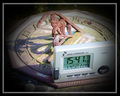
| 04/15/2007 08:04:36 PM | Time After Timeby GreetmirComment: Greetings from the Critique Club.
First impression: ooh, clever idea, and I like the old-fashioned sun dial. It definitely does fit the challenge, and there's even a nice play with concepts, with clocks being misplaced in time. Good title too.
However, as has been commented on, there are ways in which this shot could have been improved. The gray clock is good conceptually - it's very modern, and even has the little satellite symbol, etc., but in practise it's sort of ugly and unseemly and takes up a lot of the picture. I think ideally I would've liked to have seen a modern-looking wristwatch on someone's wrist going along the bottom of the picture instead of the big clock, or maybe even someone looking at the time on a mobile phone. Otherwise, at least moving the clock to the back would have helped.
I'm not sure the composition is ideal. The crop seems slightly too tight - I think having it even very slightly wider would have helped convey the sun dial as integrated into its environment, whereas this way the shot seems kind of isolated and staged.
On the other hand, I do like the difference in textures present - the smooth plastic of the modern contrasts nicely with the rough, archaic feel of the sun dial. I particularly like that fallen lead/flower in the top right.
The post-processing seems very good. I'd be intrigued to see what you started with.
Well done on an interesting shot. Feel free to PM me if you have any questions.
Jelena | | Photographer found comment helpful. |
| 04/14/2007 06:24:27 PM | | | Photographer found comment helpful. |
| 04/14/2007 09:16:46 AM | | | Photographer found comment helpful. |
| 04/14/2007 09:15:26 AM | | | Photographer found comment helpful. |
| 04/14/2007 09:14:45 AM | Break Throughby trnqltyComment: Nice image!
Reminds me of this one: //www.dpchallenge.com/image.php?IMAGE_ID=437005 | | Photographer found comment helpful. |
|
Showing 611 - 620 of ~822 |
Home -
Challenges -
Community -
League -
Photos -
Cameras -
Lenses -
Learn -
Help -
Terms of Use -
Privacy -
Top ^
DPChallenge, and website content and design, Copyright © 2001-2026 Challenging Technologies, LLC.
All digital photo copyrights belong to the photographers and may not be used without permission.
Current Server Time: 07/17/2026 12:08:54 AM EDT.
|