| Image |
Comment |
| 11/15/2006 01:02:02 PM |
hardhatby FastexposureComment: He is to centered in the image for me. A step to the right and including the stop sign would have made a good angle. Where he stands now, he has a black halo (steering wheel). It also feels like he is about to get ran over.
Good focus, dof, and lighting on the subject. The light in the background should be taken into account when taking such a shot. The sky is severely blown out. A different angle might have reduced how much sky you include. |
 Photographer found comment helpful. Photographer found comment helpful. |
| 11/15/2006 12:54:56 PM |
Comfortby sigrun_thComment: Im wondering if you were going for a high key shot. I think some skin tone would be good here. |
| 11/15/2006 12:42:50 PM |
Helmetby zoolComment: Interesting. The reflection of the room on the helmet is very distracting and making it to busy. In order to control the reflection on such a high shine item such as this, it needs to be in a higly controled studio environment. You can create a similar environment relatively cheeply. There is a yellow color cast on the image. A softbox would help both situations. just my 2 cents. Beautiful design. |
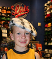
| 11/15/2006 12:33:31 PM |
Kid Lidby SheryllComment: The hat doesn't match the kid or the color of his clothes. Background is great! It tells the story on why the hat doesn't match.
The fabric on his shoulder is tucked under, should have been straightened. The light is a tad harsh on his face. I'm not sure if its the way the boy is square the the camera or where he is cropped across the chest, but something here doesn't set well with me. I want to see his hand on the brim of the hat and his head tilted to the side.
adorable freckles! |
| Photographer found comment helpful. |
| 11/15/2006 12:24:59 PM |
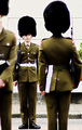
"Eyes Left!"by jimnessComment: I really like this image. It's very interesting since its not something I have seen before. There is a lot to look at. The young fella looks so scared to mess up. You wonder... is this something he WANTS to do or would he rather be out playing with the rest of the kids his age.
The white spots on the posterior of the gentleman facing away from the camera is distracting. I like the way the young guy is squeezed between the two fingures in front of him. It adds to the feel of the image. |
| Photographer found comment helpful. |
| 11/15/2006 12:16:44 PM |
Hot Headgearby firedude144Comment: I'm not a big fan of cutting the face in half. The title would have a better meaning if you showed more of the handsome feller.
Lighting looks a little flat. Love the rugged worn look of the helmet. |
| Photographer found comment helpful. |
| 11/06/2006 10:24:41 AM |
Evening Commute, San Franciscoby md8speedComment: Composition is really nice. I like the starlights on the bridge.
There is some discoloration from lens flare on the right side, but it doesn't distract it to much. |
| Photographer found comment helpful. |
| 11/01/2006 01:26:16 AM |
|
| Photographer found comment helpful. |
| 10/08/2006 11:28:56 PM |
"Swirly"by BosborneComment: This is not the image I voted on. How strange that it changed.
|
| 09/28/2006 09:35:48 AM |
September Asterby quicheComment: Composition = Good
Lighting = Great
Color = Great (Interesting choice in background colors. The green and yellow jumps out to much)
Creativity = Good
Concept/story = Good
Focus/DOF = Great
Subject = Good
Wow Factor = ok (slight variation on typical flower shot)
Marketability = Good (people like this kind of thing in adverts)
Overall = The color of the background struck me first, its not typical for a purple flower. Its definately not sky so a complimentary is usually used instead of a neighboring color. Its a good picture but rather typical. |
| Photographer found comment helpful. |
Home -
Challenges -
Community -
League -
Photos -
Cameras -
Lenses -
Learn -
Help -
Terms of Use -
Privacy -
Top ^
DPChallenge, and website content and design, Copyright © 2001-2026 Challenging Technologies, LLC.
All digital photo copyrights belong to the photographers and may not be used without permission.
Current Server Time: 05/07/2026 02:37:53 AM EDT.