| Image |
Comment |
| 10/14/2006 08:02:11 AM |
Not so Prettyby silverscreenComment: Despite the fact it's a house fly (not my favourite creatures!) this is a great shot. Lovely DOF. |
 Photographer found comment helpful. Photographer found comment helpful. |
| 10/14/2006 07:38:51 AM |
|
| Photographer found comment helpful. |
| 10/13/2006 08:05:12 PM |
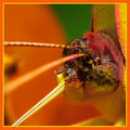
Having a drinkby Elvis_LComment: Wow - that's really close up. Truly a macro image. The orange border really emphasises the colours. this is great |
| Photographer found comment helpful. |
| 10/13/2006 04:10:16 PM |
|
| Photographer found comment helpful. |
| 10/13/2006 10:41:53 AM |
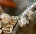
Shatteredby Jaded_HousewifeComment: This is really an interesting image. I don't think I would have identified what this is though! |
| Photographer found comment helpful. |
| 10/13/2006 08:07:19 AM |
|
| Photographer found comment helpful. |
| 10/13/2006 08:05:51 AM |
|
| Photographer found comment helpful. |
Home -
Challenges -
Community -
League -
Photos -
Cameras -
Lenses -
Learn -
Help -
Terms of Use -
Privacy -
Top ^
DPChallenge, and website content and design, Copyright © 2001-2026 Challenging Technologies, LLC.
All digital photo copyrights belong to the photographers and may not be used without permission.
Current Server Time: 04/26/2026 04:30:18 PM EDT.