| Image |
Comment |
| 12/08/2008 02:04:49 PM |
|
 Photographer found comment helpful. Photographer found comment helpful. |
| 12/08/2008 12:14:21 PM |
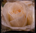
Rose copy.jpgby AliciaComment: Wow. Looks like it's in a plastic bag or something. Really interesting processing |
| Photographer found comment helpful. |
| 12/08/2008 12:12:18 PM |
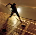
Whatever 4by AliciaComment: Amazing processing. I love the way this is now not a photo and yet...... |
| Photographer found comment helpful. |
| 12/08/2008 12:09:36 PM |
Whatever 5by AliciaComment: Well, if I would have looked here first, I guess I would have had my answer about the filter! Such a lovely candid shot. (Hope you've passed them to the parents). |
| Photographer found comment helpful. |
| 12/08/2008 12:08:01 PM |
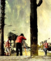
Two Tripletsby AliciaComment: Assume the use of a Nik Color filter here? Anyway, whatever it is it worked. That's a lovely pic |
| Photographer found comment helpful. |
| 12/08/2008 12:07:00 PM |
Whatever 6by AliciaComment: Alicia, this is so fun. (A side note, I wish they did Fractalius for us Mac users!). Who could have thought lights could look so great. |
| Photographer found comment helpful. |
| 12/08/2008 12:03:33 PM |
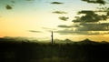
Nightfallby AliciaComment: Totally disagree with the snapshot comment. Really. I love the colours, the lighting is excellent. Totally underrated and worthy of a much higher score. |
| Photographer found comment helpful. |
| 12/08/2008 11:55:47 AM |
|
| Photographer found comment helpful. |
| 12/08/2008 11:54:35 AM |
|
| Photographer found comment helpful. |
| 12/08/2008 04:05:20 AM |
|
| Photographer found comment helpful. |
Home -
Challenges -
Community -
League -
Photos -
Cameras -
Lenses -
Learn -
Help -
Terms of Use -
Privacy -
Top ^
DPChallenge, and website content and design, Copyright © 2001-2026 Challenging Technologies, LLC.
All digital photo copyrights belong to the photographers and may not be used without permission.
Current Server Time: 05/06/2026 03:40:35 PM EDT.