| Image |
Comment |
| 02/08/2009 02:56:39 AM |
She rides the windby rinacComment: Rina, this scored pretty well. Clearly there is a market after all for this type of image on DPC! I agree with WeJay, ignore the low votes. Go to say, I'd love to be able to achieve this look (intentionally at least!). Well done! |
 Photographer found comment helpful. Photographer found comment helpful. |
| 02/08/2009 01:50:52 AM |
Reaching outby dd1989Comment: Daniel, you have received some good comments post challenge. I actually gave this a 6, I think it's a nice image, but doesn't have that much to grab you. As has already been said, the horizon is far too centered. The sky is not interesting, so I would likely crop a lot of that away.
Using an aperture of f3.5 is creating a very shallow depth of field. On a clear day like that you could have gone up to f16 and still had a fast shutter speed, meaning the image would look a lot sharper. (Bob350 has said this already, sorry).
|
| Photographer found comment helpful. |
| 02/08/2009 01:11:06 AM |
|
| Photographer found comment helpful. |
| 02/08/2009 01:01:31 AM |
|
| 02/08/2009 12:45:51 AM |
|
| Photographer found comment helpful. |
| 02/04/2009 04:53:30 AM |
|
| Photographer found comment helpful. |
| 02/02/2009 12:06:09 AM |
On his own by MelethiaComment: Wow Deb. I really liked this one, guess I wasn't alone. Well done on such an awesome result |
| Photographer found comment helpful. |
| 01/27/2009 03:35:13 PM |
We are SO stock !by islenskurgaurComment: This was my highest scoring image in this challenge. Totally met the challenge, unlike many others. Should, of course, have scored much, much higher. |
| 01/27/2009 04:39:39 AM |
What? No jobs? by bjh0705Comment: Greetings from the Critique Club
Well, first of all congratulations on your first ribbon! Well Done.
Of course, this makes it more difficult for me to provide you with some critical feedback as the image clearly was appealing, but I will have a go.
From a technical point of view I see little to comment on, the composition is good (although I do personally find the table a little distracting, but it does give some context), there are some hot spots on the dog's face, but not even to detract overall from the shot.
Personally, I found it an amusing and well executed image, but not that appealing in the context of the challenge. Perhaps I was a bit too rigid with the interpretation of this challenge, but I would likely not use this in any kind of magazine to portray a business person. Good job not everyone thinks the same!
Well done anyway for appealing to the DPC masses.
Sarah
|
| Photographer found comment helpful. |
| 01/27/2009 04:19:02 AM |
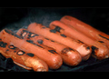
Wurstelby Rino63Comment: Greetings from the Critique Club
From a technical point of view I believe this is a good image. The composition is good, the angle of the sausages and the depth of field are great. The focus is good too. I agree with Eyewave, the border does not really work for this type of shot.
As I see it, the primary reason this scored so low, relates to the challenge topic. The challenge was for a stock photo that depicts cooking. In order for a buyer/editor to pick a photo such as this, there must be something appealing. Sadly the sausages themselves do not look very interesting or appetising. The burnt bits do not make me want to eat one. I think the concept was good and definitely portrayed cooking, as opposed to just food, but overall it was not a very appealing image due to the overdone (and in some parts uncooked) nature of the actual subject.
Hopefully this helps a little bit.
Sarah |
| Photographer found comment helpful. |
Home -
Challenges -
Community -
League -
Photos -
Cameras -
Lenses -
Learn -
Help -
Terms of Use -
Privacy -
Top ^
DPChallenge, and website content and design, Copyright © 2001-2026 Challenging Technologies, LLC.
All digital photo copyrights belong to the photographers and may not be used without permission.
Current Server Time: 08/06/2026 05:39:04 PM EDT.