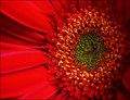
DPChallenge: A Digital Photography Contest You are not logged in. (log in or register
 
Browse Settings
Currently viewing:
Membersalmiakki

Show comments:

Per page:

Order:

Comments:


Comments Made by salmiakki
Pages:   ... [443] [444] [445] [446] [447] [448] [449] ... [658]
Showing 4451 - 4460 of ~6578
Image Comment
YMETHOC
08/01/2009 09:42:47 AM
YMETHOC
by Zigomar

Comment:
That's a fascinating exhibition. I like that someone is about to walk right through it. :)
Photographer found comment helpful.
Iva Q
08/01/2009 09:41:36 AM
Iva Q
by Zigomar

Comment:
Not sure how this escaped me, but what a fabulous image.
Photographer found comment helpful.
beachdog
07/31/2009 10:32:18 AM
beachdog
by rinac

Comment:
Looking good!
Photographer found comment helpful.
Mara
07/31/2009 03:29:08 AM
Mara
by Zigomar

Comment:
-Should she be so central?

-No - but it certainly works :)

-Did this really have to be LB-d at all?

-Not really. But the blur creates a natural vignette and it's very effective.

-Why did you do it that way?

-Because I like it. As do I

-You think you're cool talking to yourself?

Well it made me smile!
Photographer found comment helpful.
Composition with Five Pigeons and Two Windows
07/30/2009 09:50:56 AM
Composition with Five Pigeons and Two Windows
by Zigomar

Comment:
Despite the whole colour thing, I can see where you are going with the Mondrian influence. Thought it maybe a diptych when I saw the thumbnail. Well, I suppose in a sense it is a natural diptych. Well seen
Photographer found comment helpful.
Quintet
07/30/2009 09:45:10 AM
Quintet
by Zigomar

Comment:
Very well seen. It's a great shot lensbaby or not.
Photographer found comment helpful.
smiley man
07/29/2009 11:18:32 PM
smiley man
by Ecce_Signum

Comment:
Ha, I just LOVE Juliet's comment Andi. Hilarious.
Photographer found comment helpful.
Counting flowers on the wall...
07/23/2009 12:59:05 AM
Counting flowers on the wall...
by Citadel

Comment:
Greetings from the Critique Club

First Impression: A nice deviation from the regular colour images in this challenge. Very creative and nice processing.

Composition: For me the composition is just possibly ever so slightly too centered. I don't normally worry too much about that but in this case I think it may have benefited with a slight shift to the left. But in doing that I guess your holga effect would have been a bit different. Still, wouldn't mind seeing a re-edited version just to compare.

Technical: I was going to say it feels a bit soft in terms of focus, but I don't think that's the flower itself, rather than the added grain from the Holga effect. (I'm a big user/fan of the Nik Silver Efex filters). The one thing that bothers me a bit is I find the centre of the flower to be a bit blown out. Again, this is possibly due to the filter and the increased contrast from the control point, but I think you are missing quite a bit of detail.

Artistic: Great choice to convert it to black and white.

Overall thoughts: Well, I'm glad I could read the other comments, for I had no idea that the title was a lyric from a song :) As far as the image goes, nice attempt to step outside the box, I'm only sorry it didn't score higher for you, but I suppose it's always a bit risky to do something a bit different in a challenge like flowers.

Hope this is helpful
Photographer found comment helpful.
peg
07/22/2009 05:28:54 PM
peg
by Ecce_Signum

Comment:
ooh those stars are funky. I do like the macro thing though.
Photographer found comment helpful.
Gerber Daisy
07/22/2009 12:30:15 PM
Gerber Daisy
by Ja-9

Comment:
Greetings from the Critique Club

First Impression: Clearly this meets the challenge description well, although there were rather a lot of Gerbera in this challenge, so not perhaps terribly original. (Probably would have done a Gerbera myself too if I had entered, as they can be fun to photograph!)

Composition: I do like how the image fills the frame, but do find the dark shadows on the right side to be a little distracting.

Technical: Before I even looked at your camera, I figured you were a Nikon user. One of my pet peeves with Nikon is the way the reds come out. You may not agree, but I typically find the reds to be a little bit unreal and I can't help feeling this image is suffering from that to a small extent. I'm not sure how to explain it properly, so sorry for that, but I usually find the detail can be missing with red objects. I feel this is what is happening a bit on the left side of the frame. I usually desaturate reds a little bit to stop the blown out look.

I also find the focus to be just a little bit soft. I was looking at your camera settings and wondered what F0 meant, or if that was just a typo?

Overall thoughts: Gosh, reading back what I have written you would think this was an awful image. Of course, it's not! It's quite a good strong image, I was just trying to figure out why it score 5.6 not 6.6.

I hope this helps? feel free to get back to me if you have any questions.

Photographer found comment helpful.
Pages:   ... [443] [444] [445] [446] [447] [448] [449] ... [658]
Showing 4451 - 4460 of ~6578


Home - Challenges - Community - League - Photos - Cameras - Lenses - Learn - Help - Terms of Use - Privacy - Top ^
DPChallenge, and website content and design, Copyright © 2001-2026 Challenging Technologies, LLC.
All digital photo copyrights belong to the photographers and may not be used without permission.
Current Server Time: 01/12/2026 07:36:42 PM EST.