| Image |
Comment |
| 08/05/2009 02:01:06 AM |
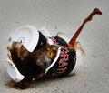
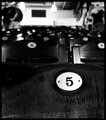
Coffee_Breakby ambakerComment: Greetings from the Critique Club
First Impression: Creative take on this username. I like the idea very much, although it possibly falls into the "water drop" category.
Composition: The composition works well, although possibly I would like to have seen more background to give a bit more context.
Technical: Here I think there is some room for improvement (when considering a higher score on DPC). I expect unless you had a whole cupboard full of cups that you were prepared to break into smithereens, that you didn't have too many chances to get this bang on the money! For me the lighting seems very flat and makes the image quite dull. I'm not sure how you could overcome that without blowing the highlights in the cup. (I'm not that technically competent that I can offer solutions). I do think this is the main reason why it only scored mid-5.
Overall I like the image, it's a good subject for this challenge and with some improvements in lighting/processing I think it could have scored higher. It did not realise it's potential.
|
 Photographer found comment helpful. Photographer found comment helpful. |
| 08/03/2009 01:23:16 PM |
|
| Photographer found comment helpful. |
| 08/03/2009 05:49:15 AM |
beachdogby rinacComment: Rina, maybe you are starting a trend here on DPC? :) I know you got your share of 1,2 and 3 votes, but you got as many 10s as 1s and that has to be good thing. Look at the commenters score too :) Great stuff and should in my not so humble opinion have scored much higher. Would have been a 10 from me if I could have voted. |
| Photographer found comment helpful. |
| 08/03/2009 12:28:54 AM |
|
| Photographer found comment helpful. |
| 08/03/2009 12:24:46 AM |
|
| Photographer found comment helpful. |
| 08/03/2009 12:08:47 AM |
|
| Photographer found comment helpful. |
| 08/03/2009 12:04:30 AM |
|
| Photographer found comment helpful. |
| 08/02/2009 12:45:24 PM |
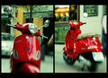
Piaggioby ZigomarComment: OOh, look at that. I think the vintage processing is the only way to go for a Vespa. Thanks for sharing. |
| Photographer found comment helpful. |
| 08/02/2009 10:23:39 AM |
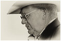
Quiet Contemplationby CitadelComment: Greetings from the Critique Club
First Impression: Very nice to see such creative processing in the portrait challenge.
Composition: Bang on the money for me. I think it works extremely well.
Technical: Well, I am not seeing anything untoward here. I think it's well exposed, well lit and as said earlier, well composed. I suppose the only thing I can think of to explain the mid-range score is that people didn't like the processing. It could be a love/hate thing. I know it's always quite risky to use one of those Nik filters. (I used an amended version of the Holga for my own pigeon entry and it tanked!).
Artistic: Not your run of the mill portrait, so in that respect maybe a bit "out of the box" for this challenge?
I'm not certain why it didn't score higher, it's a strong image but maybe the processing is just not to everybody's taste. I happen to like it and would likely have given a 6/7 had I voted. |
| Photographer found comment helpful. |
| 08/02/2009 03:41:53 AM |
|
| Photographer found comment helpful. |
Home -
Challenges -
Community -
League -
Photos -
Cameras -
Lenses -
Learn -
Help -
Terms of Use -
Privacy -
Top ^
DPChallenge, and website content and design, Copyright © 2001-2026 Challenging Technologies, LLC.
All digital photo copyrights belong to the photographers and may not be used without permission.
Current Server Time: 05/08/2026 04:16:26 PM EDT.