| Image |
Comment |
| 08/10/2009 01:25:07 AM |
|
 Photographer found comment helpful. Photographer found comment helpful. |
| 08/10/2009 01:21:42 AM |
|
| Photographer found comment helpful. |
| 08/09/2009 01:28:08 AM |
|
| Photographer found comment helpful. |
| 08/08/2009 04:08:12 PM |
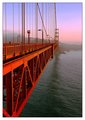
Celebrationby juliejoldComment: Greetings from the Critique Club
I must say I was rather expecting to see a lot of firework images in July Free Study given the recent holidays in North America.
I know fireworks are incredibly difficult to shoot well, I have tried only once and gave up as i was getting nowhere, so kudos to you for persevering.
To score highly in a Free Study with a firework image, the technical aspects need to be completely spot on. In the case of this image, the technicals are lacking a bit which is why I think you ended up with a 5.3.
Typically a low ISO setting (say 100), small aperture (High F number) and slowish shutter speed will give you a crisp clear image (of course, using a tripod). The settings you have used tend to leave the image quite blurry and thus the impact is lost. So, from a technical point of view, I think you image is suffering a bit. The fireworks are blown out in places and are quite blurry.
Mostly I think it takes a bit of practice to get good firework images, but the opportunity to shoot them doesn't present itself too often. |
| 08/08/2009 12:11:29 PM |
|
| Photographer found comment helpful. |
| 08/08/2009 10:22:29 AM |
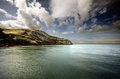
Username: Orme (The Great Orme - Llandudno, Wales)by JamesAComment: This is a beautiful image, although as Andi has said, I do think it would benefit from a slightly different crop. More sky/more sea so the horizon isn't bang in the middle.
Way to go on not getting any 1,2 or 3 votes. |
| Photographer found comment helpful. |
| 08/08/2009 10:09:27 AM |
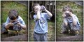
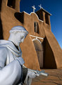
80 Years After Ansel Adams...by smellyfish1002Comment: Greetings from the Critique Club
Well, I found it interesting that I got this image to critique via the critique club. It is going to be quite difficult to give a very objective critique since this was one of my two 10s in the challenge!
There is obviously something about this image that did not appeal to other voters in the same way it did to me because it only scored 5.9 and that I find to be somewhat perplexing. I wonder if it is the composition? Personally I think the composition is excellent. Or perhaps it's because of the lighting? It is quite unusual, but I find it works well, although I suppose there are quite a lot of shadows in the statue due to the flash.
I have a feeling this would also work well in black & white, although the colours are stunning in this version.
Sorry I can't be more help, but as I mentioned, I liked this one! |
| Photographer found comment helpful. |
| 08/08/2009 08:38:20 AM |
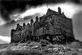
cieux déchirésby Ecce_SignumComment: Greetings from the Critique Club
Well, this is going to be difficult for me to critique under the circumstances, but as you have put it up for comments, I will give it a go. I personally like it very much, but I think you already knew that.
I was browsing through the highest LB scores section and noted that there are quite a few rather high scoring images with the LB. Perhaps people are starting to appreciate the blurry effects now.
As far as your score goes, I do think it was pretty respectable for a lensbaby image. I think possibly the burnt out highlights in the sky may have made the difference between 5.8 and 6, sorry I didn't think to mention it before! I'm not sure if that's a product of the lensbaby itself, or if it's come about by the b&w processing, but it did possibly impact the score.
Overall the moodiness created by the heavy sky really makes this image. I'm certain there are still a few people put off by the blur, but still a good performance from where I am sitting. Well done!
|
| Photographer found comment helpful. |
| 08/08/2009 07:14:35 AM |
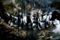
Deaths Grinby Stephie3041Comment: Greetings from the Critique Club
Have to confess my first reaction to this was - ooh, gross. But that's only because of the decay and nothing to do with the photograph, so you got a strong reaction which is something. Interestingly you do not have any 1s.
It was an interesting interpretation of the challenge topic and perhaps a few voters didn't think it actually met the challenge.
I do think the composition probably hurts this quite a bit. I think it is framed too tightly and should probably have been taken at a wider angle to give some context.
The image itself is not really 100% in focus either. I think for this to work you would need to have shot it so the whole of the skull was in focus. The way it is now it looks like a mistake not intentional.
Just some things to consider for the next challenge.
|
| 08/08/2009 05:42:45 AM |
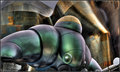
The Sentinelby Dr.ConfuserComment: You did a fabulous job with the tone mapping. I expected this to score a bit higher. :) |
| Photographer found comment helpful. |
Home -
Challenges -
Community -
League -
Photos -
Cameras -
Lenses -
Learn -
Help -
Terms of Use -
Privacy -
Top ^
DPChallenge, and website content and design, Copyright © 2001-2026 Challenging Technologies, LLC.
All digital photo copyrights belong to the photographers and may not be used without permission.
Current Server Time: 08/10/2026 02:28:43 PM EDT.