| Image |
Comment |
| 10/06/2009 02:39:23 PM |
Sunspotsby MelethiaComment: Gorgeous Deb. Such a classic. I love it. Driving past again and still love it Deb. :) |
 Photographer found comment helpful. Photographer found comment helpful. |
| 10/06/2009 01:20:56 PM |
|
| Photographer found comment helpful. |
| 10/06/2009 01:20:37 PM |
|
| Photographer found comment helpful. |
| 10/06/2009 01:17:16 PM |
|
| Photographer found comment helpful. |
| 10/03/2009 11:19:52 AM |
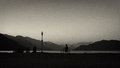
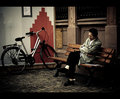
Sunset with Bikeby zeuszenComment: Really like this. Did you use one of the pre-programmed B&W settings on the camera or is it done on the computer? I quite like playing with the camera settings, they are quite cool. :) |
| Photographer found comment helpful. |
| 09/30/2009 12:08:03 AM |
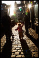
Giggling girlsby MelethiaComment: Pity it didn't tip the 6.00, but good score nonetheless. Well done, glad this one worked out. |
| Photographer found comment helpful. |
| 09/28/2009 03:07:46 AM |
Automatic Transaction Machineby pawdrixComment: I sort of figured this maybe yours, the urban scene seemed to fit in well with your style. I also happened to be one of your 10s. This one worked very well for me. And glad to see you got some Don bling :) |
| Photographer found comment helpful. |
| 09/26/2009 04:18:22 PM |
|
| Photographer found comment helpful. |
| 09/26/2009 04:16:26 AM |
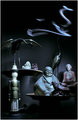
Nine Spiritsby MaxFingerComment: Greetings from the Critique Club
I noticed this is only your second entry on DPC, takes a few challenges before you start to get the hang of what works and what doesn't around here.
From a conceptual point of view, I think this is good. It is quite interesting and slightly unusual. However, the execution does let this down quite a lot. It is a very busy image and there is no main subject for the viewer to focus on. Your eyes are drawn to the "incense" and yet this doesn't really feel like it is in the right place.
The rest of the lighting is a bit flat and uninteresting. The image largely looks out of focus, mainly due to the uneven lighting I think.
The composition is way too cluttered and is very tightly framed making it very hard to look at.
As I said, I think the idea was interesting, but the technical aspects and the composition really let this one down. |
| Photographer found comment helpful. |
| 09/26/2009 03:20:05 AM |
Girls prefer nine best friendsby mbish7373Comment: Greetings from the Critique Club
I didn't actually vote on this image (I only managed 20% in the 9 challenge) but had I done so I would likely have given it a 5/6.
I do like the subject and the composition is great. The centered composition with a square crop was certainly the best way to go with this one. The depth of field was a good choice.
For me though the lighting seems a bit flat. I think you could likely have corrected some of this in post processing. I dragged the image into Photoshop CS3 and noticed that an adjustment (using Adobe Camera Raw) in the white balance settings brightened the image up a lot, made the background whiter (without having to adjust exposure, brightness or levels) and overall the image had a bit more depth.
I also agree with Ericwoo about the border, I feel the black doesn't enhance the image at all.
Still, overall I think it was a nice idea that fell a bit flat in the execution. |
| Photographer found comment helpful. |
Home -
Challenges -
Community -
League -
Photos -
Cameras -
Lenses -
Learn -
Help -
Terms of Use -
Privacy -
Top ^
DPChallenge, and website content and design, Copyright © 2001-2026 Challenging Technologies, LLC.
All digital photo copyrights belong to the photographers and may not be used without permission.
Current Server Time: 05/08/2026 10:19:20 PM EDT.