| Image |
Comment |
| 05/01/2010 02:11:05 AM |
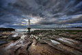
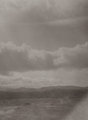
Guiding Lightby hesitantComment: Looks like Perch Rock to me :)
I like the fact you can see the docks in the background. Good foreground interest.
 |
 Photographer found comment helpful. Photographer found comment helpful. |
| 04/30/2010 02:42:12 PM |
|
| Photographer found comment helpful. |
| 04/29/2010 02:57:49 PM |
|
| Photographer found comment helpful. |
| 04/29/2010 04:36:15 AM |
Holg120N-7by bspurgeonComment: That's a cracking light leak. I have a few on my colour roll that have created a bright pink flare. It's sort of cool. |
| Photographer found comment helpful. |
| 04/29/2010 04:35:28 AM |
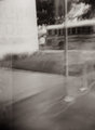
Holg120N-8by bspurgeonComment: Looks like you managed to squeeze one last image out of the roll. I love how you can see the guides on the film and the frame number. |
| Photographer found comment helpful. |
| 04/29/2010 04:34:28 AM |
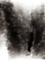
Holg120N-6by bspurgeonComment: clouds are very nicely done. Glad to hear yours had overlapping frames too. I can't quite figure out why all mine seem to. |
| Photographer found comment helpful. |
| 04/29/2010 04:32:36 AM |
|
| Photographer found comment helpful. |
| 04/29/2010 04:32:07 AM |
|
| Photographer found comment helpful. |
| 04/29/2010 04:31:44 AM |
|
| Photographer found comment helpful. |
| 04/29/2010 04:30:55 AM |
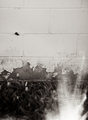
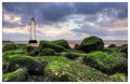
Yarnellby bspurgeonComment: But that is sort of cool. I have found the whole unpredictability of the film process to be much more enjoyable than digital. I am looking to expand my film camera collection. :) |
| Photographer found comment helpful. |
Home -
Challenges -
Community -
League -
Photos -
Cameras -
Lenses -
Learn -
Help -
Terms of Use -
Privacy -
Top ^
DPChallenge, and website content and design, Copyright © 2001-2026 Challenging Technologies, LLC.
All digital photo copyrights belong to the photographers and may not be used without permission.
Current Server Time: 05/10/2026 07:13:34 PM EDT.