| Image |
Comment |
| 05/05/2010 01:15:22 PM |
|
 Photographer found comment helpful. Photographer found comment helpful. |
| 05/04/2010 12:18:28 PM |
|
| Photographer found comment helpful. |
| 05/03/2010 02:14:37 PM |
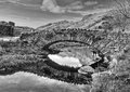
BW-1345by SaraRComment: Oh now I think I like this better than your entry. Watendlath ?
|
| Photographer found comment helpful. |
| 05/03/2010 01:41:07 PM |
tir na nogby posthumousComment: Wonderful to see a score like that on a less conventional landscape image. I second  Redjulep Redjulep's comment. My image was so blah, I had no enthusiasm at all for entering it. I never learn. :) |
| Photographer found comment helpful. |
| 05/03/2010 01:38:45 PM |
got mailby bladComment: So sorry about your score. I love it. See posthumous thread :) |
| Photographer found comment helpful. |
| 05/03/2010 01:37:25 PM |
|
| Photographer found comment helpful. |
| 05/03/2010 01:27:30 PM |
Above Cat Bellsby SaraRComment: Sara this is lovely, however, I think this would be so much better in colour :) |
| Photographer found comment helpful. |
| 05/03/2010 01:25:24 PM |
A Positive Altitudeby briantammyComment: I didn't list this in my posthumous roll call because you did get top 10, but this was certainly one of my higher scoring images in the challenge. |
| Photographer found comment helpful. |
| 05/03/2010 01:24:14 PM |
Roadscapeby bvyComment: OMG, how on earth did this only get a 5.3? I give up, I really do. Ho hum. Scored well from me. |
| Photographer found comment helpful. |
| 05/03/2010 01:23:17 PM |
|
| Photographer found comment helpful. |
Home -
Challenges -
Community -
League -
Photos -
Cameras -
Lenses -
Learn -
Help -
Terms of Use -
Privacy -
Top ^
DPChallenge, and website content and design, Copyright © 2001-2026 Challenging Technologies, LLC.
All digital photo copyrights belong to the photographers and may not be used without permission.
Current Server Time: 05/10/2026 08:30:00 PM EDT.