|
|
|
Showing 421 - 430 of ~2831 |
| Image |
Comment |
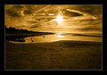
| 10/24/2008 06:31:09 PM | The Beachby NigelComment: Very cool shot. I could do without the borders, but everything else is exemplary. |  Photographer found comment helpful. Photographer found comment helpful. |
| 10/24/2008 06:22:23 PM | | | Photographer found comment helpful. |
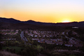
| 10/24/2008 06:18:29 PM | Sunset at East Bay Suburbby DigiFotoBuddyComment: Cheers from the Critique Club:
Not too bad, you came in the middle of the pack. Hopefully my comments below will help you further.
What this photo has going for it:
By far the best thing about this photo is the relevancy to the challenge. This shot screams suburbia too me, so well done. Also all the gentle curves and how the houses slow bend around. It creates a nice eye movement in the frame. And the sunset coming over the horizon is just icing on the cake, sleepy suburbia at dawn.
Scoring better:
Just some ideas if you were looking for a better score, ignore this if you were not. The middle horizon the bane of all photographers. I still get caught up in central horizon. "Generally" it is something you want to avoid. A couple of things you could try, cropping this to a pano, removing most of the sky. Going to a square crop, central horizons work well here, or lastly recompose the shot so you either have less foreground or less background (rule of thirds). People here like to have a central subject, this is subjective. When I look at this picture, the Sun is the highlight. With this in mind, try cropping in closer. If you have the sun/horizon near the top or bottom of the frame I think you would have had a lot more drama. There is just a lot of space here. Anyhow, if scores are not your concern just ignore this.
Things to consider in the future:
Some things I would like to see. Consider some traditional framing techniques, a tree framing to the shot would add a lot of interest. A slightly different crop may also help. Think vertically, sometimes that helps look at a scene in a new way These are just tips, not necessarily good ones, but perhaps something to consider in the future.
To Sum Up:
Personally, I think this photograph was a terrific example of suburbia. It has a lot of nice elements, sunset/sunrise, nice mountain backdrop, and some nice repeating forms in the homes. Middle of the pack is great, I'm just happy to get there myself. I gave some tips on what I think you could do for a better score, but take that with a grain of salt. The last part is more of what I might doing when preparing for a shot and is a matter of personal preference and in no way impacts this photo. | | Photographer found comment helpful. |
| 10/24/2008 06:01:54 PM | DSC_1033.jpgby Thaddeus_SmithComment: Very intriguing shot. I really like the personal nature of this photo. While usually I hate tilt, I think it has it's place in this photo as it add some very nice tension. | | Photographer found comment helpful. |
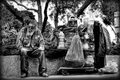
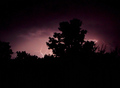
| 10/24/2008 05:35:22 PM | Lost In Translation.by twotkynsComment: Cheers from the Critique Club:
11th Place, wow. Not sure why you wanted a critique on this photo, it obviously struck a cord with the voters. Here goes.
What this photo has going for it:
You managed to use the frame in nearly a perfect way. Equal parts left/right and the tree branches spreading lines out. Very nicely done. The choice of B&W was good here, as these types of shots get a little too busy with color. The shot is well processed with a nice high contrast large tonal range. The various shapes also is a nice touch, circles, squares, lines, etc...
Scoring better:
Can't really add much here as anything above a 6 generally would just be nitpicking. I would think this photo would have done even better the Poverty Challenge.
Things to consider in the future:
Some things I would like to see. Maybe tone down the brights/contrast just a bit I think this might bring out the tonality better. Lastly, not sure if you thought this would do poorly? If you think a photo might do as well next time you might refrain from the critique club as it is probably less beneficial to you than others.
To Sum Up:
Personally, I think it is a wonderful photograph with a lot going for it. 6.1 is a terrific score and you should be happy. I don't really have much to offer in terms of improving the photo. The last part is more of a reflection what I like to see in a shot and is a matter of personal preference and in no way impacts this wonderful shot. |
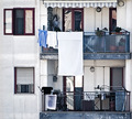
| 10/24/2008 05:23:34 PM | Beehiveby Rino63Comment: Cheers from the Critique Club:
Well your photo did certainly well in the challenge. Congrats.
What this photo has going for it:
Amazing geometrics and an interesting mix at that. One window open, one closed, towels hanging from the rail, lines going up and down, they all make for a good photo. It is all nicely composed too, you used the frame wisely. I like the square crop.
Scoring better:
Just some ideas if you were looking for a better score, ignore this if you were not. Usually high key/bleached photos do not tend to do as well unless it is a portrait shot. You might try using a wider tonal range. Matra here, the less noise the better, (probably because of the crop)? Anyhow, if scores are not your concern just ignore this. I personally like the bleached effect here.
Things to consider in the future:
Some things I would like to see. A single person would add so much to this photo. Whether they are peaking out the window or standing on the balcony. Maybe that absence was your intent. Not sure if you heard the saying, odd numbers are more pleasing to the eye. Not sure how much of that is real, but perhaps something to consider in the future.
To Sum Up:
Personally, I think it is a wonderful photograph with a lot going for it. 5.8 is a terrific score and you should be happy. I gave some tips on what I think you could do for a better score, but take that with a grain of salt. The last part is more of a reflection what I like to see in a shot and is a matter of personal preference and in no way impacts this wonderful shot. | | Photographer found comment helpful. |
| 10/24/2008 04:53:38 PM | These Eyesby rmezzoComment: This was a very nice color portrait. I like the pose and expression. | | Photographer found comment helpful. |
| 10/24/2008 02:43:21 PM | Weeeeeeeeeby ericwooComment: That expression is to die for. The colors really pop. A true moment you caught. | | Photographer found comment helpful. |
| 10/24/2008 02:11:51 PM | |
| 10/24/2008 01:37:51 PM | | | Photographer found comment helpful. |
|
Showing 421 - 430 of ~2831 |
Home -
Challenges -
Community -
League -
Photos -
Cameras -
Lenses -
Learn -
Help -
Terms of Use -
Privacy -
Top ^
DPChallenge, and website content and design, Copyright © 2001-2026 Challenging Technologies, LLC.
All digital photo copyrights belong to the photographers and may not be used without permission.
Current Server Time: 06/22/2026 07:26:51 AM EDT.
|