| Image |
Comment |
| 01/17/2007 05:51:05 PM |
Leaf.jpgby UAE_GuyComment: The colors are nice as well as the sharpness. Not found of the angle the shot was taken at. I think dead on would have had a bigger impact. |
| 01/16/2007 11:15:52 PM |
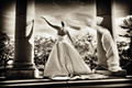
STOP!!!!by jcapps25Comment: *Critique Club*
Initial Impression - Great exposure and contrast but ultimately lacking in subject interest.
Composition - Overall the composition is okay. I get what you were going for, isolating the sign agaist the white wall background. You are right to go with a centered composition here. However, I think the angle of the sign is a real deterent, but that probably has more to do with the wall as the background...
Technicals - The exposure is actually pretty good. Sharpness is good. There is a tilt, but it works for this image. Techniquely I think the image is strong.
Possible Suggestions:
You might try a higher plane, rather than looking up it might be beneficial to look straight on. Normally I don't like vignetting, but in this case accentuating the sign by a strong vignette I think would help. Along the same plan allowing to see more of the bricks in the background "may" also help with a stronger composition. Maybe bring out the white a little more, especially in the "Stop" in the sign. Normally, I am not a strong component of post, but I think a little added dramatic style done in post would have really worked well. |
 Photographer found comment helpful. Photographer found comment helpful. |
| 01/16/2007 12:07:22 AM |
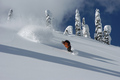
'extreme sports'by xtineComment: My favorite Candid in the challenge. Great control of light. Wonderful "scene" and moment. Great tone and nice use of repeating patterns. One of my highest rated in the challenge |
| Photographer found comment helpful. |
| 01/16/2007 12:07:11 AM |
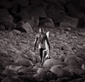
Surferby totiComment: My favorite Black and White in the challenge. Terrific lighting. Use of scale is amazing. Wonderful focus. It all comes together. One of my highest rated in the challenge. |
| 01/16/2007 12:07:04 AM |
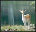
Surprisedby AlainComment: You get my vote for best Animal shot. I like this picture alot. The reason, the scale. The thing just seems microsopic for some reason. Not sure if that was the intention, but it just works! One of my highest rated in this challenge. |
| Photographer found comment helpful. |
| 01/16/2007 12:06:58 AM |
beetleby ralphComment: My favorite Macro in the challenge. Great color, terrific light, and terrific use of controlled focus. One of my highest rated for the challenge. |
| 01/16/2007 12:06:53 AM |
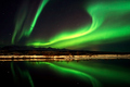
Auroral Displayby indridistefansComment: After a while I seem to bore of the Aurora... Then all of a sudden an image like this one hits. Yes, the Aurora is a beauty, but what really works is the like of the beach, the reflections, and the the lines in general. Not sure if this is one of your works, Larus, but this is one of my favorite Auroral Displays. Nicely done and highly rated. |
| Photographer found comment helpful. |
| 01/16/2007 12:06:46 AM |
Vulture 1by UnRed DaveComment: Terrific capture. My favorite Action shot in the challenge. I like the orange and the blue. Love the shadow and the framing. Great stop action. One of my hightest rated for this challenge. |
| Photographer found comment helpful. |
| 01/16/2007 12:06:39 AM |
Christina by grigrigirlComment: My favorite "Wedding" shot in the challenge. More importantly my favorite Portrait photo in the challenge. Excellent light. Love the shadows and the use of the entire frame. My highest rated for this challenge. |
| Photographer found comment helpful. |
| 01/15/2007 11:40:25 PM |
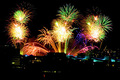
Brisbaneby MontageComment: *Critique Club*
First off, congrats on the nice score and high placement.
Initial Impression - It appears to be a study of color and a very good one at that. Most of the colors sit on the same side of the color wheel and compliment each very well. A stunning photograph.
Composition - The centered composition works well for this photography, mainly because of the two firework anchors you have on either side. The symmetry works smoothly. The horizontal fireworks all give the photo nice breadth. I slightly notice a slight dip to the lower right in the horizon, not a big deal but worth mentioning. You might try and see if cropping an 1/8 off the bottom helps bring more emphasis to the photo. I don't feel the bottom is bringing anything to the composition.
Technique - Exposure is execellent. The fireworks have a nice contrast against the dark background. Not sure if this was done in post or taken ala naturale, but it is seemless nonetheless. I notice jagged edges to the photo, not sure if it was from a severe crop or more likely an anti-aliasing issue at this point. I doubt it shows up in the original so it is more of a minor critique.
Overall: It is a terrific photo. Considering the long exposure it is even more impressive. Great work with the colors and setting up the frame. A job well done. |
Home -
Challenges -
Community -
League -
Photos -
Cameras -
Lenses -
Learn -
Help -
Terms of Use -
Privacy -
Top ^
DPChallenge, and website content and design, Copyright © 2001-2026 Challenging Technologies, LLC.
All digital photo copyrights belong to the photographers and may not be used without permission.
Current Server Time: 06/22/2026 09:10:54 PM EDT.