| Image |
Comment |
| 01/19/2007 10:21:12 PM |
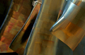
Copper Wavesby beamsclanComment: EMP? My favorite Architecture/Abstract photo in the challenge. Great study of form and pattern. Great colors. Curous how l ong it took to bring out all the rivets. One of my highest rated photos. |
 Photographer found comment helpful. Photographer found comment helpful. |
| 01/19/2007 07:18:13 PM |
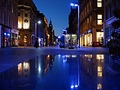
Blue Glasgowby CitadelComment: Love the blue tint, the reflections and the overall feel of this photo. A spectacular image. Highly rated. |
| Photographer found comment helpful. |
| 01/19/2007 07:17:17 PM |
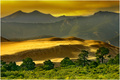
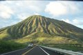
Eldoradoby CutterComment: My 2nd favorite landscape in the challenge. Beautiful golden tone. Nice structure too the frame. Wonde4rful shot. Hihgly rated. |
| Photographer found comment helpful. |
| 01/18/2007 02:39:29 PM |
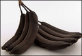
Banana Bread? Uhhh... Maybe not!by TlemetryComment: *Critique Club*
Initial Impressions: Wonderful photo that fits the challenge well with only a few minor quibbles.
Composition: I really like the overall composition here. The lines in one of the bananas to the other set of bananas really works. It helps engage your eye to the entire frame. The angle of the frame is near perfect. Not much I would change.
Technicals: Good sharpness. Great exposure, though the lighting seems to go to white to gray. Not sure if this was intentional. I think I would prefer a uniform background. Maybe not, depends on how the shadows work out. Lighting is subdued as far as impact but works really well.
Possible suggestions: I would perhaps see what a little more depth gives you, specifically the bottom left. Move out just a bit to get all of the banana bunch on the right and a bit on the top so it is not cut off. Maybe a little color highlight/contrast with the light brown on the ends of the banana? Just minor quibbles overall.
Overall: Great challenge entry. Both the composition and technicals are great with just a few minor nit picks. Great exposure and detail. Good use of filling the frame with good eye movement. A terrific picture. |
| Photographer found comment helpful. |
| 01/18/2007 01:45:18 PM |
The Long Delayed Deck Repairby EssAreDubyaComment: *Critique Club*
Initial Impresssions: Fits the challenge very well, though it just lacks that extra something.
Composition: I think you "started" off strong. The pieces of wood below make a good leading line. From there it gets a bit haphazard in placement resulting in a photo that isn't pulled together. The frame needs to be better filled. There is just too much space where things are not working. I like the idea of the green plant, but I think it needs to be repositioned. The idea of the two tone, green and off-white is great. I just think it needs to be more realized.
Technicals: Overall this is the strongest suit. Not sure if I understand the contrast/brightness settings you did in post. If anything I think it might be just a tad too dark. This is just a personal thing, exposure it pretty spot on. Sharpness is good. Depth of Field is good here as most everything is in focus. Techincally the photo is quite strong.
Possible Suggestions: Try a different angle. You are kind of looking down on the photo, which is sort of distoring the lines. Not sure how many shots you took, but maybe try a few more with different angles. Try removing some unneeded elements in the photo, the brooms, the bench. The bench might be okay if moved to a different location so you can see the whole thing. Maybe move some of the pieces of wood a bit. Might try the photo at another time of the day, without the back light or try to minimize that. I personally think the problem is the placement of all the items in the frame. If you change things up this photo would be greatly improved. Experiment with the canvas.
Overall: I terrific idea which has pretty good technicals, but is ultimately lacking in composition (setup) to fully realize the potential. |
| Photographer found comment helpful. |
| 01/17/2007 10:35:35 PM |
|
| Photographer found comment helpful. |
| 01/17/2007 07:29:26 PM |
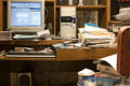
Organize my Computer Desk!by mpreslarComment: *Critique Club*
Initial Impressions: Fits the challenge well, still perhaps a bit too busy even if trying to convey a message of being disorganized.
Composition: You have your monitor and paper in the rule of thirds area which stabilizes the image. However, there is really very little eye movement, mostly just at the top of the frame. I do like the slight bend in the desk, conveying the weight of everytihg. However, in the attempt to make things messy you ended up with a very busy image that really isn't connected. I think the composition is the weak point of the image.
Technicals: Now we are talking. Most everything is pretty spot on. Sharpness is great. Everything is level. Exposure is good, with just a few blown highlights, but nothing to really work about. White balance and colors are near perfect.
Possible Ideas: Perhaps cleaning up a little bit in some places and moving the mess in areas so that your eye moves around the frame. Remove the clutter that doesn't help the picture as with the speaker. Think leading lines with trash! Maybe a bit more depth of field, though that is more of a minor issue.
Overall: It is a terrific idea for the challenge subject. All the technicals are pretty good just wish the placement of items helped the photo a bit. Nicely done. |
| Photographer found comment helpful. |
| 01/17/2007 07:13:20 PM |
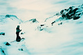
hikingby garlicComment: *Critique Club*
Initial Impressions: Ouch, that kind of hurts the eyes. I understand the high-key but this seems overly strong. Nice composition. Blue Rendition is nice. Fits the challenge nicely.
Composition: The framing of this subject is terrific, though I think a little bit gets lost in the high-key element. The leading lines in the mountain flows nicely through the frame. I also like the "empty" areas juxataposed against the "busy" areas. It helps with the eye movement. Overal placement is great.
Technicals: Focus seems fairly good, though alot of this gets lost in the highlights. I like the over tone of this photo, not sure if this was a white balance mistake or purposely done but the blue just works. Sometimes it is hard to tell if this photography was an accident or purposeful as far as color and exposure.
Possible Suggestions: I think there is a bit too much post going on here. While I like the placement of the individual, the person looks overly sharp and it appears to have been done in post. I don't mind high key, but this one might have been overly done, actually I am almost tempted to see what this picture would have looked like with normal exposure keeping the same "blue" tint. The clouds looked like they would have been pretty dynamic if not blown out. Maybe a bit more verbose title.
Overall: Wonderful composition and it helps sell the image. I'm not sure of the artistic direction though, I like the blue tint but not the high-key.
|
| Photographer found comment helpful. |
| 01/17/2007 06:13:06 PM |
Matchbox Car Street Racingby AnnComment: You could have easily been in Panning also, but this is great. Love the detail on the Matchbox cars and like what you did with the background. One of my highest rated for the challenge. Terrific. |
| Photographer found comment helpful. |
| 01/17/2007 06:11:52 PM |
Alternative Lighting by moonwellComment: Even though it is a studio type shot (aka very controlled), I like what you were doing here. An ingenious idea. Exposure is terrific. One of my highest rated for the challenge. |
| Photographer found comment helpful. |
Home -
Challenges -
Community -
League -
Photos -
Cameras -
Lenses -
Learn -
Help -
Terms of Use -
Privacy -
Top ^
DPChallenge, and website content and design, Copyright © 2001-2026 Challenging Technologies, LLC.
All digital photo copyrights belong to the photographers and may not be used without permission.
Current Server Time: 06/22/2026 09:15:58 PM EDT.