| Image |
Comment |
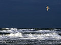
| 01/28/2007 10:46:09 PM |
Jonathan?by hajekaComment: I like the idea of the framing here, maybe just a little more off the bottom? The exposure seems a little off, maybe a white balance issue. However, the bird is the main issue. I like the moment you capture the shot, great timing. Though I think the poor thing has been a bit over-processed or "zoomed" in a bit much. The detail is lacking. Average rating. |
 Photographer found comment helpful. Photographer found comment helpful. |
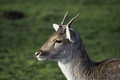
| 01/28/2007 10:43:55 PM |
Deer, Oh Deerby kevip6Comment: Nice focused image. The side lighting helps add texture to the animal. I think the composition needs to change a bit. It is a little too centered and too much negative space for this type of image. Seems like you are looking down on the animal rather than at eye level. Otherwise a good effort and a nice capture. Average rating. |
| Photographer found comment helpful. |
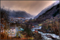
| 01/26/2007 04:11:00 PM |
The Fog Lifts Over The Fjordby scarbrdComment: Wonderful colors on this one. Norway is such a terrific place, looks like the weather was good to you while you were there (photo-wise). This reminds me of those old romantic paintings. |
| Photographer found comment helpful. |
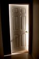
| 01/25/2007 01:34:50 PM |
What is on the other side?by tiggermoComment: The lighting and exposure are great in this photo. I love the long shadow of the door handle. Quite a bit of barrel distortion, but no fault of your own. While I think it is a simple composition, I think it would work even more if were more basic. Example, the carpet odesn't help that much, nor the left wall. I would be tempted to make this B&W. It is a great control of exposure and technical skill though. Above average rating. |
| Photographer found comment helpful. |
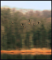
| 01/24/2007 10:15:07 PM |
Pan Fly Gooseby posthumousComment: This is one of those photos where at first I liked, then I didn't like it, and now that I look at it a bit more I like it. Take that dribble for what it is worth. :) One thing I do love, is the colors! I think the "texture" is what bothers me, sometimes it feels right sometimes it feels wrong. It is one of those photos that if I saw in a gallery I would look at for hours. Standing 2 inches from it, then 10 feet away, then 2 inches, etc. If the challenge was "Interpretive" an easy 10; "Motion Panning" I'd give it a 6. Message edited by author 2007-01-24 22:15:37. |
| Photographer found comment helpful. |
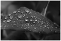
| 01/24/2007 09:18:20 PM |
Precious Gemsby jpochardComment: An interesting idea. I think the background and the foreground mesh a bit too much. I see what you were trying to convey, just not sure about this. As far as exposure and color, it is terrific. I think placement of the locket in the lower right to see more chain might have helped. A good first attempt at Bokeh. |
| Photographer found comment helpful. |
| 01/24/2007 09:15:08 PM |
A Simple Faith outtakeby jpochardComment: Great picture. I like the row of trees, the green roof contrasting against the white, and the lighting on the ground. Seems to be some weird patchness in the far tree section that was introduced in post. I'd be tempted to cut a little of the sky out for a more standard format. Great picture overall. |
| Photographer found comment helpful. |
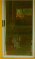
| 01/24/2007 07:39:31 PM |
in and outby tnunComment: The idea of this photo isn't bad. I like the yellow trim and border you added. Maybe a bit more of that. A stronger contrast between white and yellow. I think the relection in the glass is a big deterrant, especially if you were going for the "lines" the carpet inside. A polarizer might have helped here or a screen to shield the reflection. Like I said, I like the idea of the carpet in the house, maybe if you remove some of the other clutter and helped reinforce the line inside that would help. You could almost have a color study on this one, just need to emphasize the colors a bit more (add another yellow element inside the door)...
As it stands only a 4. |
| Photographer found comment helpful. |
| 01/24/2007 07:34:11 PM |
Awaiting Entrance Into The Stomataby giziComment: One of the pictures that thinks outside the box a bit. Great B&W treatment. Terrifice focus. Compositionally, there could be a little improvement. Not sure what exactly, maybe a different angle, isolate a but of the backgroudn, etc... Still a standout here and highly rated. |
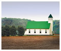
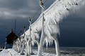
| 01/24/2007 07:32:27 PM |
Grand Haven Harbor Entrance by DrakeComment: My favorite shot of the challenge. The composition is unique! Love the little details such as the people. Great lines. Nice moode. Good exposure, maybe just a little low (not much). Highest rated here. |
| Photographer found comment helpful. |
Home -
Challenges -
Community -
League -
Photos -
Cameras -
Lenses -
Learn -
Help -
Terms of Use -
Privacy -
Top ^
DPChallenge, and website content and design, Copyright © 2001-2026 Challenging Technologies, LLC.
All digital photo copyrights belong to the photographers and may not be used without permission.
Current Server Time: 06/23/2026 12:04:45 AM EDT.