| Image |
Comment |
| 01/30/2007 03:25:25 PM |
Redby DrakeComment: I like this image alot, though I think it relies too much on the title for the challenge. While the lighthouse is a strong element to the photography, I still don't see it as the primary subject. Love the picture otherwise. |
 Photographer found comment helpful. Photographer found comment helpful. |
| 01/30/2007 12:45:54 AM |
Market Derbyby quiet_observationComment: Hmmm, this shot gives me ideas. I love when a shot does this. With a long focal length, an extremely long exposure (5 seconds or so), and keeping the panning on the cart the whole time I bet this would be tremendous. High speed background motion, perfectly focused cart, blurrly legs.... I might have to try this. Probably take a few hundred shots to get the cart in sharp focus for that long of an exposure. Three different senses of motion. A little off the critiquing really but just rambling things as they come to mind...
Great ideas come from the simpliest photos.
As for the photo itself in this challenge, I think it was a great idea just a bit hard to sell to the motion panning voters. Exposure was good, angle was terrific, and the technique of panning was strong (but short lived). |
| Photographer found comment helpful. |
| 01/30/2007 12:27:31 AM |
Black and Whiteby NikonJebComment: I voted on the image, but never really commented on it. In reality you were very very orignal with this shot. It is a shot that breaks the grain yet works because it still fits the challenge. I love the idea!
However, being honest here I dislike it as a portrait. Even if the portrait was in black and white I still wouldn't vote it high. It's just not a good portrait, at least to me. Harsh light, awkward/downward pose, skin too shiny, and it is hard to see the eyes. The model almost seems to be squinting/moving away from the sun. Did you use a fill flash? I think some added lighting would have helped. Don't get me wrong, the subject has strong interest just the setup is wrong to me. I do like the background color choice, good use of depth and focus. I am being a little harsh here, I know... Of course take this lightly, I am horrible at taking portraits.
What I am saying, if this would have been the same colorized idea but setup as a traditional portrait it would be an easy and rare 10 from myself. As it stands it is just average even though the idea was awesome. |
| Photographer found comment helpful. |
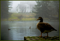
| 01/29/2007 11:26:00 PM |
Ducks in the Mistsby NikonJebComment: I think overall the mood is great. It is a very artisticly done shot. I don't mind the depth choice used here, I think having the front duck slightly out of focus works great. There are just a few compositional elements I would change, and really this is mostly beyond your control. The ducks in the pond, I wish they were more to the left, or at least the two to the furthest to the right. They distract just a bit from the front ducks form. It would just be a small element that would make a better line and get more involement in that middle section. Lastly just a slight adjustment in the angle, maybe just a bit higher, so you could get the foreground duck's head in the water rather than covering up some elements in the background. Granted of course that you can still maintain the same general perspective
However, I'm just picking on very small details here. It's the type of thing that makes a great wildlife picture extrodinary. Sometimes a little luck has to come into play. Wildlife I think is the hardest, because in the purest sense you have the lease amount of control of your subjects. This is really a tremendous photo you have here! |
| Photographer found comment helpful. |
| 01/29/2007 01:07:08 AM |
Take a Chance - Kiss Me!!by scarbrdComment: I really like the complimentry colors going on here. The textures are superb too. Another great photo from a talented photographer. |
| Photographer found comment helpful. |
| 01/29/2007 12:58:30 AM |
|
| Photographer found comment helpful. |
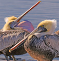
| 01/29/2007 12:55:08 AM |
Hard Weather Compromiseby raishComment: Terrific capture! I like the busy-ness of this photo. A sea of green, brown and white. The repeating patterns really make this special. I think it is just too abstract for some. Really, who has ever seen a duck scene captured in such a way. Great stuff. |
| Photographer found comment helpful. |
| 01/29/2007 12:45:36 AM |
Onlookersby theSajComment: I really like the context of the action here. Great eye movement from left to right. There is something strange about the colors though, almost of the red dresses have too much brightness but not enough contrast? Curious if fill flash was used, or if the exposure was fixed in post? Still a great photo where the compostion and idea really shine through. |
| Photographer found comment helpful. |
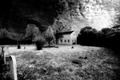
| 01/29/2007 12:43:06 AM |
Milkman Commethby KronusComment: I love the idea of the black and white capture here. The lighting is terrific. Not sure of post though, as some might be a little overdone? Tree edges have a strange halo effect on the left side. Terrific framing of the head stones and good placement of the central subject. A great photo. |
| Photographer found comment helpful. |
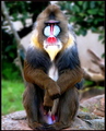
| 01/29/2007 12:40:03 AM |
I Hate Mondays...by Blue MoonComment: A terrific pose. Funny how he is giving you the bird. Colors are superb. The texture seems a little strange, maybe over-sharpened or missed focus? Still a great photo. |
| Photographer found comment helpful. |
Home -
Challenges -
Community -
League -
Photos -
Cameras -
Lenses -
Learn -
Help -
Terms of Use -
Privacy -
Top ^
DPChallenge, and website content and design, Copyright © 2001-2026 Challenging Technologies, LLC.
All digital photo copyrights belong to the photographers and may not be used without permission.
Current Server Time: 06/23/2026 07:19:38 AM EDT.