| Image |
Comment |
| 02/07/2007 10:58:02 PM |
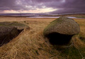
White Holme Reservoirby KHoltComment: This is one of the times where I think a telephoto or longer lens for the landscape might have work better. I really like that line of power lines and the clouds in the background, they just seem to be playing second fiddle to the rocks in front. Just a suggestion though. Beyond that , the colors are wonderful. I really like that purple with the light brown grass. Good use of the entire exposure range. Good sharpness, but maybe a bit more depth. A nice landscape overall that I think just missed the full potential of the composition. |
 Photographer found comment helpful. Photographer found comment helpful. |
| 02/07/2007 10:54:44 PM |
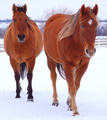
Friendsby tomcatComment: I like the colors going on here. Myabe a bit too much saturation though, the eyes seem to be a bit purple. However, it is a great contrast in color between the white and red. I think it would have been interesting, if possible to get the horse exactly pararell, as with the same stance on the left. I know how horses can be sometimes, just charge up to you when they see the camera. Still a fun picture and nice idea. |
| Photographer found comment helpful. |
| 02/07/2007 09:09:59 PM |
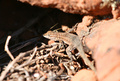
Who goes thereby seeComment: Interesting idea, because normally you wouldn't see the tail coming towards you run out of depth. It looks like some mid-day harsh light coming down on this one? Have you tried a B&W version, sometimes the high contrast works well there. Just a thought. You have the little guy in such a great pose. Sharpness on the central head is good. Maybe a little further crop. This picture is better than the indicated score and a good find on wildlife, those little guys can be such a dasher. |
| Photographer found comment helpful. |
| 02/07/2007 09:06:06 PM |
Rolls Royceby PhotologistComment: Great stunning picture. How many takes did it take you to get this depth right, or did you use a depth of field preview button? Love the contrast and the repeating patterns. A wonderful shot with a nice balance throughout the frame. |
| Photographer found comment helpful. |
| 02/07/2007 03:20:11 PM |
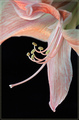
Aliciaby grigrigirlComment: Hmmm, this is a shame. It is a terrific portrait, works well with the challenge. I don't get it. I am guessing the high-key hurt you. Still nicely composed, great mood set by the colors, and good use of depth. |
| Photographer found comment helpful. |
| 02/07/2007 03:05:40 PM |
Gratuitous Medical Experimentsby meyersComment: I like this picture. Great colors and nice use of depth. I like how the other figures are kind of circling the one in focus. I also like the shadows being cast, maybe a slight enhancement to those. Really, there isn't much I don't like about the photo. Very minimalist style that fits the challenge very well. |
| Photographer found comment helpful. |
| 02/07/2007 03:02:11 PM |
The Touchby posthumousComment: That is some crazy depth of field! Looks like just the brush is in focus, curious how long it took you to setup that shot. I'd get frustrated after 5 minutes. I love the minimal use of color tones in this one: brown, white, and skin tones. Was there intentional motion blur? Just curious how you got the lines on the back of the page to move like that. I like the techinque nonetheless. Nice capture.
P.S. - Awesome final product (of your leopard). |
| Photographer found comment helpful. |
| 02/07/2007 02:55:26 PM |
Probingby noranekoComment: A great macro shot. Nice lighting and great colors. Funny thing is I would have liked to see more depth, but I guess that is against the challenge. :) Terrific shot and congrats on the good score. |
| Photographer found comment helpful. |
| 02/07/2007 02:44:36 PM |
Feel of Depthby raishComment: A very nice warm feeling to this photo. The color palatte really helps to create a nice mood. I really like the white whiskers/eyelashes/hair as it really helps fill the frame.
I think the only two things holding back from a higher score are the voters here tend not to like "pet" images (shame on them), and there might be too much noise for some. However, if you really look at what the photo is though, it is a wonderful portrait with some great lighting and character. |
| Photographer found comment helpful. |
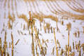
| 02/07/2007 02:34:37 PM |
The Harsh Effects of Winterby bmartuchComment: Nice shot. I really like the lines and contrast in this one. The stark white versus the yellow/brown works well. I really like how low to the ground you were. Technically it is terrific. I might have changed the composition just a little. I love the back hills, keep that the same, but the front focus seems a bit too centered. Nonetheless a gorgeous photograph. |
| Photographer found comment helpful. |
Home -
Challenges -
Community -
League -
Photos -
Cameras -
Lenses -
Learn -
Help -
Terms of Use -
Privacy -
Top ^
DPChallenge, and website content and design, Copyright © 2001-2026 Challenging Technologies, LLC.
All digital photo copyrights belong to the photographers and may not be used without permission.
Current Server Time: 06/23/2026 10:08:05 AM EDT.