| Image |
Comment |
| 05/02/2007 12:28:48 AM |
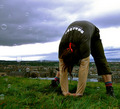
Meditationby purpleflutterby13Comment: Another very interesting capture. A bit strange, I think it is missing a bit of context, maybe seeing the bubble blower person/machine would have added a lot. Though a wonderfully composed image. I give you props overall, the more I look at it the more I enjoy it. |
 Photographer found comment helpful. Photographer found comment helpful. |
| 05/02/2007 12:22:55 AM |
Lost at Seaby noranekoComment: Wonderful picture, the lines really make a strong composition. This is one of the best examples of negative space, because it isn't just the subject and negative space. This is negative space separating the two points of interests. Brilliant. Colors are surperb. This shot give me a lot of ideas for my own shots. I really recommend people study this shot and why it works. Making it a fav. |
| Photographer found comment helpful. |
| 04/30/2007 02:04:58 PM |
|
| Photographer found comment helpful. |
| 04/30/2007 01:55:47 PM |
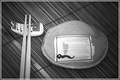
Sukoshiby noranekoComment: This is a well done photo, great use of lighting here. Wonderful textures and lines help creates a terrific composition. Personally, I think it is a standout in the challenge being a bit different than most entries. |
| Photographer found comment helpful. |
| 04/30/2007 01:54:13 PM |
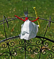
That's It?by JuliBocComment: Simple shot. Kind of reminds me of old late 70s early 80s product shots. Good placement of items. Works well enough for the challenge. I gave you a 6 for simplicity. |
| Photographer found comment helpful. |
| 04/30/2007 12:51:25 AM |
The chicken's POVby purpleflutterby13Comment: While I really liked the content of the shot, I thought the focus was a bit off (seems to be on the counter). Though I thought it was a little of a stretch for the challenge (unless I just don't get it, besides the whole chicken thing). Still I thought the idea was ingenious and it was a well thought out and well framed photo. In a FreeStudy, you would have gotten around an 8, however I only gave you a 5 in the challenge do to connection to the challenge topic. Great job though! |
| Photographer found comment helpful. |
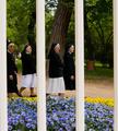
| 04/30/2007 12:17:33 AM |
Sunday at the parkby imagine74Comment: As an overall picture, a terrific shot. I think as a triptych, it is pretty good but loses something. The two outside frames are great, but the one in the middle is a little weak on its own. Still above average rating. |
| Photographer found comment helpful. |
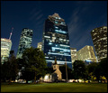
| 04/26/2007 12:54:03 AM |
Say Hello To My Little Friendby scarbrdComment: Wonderful juxtaposition. A skyline with a sense of humor. Surprised you didn't get more comments though, because it is a terrific photo. |
| Photographer found comment helpful. |
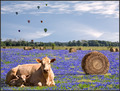
| 04/26/2007 12:52:23 AM |
Field of Dreamsby scarbrdComment: Initially, I had this at an 8, though I lowered it to a 6 (probably should have ended at a 7). I love the composition and I think all the elements are placed very well in the frame. However, on my 2nd pass it didn't feel right. I think it was the lighting/contrast. Not sure if I can put my finger on it for sure. It jumps out at you at first, then the lighting feels a little unnatural. Way better than I could ever do in PS though. I still really liked how everything is composed and combined for a very high interest picture. Congrats on the great score. Comopositionally a 10! |
| Photographer found comment helpful. |
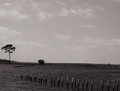
| 04/25/2007 09:23:53 PM |
Refugeby quiet_observationComment: Tough shot to pull off in that kind of light; looks like 1pm/2pm. Overall it is good photo. The picture isn't lacking interest points, some very subtle but I like the elements here (clouds, house, tree, wood). Maybe a 4x6 crop instead to remove just a bit of the top sky? Just a suggestion. Hey, better than my dribble I served up this time.
Also I think this one needs viewing distance to really appreciate, moving twice as far away from my desk it changes the scene dramatically. Message edited by author 2007-04-25 21:25:33. |
| Photographer found comment helpful. |
Home -
Challenges -
Community -
League -
Photos -
Cameras -
Lenses -
Learn -
Help -
Terms of Use -
Privacy -
Top ^
DPChallenge, and website content and design, Copyright © 2001-2026 Challenging Technologies, LLC.
All digital photo copyrights belong to the photographers and may not be used without permission.
Current Server Time: 06/24/2026 07:20:19 AM EDT.