| Image |
Comment |
| 08/06/2007 07:42:03 AM |
Temideby AndrewTOComment: The lighting is good it's just not saying 'Wow' to me especially for 'Free Study'. |
 Photographer found comment helpful. Photographer found comment helpful. |
| 08/06/2007 07:40:53 AM |
Botanical Fountainby meyersComment: It's not a bad photo but it's just not grabbing my attention. I'm not to hip on the frame choice but that's a very minor point. |
| Photographer found comment helpful. |
| 08/06/2007 07:39:42 AM |
|
| Photographer found comment helpful. |
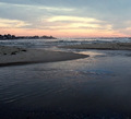
| 08/06/2007 07:37:17 AM |
Inspirationby VenomComment: I can see this photo as so much more. I like the idea. Is that snow? |
| Photographer found comment helpful. |
| 08/06/2007 07:36:05 AM |
Untitledby whiterookComment: It looks like you had a nice photo and cropped the heck out of it. The colors are awash to me. |
| Photographer found comment helpful. |
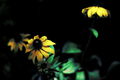
| 08/06/2007 07:34:36 AM |
Glow in the Darkby freakin_hilariousComment: For me, what have improved this photo would have been a tighter crop on the flower in the forefront. The lighting is subtle and nice to me giving the flower a very natural color. |
| Photographer found comment helpful. |
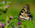
| 08/06/2007 06:54:35 AM |
Butterflyby ladpupmoeComment: To me, it just has a 'dull' general appearance. The focus seems like it could be sharper. A nice dof and crop. |
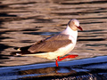
| 08/06/2007 06:53:38 AM |
Helloby GinaRothfelsComment: A centered crop is not appealing to me and it looks like you've increased the red way too much. I can't imagine his feet are really that color. The focus is very, very nice though. |
| Photographer found comment helpful. |
| 08/06/2007 06:52:26 AM |
Harald Jensens Squareby palfinComment: Maybe I just don't understand the language that might be an important part of the photo. It almost looks like something accidental. |
| Photographer found comment helpful. |
| 08/06/2007 06:51:28 AM |
Amanda Warrenby Meridian SageComment: To me, I think an increase in the overall color saturation and more contrast would have greatly improved your photo. It has a nice softness appearance but I think some selective sharpening to her eyes might be in order. |
| Photographer found comment helpful. |
Home -
Challenges -
Community -
League -
Photos -
Cameras -
Lenses -
Learn -
Help -
Terms of Use -
Privacy -
Top ^
DPChallenge, and website content and design, Copyright © 2001-2026 Challenging Technologies, LLC.
All digital photo copyrights belong to the photographers and may not be used without permission.
Current Server Time: 06/22/2026 03:16:57 AM EDT.