| Image |
Comment |
| 11/27/2003 10:03:56 PM |
A guiding light through life's stormy seasby DrakeComment: Critique Club
Very nice image. Only thing I can see that might improve a little more is moving the lighthouse to the right slightly it is neither in the middle or the right third. I think cropping a little more off on the right would have made this much stronger.
Overall the focus and detail are good. I do believe you also met the challenge very well. Nice work. Hope to see more of the lighthouse in future challenges. |
 Photographer found comment helpful. Photographer found comment helpful. |
| 11/27/2003 11:35:18 AM |
Beware of "The Phog"by CraigDComment: First of all you took this photo from under the statue and caused a distortion of the man. To me what stood out was his the rather large crotch! I know it isn't always possible to take a photo from directly in front and you have to take it at an angle but you can always move back and zoom in on the subject. In this case the photo of this statue is so simply to distorted cause you took it from an angle to close and left him with a large crotch and a peasized head.
Another distration that hurts this photo is the tree in the background is in too good of focus it would have worked better using a limited depth of field leaving the tree out of focus.
I do have to say though your focus on the statue was excellent. The detail is really good. Two things really hurt you here were first was the distortion of the man and the second thing was no one understood the photo. Possibly a different title would have worked better.
|
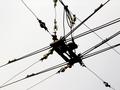
| 11/17/2003 07:11:39 AM |
Where trolley's have sex.by frumoazniculComment: Critique Club
I found this to be a rather interesting photo during the challenge, brought a smile to my face with the title.
I think the idea you have going here is cute and would have done fantastic had this been an abstract challenge. After reading the comments I believe you were like me, you did a still life and yet those who couldn't think past a traditional studio still shot didn't understand the still life here. Only thing I would change in this is the placement of connectors or whatever you call them in the center. With the strength of the lines to the right I would have cropped out the bottom to the left and brought the connectors to the bottom left third to create more of a sunburst effect with the different lines.
Very nice thinking outside of the traditional still life! |
| Photographer found comment helpful. |
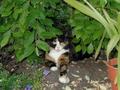
| 11/17/2003 07:06:22 AM |
Naturally Relaxedby NicoComment: Critique Club
Very pretty calico with nice markings. The plants would make for a nice backround for Lucy, but this wasn't a pet challenge it was a still life. Still life is something that can't move on it's own like plants a bowl of fruit or a vase.
This photo however not meeting the challenge could be made a lot stronger by cropping it in on the right side and getting rid of the terra cotta planter that is in the corner, thus moving Lucy from the center of the photo more into the right third of the photo. |
| 11/16/2003 08:30:57 AM |
A Dew Drinker's Dreamby ShannonComment: Critique Club
Very orginal. Your biggest flaw here was your lack of lighting, its to dark and it has left you grainy. Also, you have to much red saturation. The white on the cans appears pink, a simple adjustment in editing can correct this.
I feel this does meet the challenge and was also a very refreshing take on it. A little better lighting and this can be a fantastic photo.
|
| 11/16/2003 08:26:34 AM |
Through the Wormholeby TooCoolComment: "Critique Club"
Interesting, the slinky made for a good subject here. I would say you definately fit the challenge with this as it appears to go on and on. I realize you were using a very limited dof but at the same time that left you with just not enough in excellent focus. You are blurry on the outside and in the center, I'm sure that hurt you in the voting.
You definately met the challenge. |
| Photographer found comment helpful. |
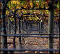
| 11/15/2003 09:18:53 AM |
Vines... grapes... wine... raisins... jelly... juice... ...infinite possibilitiesby DiamondPeteComment: Critique Club
I like this one. I like photos that pull you into the center of the photo the way this one does.
You have nice detail and a good texture visable. The only thing that might have helped here would be cropping differently to get that first cross bar out of the image the out of focus bar is very distracting. Also don't be afraid to resize closer to the 640 for the largest side.
Again this was a nice attempt at the challenge. |
| 11/15/2003 09:15:31 AM |
Timeby melongrindComment: Critique Club
Time definately fits the challenge well. Your colors are good as are the details and focus. This was a nice attempt at the challenge, and well executed. There just might be to many lines in it that it makes it a bit to busy. |
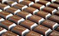
| 11/15/2003 09:12:15 AM |
Infinite Chocolateby sn4psh07Comment: Critique Club
Very nice take on the challenge. Well done with good focus and a nice amount of detail. The chocolate seems smooth as silk and they lettering is in fantastic focus in places. Definately a nice look at this challenge. |
| Photographer found comment helpful. |
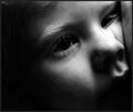
| 11/15/2003 09:10:32 AM |
INFINITE LOVEby howzaComment: Critique Club
This is a very touching image. The low key lighting makes it beautiful but at the same time seems too soft and boarding on the fuzzy side. A touch more lighting might have helped.
Nice take on the challenge. Very creative. |
| Photographer found comment helpful. |
Home -
Challenges -
Community -
League -
Photos -
Cameras -
Lenses -
Learn -
Help -
Terms of Use -
Privacy -
Top ^
DPChallenge, and website content and design, Copyright © 2001-2026 Challenging Technologies, LLC.
All digital photo copyrights belong to the photographers and may not be used without permission.
Current Server Time: 06/02/2026 12:02:19 AM EDT.