| Image |
Comment |
| 04/21/2010 11:12:19 PM |
Blissfulby beckydiComment: I like this unique idea. Good perspective. The big yellow part in the middle of the balloons is a bit distracting imo. |
 Photographer found comment helpful. Photographer found comment helpful. |
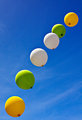
| 04/21/2010 11:01:09 PM |
On The Wayby phinbobComment: Nice blue sky here, I like the pattern to the balloons. I don't know how close to the ground they were or if you could have helped it but it would have been better for me if the shadow on the bottom of the balloons wasn't so strong. |
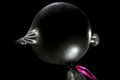
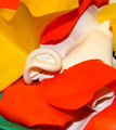
| 04/21/2010 10:09:54 PM |
Pressure Pointby ozeradComment: I like the idea here. I think this would have been better for me with the angle more head on. Also either the lighting or the processing has created a bumpy edge to the balloon that is distracting imho. |
| 04/21/2010 02:29:02 PM |
Water Dropby tehbenComment: This was a really nice concept. You usually see so many water pops, so I really like the concept here. I think it would be better for me without the water droplets on the outside. The smooth balloon with the water inside would have really made it look more like an actual water drop to me especially if the purple color had been adjusted to have a more blue hue. Really nice different take on the water balloon though :) |
| Photographer found comment helpful. |
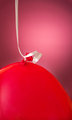
| 04/21/2010 02:23:18 PM |
Red balloonby abrantonComment: I like the gradient feel in the backdrop, but it would be better imo if it had been more red like the balloon and less magenta. A darker version of the candy apple red color would have really made this stand out for me. Aside from that the focus on the balloon and ribbon seem a little on the soft side, but i really like the composition of the ribbon and the balloon with the gradient spot in the background. |
| Photographer found comment helpful. |
| 04/21/2010 02:16:41 PM |
The Party's Over...by ambakerComment: Nice use of dof. I feel that the red balloons are so bright that the color looks too smooth, like there is no texture there. |
| 04/21/2010 02:14:24 PM |
UPby Art RoflmaoComment: Nice detail here. I wish the balloons where more the focal point though, and it does feel a little over processed with the background and halo around the balloons. |
| Photographer found comment helpful. |
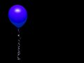
| 04/21/2010 02:11:49 PM |
Floatingby karmatComment: I like the use of negative space here and the blue is a pretty color. I wish that the balloon had some sharper detail in it. I feel like the ribbon is in focus but not the balloon. |
| Photographer found comment helpful. |
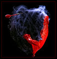
| 04/21/2010 01:19:14 PM |
The dart: the balloons natural enemyby millsaComment: I think this catch is pretty cool. I like the way the balloon popped it is different from what you usually see. The wrinkles look pretty neat. The only drawback for me is that the red looks like it got a little over saturated which you can really see down at the bottom of the balloon, but at the same time that brightness gives it that "pop" color that makes it stand out so I guess it is a catch 22. |
| Photographer found comment helpful. |
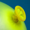
| 04/20/2010 11:50:24 PM |
The knotby hajekaComment: I like the texture and focus. Even thought the yellow is a bright lemon color the overall feeling for me is that it is flat for lighting. I Think changing the background from blue to a purple would have helped a little bit. |
| Photographer found comment helpful. |
Home -
Challenges -
Community -
League -
Photos -
Cameras -
Lenses -
Learn -
Help -
Terms of Use -
Privacy -
Top ^
DPChallenge, and website content and design, Copyright © 2001-2026 Challenging Technologies, LLC.
All digital photo copyrights belong to the photographers and may not be used without permission.
Current Server Time: 07/18/2026 08:21:22 PM EDT.