| Image |
Comment |
| 05/03/2012 11:27:01 PM |
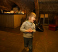
Strike !!!by KP_82Comment: I like the color.The subject (ball) is too small compared to the rest of the composition. A better perspective would have been if you could get up next to the lane and panned down as the ball was rolling down the lane. Trying to keep the ball somewhat in focus. Bowling alleys usually have some cool colors on the side walls so it would have made a good abstract background. From this perspective the bright white of the pins are really pulls the eye away from the subject as well. |
 Photographer found comment helpful. Photographer found comment helpful. |
| 05/03/2012 11:23:01 PM |
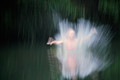
leb danceby GilesComment: Looks like fun. Overall I would say there is too much blur on the subject and not enough on the background. Having the background items this easy to identify is distracting imho. |
| Photographer found comment helpful. |
| 05/03/2012 11:19:18 PM |
Impact!by frogaroo66Comment: Looking through this challenge I see a lot of folks got motion panning confused with motion blur. Aside from that the hand blur is the main thing that is catching my eye. What I like about it is the expression around the facial area appears to be dreamy and surreal. |
| Photographer found comment helpful. |
| 05/03/2012 03:08:05 PM |
Colored Stonesby RyanWComment: I love this one. It reminds me of my munchkins. Very whimsical. However I would say it is too dark. A lower perspective with a creative depth of field would have been cool too. |
| Photographer found comment helpful. |
| 05/22/2010 09:50:48 PM |
A is for Alstromeriaby Ja-9Comment: ** Critique Club **
First Impression
Stunning color
Subject
What can I say, I just love flowers :)
Composition
I really like the composition on this. I usually like tighter crops when there is a single flower for the main focus, but I think in this picture the space to the right just adds to the beauty of it. The depth of field is good for making the main flower pop. I don't know if it was the neat image or the depth of field that caused the blur in the stamin and the top two petals of the flower. This is the only thing that I find a little distracting.
Lighting and Color
I really can't offer anything in this area other than to say it rocks!
Thank you and if you have any questions about this critique please feel free to pm me.
Christina
|
| Photographer found comment helpful. |
| 05/18/2010 09:03:47 PM |
Through the Skatesby scoxComment: ** Critique Club **
Subject
At first look your subjects just seem to be there. Like you placed them in the frame just to meet the challenge. My take on your title was that you were referencing the view between the skates. It wasn't until I read cablondeone's comment that I realized you were actually trying to tell a story about the puck going between the skates. So I would have to agree with them that the photo doesn't tell the story on it's own. It may have worked better if the puck had been between the skates with some motion blur on it.
Composition
One thing that is throwing me off about the composition is the tilt. If it was intentional for artistic purposes I would have suggesting making it a little more tilted so that we know that it was there to add some drama. Your use of DOF is good here with the concentration on the skates. You had mentioned in your notes that you wanted to use it to evoke some kind of emotion. Again, I think it would have worked better if the puck had been in between the skates as well.
Lighting/Color
I think the lighting here is good. The light seems to wrap around the skates well and highlights the details in the boot portion. I think your black and white conversion was done well. There seems to be a good range of all the shades throughout the photo.
In relation to the challenge
I can understand where mrbig65 was coming from when he said you can see the player. Those who felt that way probably felt like since the skates where being worn by the player it meant that you were showing the player and would have voted DNMC. I personally wouldn't have felt that way.
Great concept! Keep up the good work. If you have any questions about this critique please feel free to send me a pm.
Thank you!
Christina |
| Photographer found comment helpful. |
| 05/17/2010 12:16:35 AM |
|
| Photographer found comment helpful. |
| 05/14/2010 10:44:04 PM |
Life in the Outbackby IssusComment: ** Critique Club **
First Impression
What a pretty color gradient, and your title sparked a debate between my father and I.
Subject
Since I mentioned the debate, I will start with the title. From my father's point of view the title indicated that the livestock(?) on the horizon was supposed to be the main subject of the photo. Since that portion takes up minimal space overall, he understood the sub 5 score. My impression was that the title was meant to encompass the entire scene. To me you were saying this is my life; beautiful skies, luscious grasses, and a wonderful glimpse of nature at its best... at least for part of the year.
Composition
I think your use of a landscape in portrait view hurt you in this case. You would have really needed a strong ground subject to balance the strong cloud presence in the sky. Your use of thirds for the horizon was good though. I do have to agree with abuscemi and my father that the livestock being so small is a distraction overall. Had you been able to get closer to the livestock, they may have provided that stronger ground subject that was needed. If the livestock had just been absent and your point of view been closer to the ground it may have worked better as well. Although one of your comments mentioned lack of interest in the foreground, I personally like the contrast of the dry grass with the nice new green grass. I feel it adds a lot of texture. All that would have been needed was a stronger perspective. There also appear to be some lines in the grasses where there is none of the dry grass. I think had you moved so that these lines either ran parallel to the horizon or vertical would have also added some interest. Vertical would have been better than horizontal as it would have given us some leading lines to follow. For the crop, there is a dirt spot (tire tracks?) that is a little distracting imho.
Lighting and Color
Your lighting is perfect in my opinion. You could not have asked for a more beautiful day. I also love the color. It has a wonderful pop to it from the green in the grass to the darker blue in the sky. My only wish is that you would have let that deeper blue go down to the horizon. Right at the horizon it gets washy and looses detail in the clouds. Add that to the livestock that we can't really see and it makes for a confusing mesh of a focal point compared to the rest of the photo
In relation to the Challenge
Free Studies are always hard to compete in. This photo has a lot of the pop that is required, however I think the title may have confused people. The image that comes to my mind when someone mentions the outback is more about dryness, so I think that people who just think of the stereotype may have been expecting something different from this fresh spring look here. I personally love it when someone showcases a different perspective that what is usually portrayed. So thank you for that. :)
If you have any questions or comments about this critique please feel free to pm me!
Thanks and have a great day!
Chris
|
| Photographer found comment helpful. |
| 05/14/2010 02:06:57 PM |
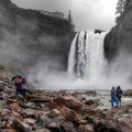
Their Honeymoon Was Off to a Rocky Startby Dr.ConfuserComment: ** Critique Club **
First Impression
If I were standing in this spot I would be holding my breath at the power of it.
Subject
A very beautiful location. I think that the honeymooner's story was a nice aspect to show. I also love how you told us about the setting and what it took to get there. It really puts the scene into perspective and adds to my enjoyment of this photograph.
Composition
The triangular composition works great here with the falls and the two couples. I kind of wish this perspective didn't include the lodge at the top since it pulls my eye some from the main subjects and makes me focus on the desaturation instead of the story. The couples do a fine job of fitting to the story of the honeymoon on their own quite well.
Lighting & Color
I can appreciate the time you took in post processing to convey the atmosphere of the weather. After reading your notes on it I can say that it does do that, but only because you pointed it out to me. I would not have made the connection during voting. Your use of HDR has done a great job of giving us good detail and texture throughout the picture and is very tastefully done.
Thank you for a beautiful scene. I enjoyed learning about this place and the attention to detail you had in your post processing. If you have any questions about this critique please send me a pm.
Have a great day!
Chris |
| Photographer found comment helpful. |
| 05/13/2010 09:46:11 PM |
Mary Jo Beckerby PhocalComment: ** Critique Club **
Initial Reaction
I like the leading lines
Subject
These types of cemeteries are usually visually appealing due to their leading lines. I think what is lacking here is a strong focal starting point. I think that if you had used the Mary Jo Becker headstone as your starting stone it would have provided that. Or since you plan to shoot again look for one that has flowers on it or a flag by it.
Composition
I think that your choice to crop out the trees and sky was a good one, since it provides us with the vanishing points. Mitch55 had commented that there were too many of them, but I think that if you had that stronger starting point this would have not been so noticeable to him.
Lighting and Color
First I would like to say that I like the fact that your HDR doesn't look like HDR. This is a personal preference of course and I do feel that in some instances it looks cool, but I also feel that it can get out of hand as well. As for lighting, I feel that overall it's a little flat and on the dark side. I don't know if this is a byproduct of the HDR or not since I don't use it enough to know how it effects things. Also, I think you may want to play around with a partial desaturation or a black and white conversion, the yellow/green really draws my eye away from the main subject of the headstones.
In relation to the challenge
Not a bad go at all for your first Free Study challenge! I think if the picture had told us more of a story (starting focal point) it would have done a little better.
If you have any questions about this critique. Please feel free to send me a pm!
Thank you!
Chris
|
| Photographer found comment helpful. |
Home -
Challenges -
Community -
League -
Photos -
Cameras -
Lenses -
Learn -
Help -
Terms of Use -
Privacy -
Top ^
DPChallenge, and website content and design, Copyright © 2001-2026 Challenging Technologies, LLC.
All digital photo copyrights belong to the photographers and may not be used without permission.
Current Server Time: 07/18/2026 05:48:35 AM EDT.