| Image |
Comment |
| 09/14/2007 07:21:32 PM |
The End of the Beginningby Dr.ConfuserComment: Critique Club feedback:
You did a very nice job planting the cloudy sky in the image. Until I read your notes I thought it was real.
It is a very interesting looking statue. I think that cuts both ways in that it is nice to look at, but is really also someone else's effort on display.
On another note, this would make a stunning piece in black and white, all the moreso with that sky you added.
Good luck! |
 Photographer found comment helpful. Photographer found comment helpful. |
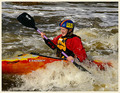
| 09/14/2007 12:50:40 PM |
Play Boatingby QikiComment: Critique Club feedback:
I think the score this shot received is pretty much on the mark. The photo is decently lit, decently in focus and the composition is ok. Overall, everything is ok while nothing really stands out.
There is a yellow haze to the shot that actually makes this look like a faded/older photo. I think it is actually enhanced by the off-white border. Perhaps this was a look you were going for.
Obviously this would have fared better were there more action in the shot, but for what it is it isn't bad.
Good luck! |
| Photographer found comment helpful. |
| 09/14/2007 12:47:47 PM |
Beach Body Babeby nsoroma79Comment: Critique Club feedback:
Lighting held this shot back from working as well as it could have. The overexposure along the right side of the model doesn't play well with the shadows falling along the other side of her body. I read in your notes you didn't use any lighting gear,so you take what nature gives. Might have been worth waiting a bit later in the day.
Other than that, the shot is a pretty good 'babe on the beach' type of shot. I think the composition works well, the semi-nudity is usually expected in these shots, and the pose itself isn't bad. The model's facial expression could use some work, but I'm not tasked with giving her a critique so she's on her own ;).
Look forward to more of your work! |
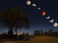
| 09/14/2007 12:42:46 PM |
A Night to Remember by Shadowi6Comment: Critique Club feedback:
I found this to be one of, if not the, best of the eclipse images in the challenge. Obviously I wasn't alone in that opinion!
The only critical thing I would have to say about this shot is that the guy appears to be pointing and looking in a different direction from the moon(s), and it was odd enough that it was actually the first thing that hit me about the image. Were he pointing at the horizon in front of them (more towards the top of the shot), I think this would have looked frighteningly 'real'.
Minor nitpick. Hell of a picture.
Good job! |
| Photographer found comment helpful. |
| 09/14/2007 12:39:40 PM |
Venetian Parking Spaceby sh0rtyComment: Critique Club feedback:
This is a nice capture, if a bit static for a Free Study entry.
While there is no real excitement here to draw the eye, I do like all the textures and patterns and the overall clarity of the scene. Having been to Venice I realize that it isn't always possible to find different angles to shoot from, but assuming it was possible, a different point of view to give more emphasis to the boat and its reflection might make this shot pop.
Good work and I hope you enjoyed Venice! My fav city in the world. |
| Photographer found comment helpful. |
| 09/14/2007 12:36:44 PM |
Beautiful Sunset on a Lazy Saturday Eveningby rugman1969Comment: Critique Club feedback:
You have an eye for a pretty scene, and that is half the battle.
The other half is capturing the scene and presenting it an appealing manner. Here are a couple of tips that will hopefully aid you in that regard:
1 - Avoid splitting your scene down the middle with the horizon. Shoot it (or crop it) so the horizon is about 1/3rd up from the bottom of the image if it is the sky you want to emphasize (reverse the logic if its the ground you are showcasing).
2 - In camera or in photoshop, try a much lighter hand with the saturation of colors. While the blues are very striking at first glance, the eye starts to notice things like the odd clipping in the red parts of the clouds and, often, a bit of pixelation where the color has just gone haywire.
DPC voters do tend to prefer very bright, saturated colors. At the same time, going too far will cause a bit of a backlash. I think this went a long way towards keeping this shot from scoring a bit higher than it did.
Hopefully these are helpful comments. Good luck! |
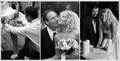
| 09/14/2007 12:29:32 PM |
Transitionby jeroweComment: Critique Club feedback:
These are nicely lit and composed shots, and the triptych approach is something different to look at. While all technically competent, they lack any mass appeal and would have a hard time competing in a Free Study. Still you've captured some nice moments here and are obviously a capable wedding photog.
Good work! |
| Photographer found comment helpful. |
| 09/14/2007 12:27:05 PM |
Symmetryby sz1_Comment: Critique Club feedback:
This is a very nice study of symmetry and patterns. I think the wide aperture holds this back a bit by not capturing the scene in as sharp of focus as the subject demands. A slight increase in contrast might also make this look even better by getting all those details to jump out even more.
Good work! |
| Photographer found comment helpful. |
| 09/14/2007 12:24:56 PM |
This is my patch!by KHoltComment: Critique Club feedback:
Who know that Expert Editing Free Studies would attract so many cows?
There is nothing negative to say about this shot, and I think the score it received reflects that. Perfect exposure, great lighting, the focus is dead on, and the bit of natural framing provided by the tree takes it over the top.
Very nice shot. |
| Photographer found comment helpful. |
| 09/14/2007 12:22:47 PM |
Gold Dust Womanby kellianComment: Critique Club feedback:
You have an eye for an attractive pose and a composition that works very well for the scene.
Shooting into the sun is very difficult, and while you managed to save a lot of detail in the subject the cost was an overexposure of the sky which robbed a lot of detail out of that flowing piece of cloth she is holding.
If you have(or can buy or make) a reflector, this is the perfect sort of shot to use it on. You can reduce your exposure a bit and save the sky and the details in the cloth by having the reflector bounce some of that light back up into the model's face.
I also think the Gaussian Blur is a little on the heavy side here, but that could be an artistic decision on your part so run with it.
Good job! |
| Photographer found comment helpful. |
Home -
Challenges -
Community -
League -
Photos -
Cameras -
Lenses -
Learn -
Help -
Terms of Use -
Privacy -
Top ^
DPChallenge, and website content and design, Copyright © 2001-2026 Challenging Technologies, LLC.
All digital photo copyrights belong to the photographers and may not be used without permission.
Current Server Time: 06/23/2026 09:50:00 PM EDT.