| Image |
Comment |
| 09/22/2007 11:33:21 AM |
day-15by digitalpinsComment: So far, I like it best of your grafitti shots. So many shapes presented by the windows, then the chaos of the grafitti lines. You keep posting these, eventually I'll look up how to spell grafitti. |
| 09/22/2007 11:32:11 AM |
Day 15: Andrew at the Shedby jasonlpriceComment: Nice shot, has a candid feel to it. Everything here works, I just wish it were a wider composition so I could see more of the environment the kid is in. |
 Photographer found comment helpful. Photographer found comment helpful. |
| 09/22/2007 11:30:04 AM |
|
| Photographer found comment helpful. |
| 09/22/2007 11:28:31 AM |
Day 14 - Pete Yornby WalesPComment: Nice range of tones throughout the image. Good exposure too. I know it's hard with bands to deal with all the shiny bits on stage and still keep everything else well lit. |
| Photographer found comment helpful. |
| 09/22/2007 11:27:32 AM |
|
| Photographer found comment helpful. |
| 09/22/2007 11:26:59 AM |
Secret Gardenby ordinaryangelComment: Nice eye for the natural frame (or man-made natural frame heh). If only there weresomething a bit more exciting behind the fence. |
| Photographer found comment helpful. |
| 09/22/2007 11:26:08 AM |
Day 15 - Left for dead...by shalrathComment: You're always good for an eye catching post and this is no exception. Love everything about it, but I think backing down the saturation of the yellow tones might be worthwhile. It's just a bit overpowering to me, and actually makes it hard for my eye to distinguish a lot of the shapes in the scene. |
| Photographer found comment helpful. |
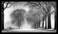
| 09/22/2007 11:24:57 AM |
sneeuw.jpgby PuckzzzComment: Excellent. Love stark contrasts between tones but still the shot doesn't have the harsh feeling of a high contrast scene. Good job on the snow too, just enough motion blur to give it life. |
| 09/22/2007 11:23:38 AM |
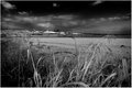
Sutter Buttesby cogeroxComment: Nice scene and I like how the foreground frames the shot. Overall it's pretty dark though and I'm thinking a narrower aperture (f11 or higher) might get those mountains or whatever is on the horizon to stand out with more detail. |
| Photographer found comment helpful. |
| 09/22/2007 11:21:55 AM |
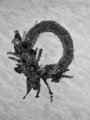
Wreathby dtremainComment: I think the contrast is dead on. This is much brighter than many of your posts and I have to say I like it a lot. The wallpaper texture makes a very nice background, though a tighter crop might give more play to the wreath itself. Lots of tiny details in there which would be even tastier if more prominent in the frame. |
Home -
Challenges -
Community -
League -
Photos -
Cameras -
Lenses -
Learn -
Help -
Terms of Use -
Privacy -
Top ^
DPChallenge, and website content and design, Copyright © 2001-2026 Challenging Technologies, LLC.
All digital photo copyrights belong to the photographers and may not be used without permission.
Current Server Time: 06/23/2026 08:38:40 AM EDT.