| Image |
Comment |
| 08/15/2006 04:51:19 PM |
All laced upby TheDruidComment: I'm going back through and trying to comment on shots I voted low. I don't care for the high-key look of this shot because parts of her skin are so overexposed as to have disappeared completely. More to the point, there's nothing about this photo that is shot from the perspective of the ground up. It's a straight on shot focused at, of all places, her knee. With such gothic looking boots covered with such great detail, perhaps a more interesting photo would have been up the front or side of the boot. Who can say. Good effort. |
| 08/15/2006 04:49:04 PM |
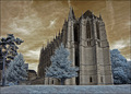
Hogwartsby marboComment: I'm commenting on photos I voted low since people keep wishing they got comments on their low scoring shots. As IR eye-candy (I assume this is IR) always seems to do well, I'm pretty sure this shot will score decently but nontheless...
The colors in this photo do not work. Browns and blues don't have to be lifeless, but these are. There is gothic and nightmarish and there is boring. Unfortunately this photo finds itself in the latter category. Composition-wise, this shot is not from the perspective of the ground up. It is from the side of the building straight over. All those flying buttresses there beg to have you push your nose up against the side of that building and take a shot up the side or front. There is also a lot of interesting detail all over the building that would have been better served by shooting from an angle that shows more of the side. A lot of interesting stuff here sacrificed to blue trees and grass and a monolithic view of a building. Maybe it's what you were going for, I don't know. Overall not a bad shot, not to my liking, and borderline dnmc but good effort. |
 Photographer found comment helpful. Photographer found comment helpful. |
| 08/15/2006 12:16:10 PM |
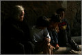
generationby TiberiusComment: There is dark and moody and then there is dark and unable to be seen, unfortunately this shot falls in the latter catergory. Looks like interesting subjects, and certainly some interesting detail on the old woman's face which is decently lit. Not sure what else to say, it is simply too dark to make other judgements about the photo. Possibly a crop with just the lady and the kid next to her could give a nice light/darkness age/youth contrast effect but with the kid's face blacked out it would be rough even then. |
| Photographer found comment helpful. |
| 08/14/2006 01:13:39 AM |
Focus on Natural Gasby GeneralEComment: I like it insofar as the blurry blue is appealing. I would have worked better if set against a 100% background above and below. As a person who has routinely gotten beaten down for submitting out of focus shots intentionally, I'm going to toss you an 8 just out of sympathy for how bad you are going to do. |
| Photographer found comment helpful. |
| 08/14/2006 01:02:32 AM |
Summoning the flames by TUBORGComment: On the one hand this is a really cool shot, straight out of a sword and sorcery tale. On the other hand it's very artifical looking. Nice work, I have no doubt it will rank very high. |
| Photographer found comment helpful. |
| 08/14/2006 12:34:55 AM |
cooking!by Ecce_SignumComment: Wow, the one 10 I gave in the challenge and only 17th place. Not a bad score, but really this was a great shot and should have ribboned. Again, great photo. |
| Photographer found comment helpful. |
| 08/13/2006 08:58:28 PM |
|
| Photographer found comment helpful. |
| 08/13/2006 03:39:58 PM |
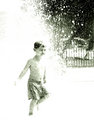
Splashby JutildaComment: Excellent high key shot. Perfectly nailed the water splash without actually showing much detail of it. Nice composition too. Love that look of serene bliss on the kid's face as well. |
| Photographer found comment helpful. |
| 08/12/2006 12:43:05 PM |
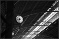
06:49by alexgarciaComment: Love this shot as well as the other and pretty much for the same reasons. Of the two, I prefer this one because it has a bit more symmetry and balance. Again, great dof, great processing. You've balanced the wwhite clock face against the skylights on the left and I think that makes the shot more interesting. Only thing I could point at that might enhance this shot some is getting a little more detail of that scrollwork beneath the clock to jump out. Real nice shots both of them. |
| Photographer found comment helpful. |
| 08/12/2006 12:41:29 PM |
06:43by alexgarciaComment: Only thing I don't care for is how the post the clock is attached to is on such a severe angle. Other than that, the processing works very well. I like how the white clock face balances against the strip of white on the right side. You've left enough details in the background to keep the shot interesting without overwhelming the eye. Good use of dof as well. Nice shot. |
| Photographer found comment helpful. |
Home -
Challenges -
Community -
League -
Photos -
Cameras -
Lenses -
Learn -
Help -
Terms of Use -
Privacy -
Top ^
DPChallenge, and website content and design, Copyright © 2001-2026 Challenging Technologies, LLC.
All digital photo copyrights belong to the photographers and may not be used without permission.
Current Server Time: 06/21/2026 10:45:35 PM EDT.