| Image |
Comment |
| 08/27/2006 10:50:29 PM |
Alumni Office Archesby igoofryComment: You should list your lense and exposure settings on your photos.
This is a nice photo. Architecture shots are very appealing and this one has very nice shapes within shapes and good detail throughout. I think the fact that the whole of the exterior arch wasn't caught calls for a tighter crop here. I would come in more so just enough of the exterior arch (the vertical portions) show to frame the rest. I would also dump the first step. That would focus the eye less on what is incomplete and more on that great brick detail of the floor as well as immediately pulling you 'through the hall'.
Very nice. I hope you got around to shooting some of that interior as that sunlight on the far end makes me want to go grab my camera heheh. |
 Photographer found comment helpful. Photographer found comment helpful. |
| 08/27/2006 10:46:27 PM |
At the beachby igoofryComment: Really nice shot. What I like most about this is it looks real. The colors of the sky are natural and beautiful without getting the hyper-saturated photoshop treatment. So, kudos for that.
I think a tighter crop here would work well. nothing wrogn with the nice scenic background, but being relatively small in the frame, that golden light shining on their hair and the great expressions on their faces aren't as fully realized as they could be. Ditto to other commenter about the line of string there, I would clone that out if possible. Agree as well about seeing all of the kid's shoe.
Really nice photo. The sort of shot you can actually get a few nice pieces out of depending on how you approach cropping it. |
| Photographer found comment helpful. |
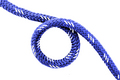
| 08/23/2006 10:03:22 PM |
Circle of Lifeby alfrescoComment: Very simplistic, well composed shot. Only thing that is sort of odd is that there are no apparent shadows beneath the rope, yet there is a shadow beneath the rope where it crosses over the rope below it. some magic of physics I guess, but it looks odd. Nice shot. |
| Photographer found comment helpful. |
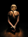
| 08/23/2006 10:01:33 PM |
Bondage for beginnersby scaramangaComment: Like the lighting here and I think the braided hair sort of adds another dimension to the 'rope' theme. What really kills me about this photo is the centered model offers a chance at symmetry and balance which is very pleasing to the eye and would work well with the negative space and highlights on her back and hands, yet the wooden floor beneath her is noticeably off kilter as far as being horizontal. It distracts my eye. Also think she might have pulled her left shoulder back a bit so that the light fell evenly across her upper back. Nice photo, good luck. |
| Photographer found comment helpful. |
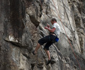
| 08/23/2006 09:58:58 PM |
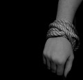
Lifelineby MichaelCComment: I like to see the point of the challenge as the subject of the entry, and obviously that's not the case here. Still, it's a cool shot with nice exposure and good crisp detail all around. For purposes of the challenge (getting a bit more attention to the rope), might have cropped in more on the guy and the two other pieces of rope next to him. Still, a pretty neat photo. Good job. |
| Photographer found comment helpful. |
| 08/23/2006 09:57:45 PM |
Intertwinedby kanoComment: Nice texture, nice earthy tones. I think the shot could be better balanced by cropping (or arranging the rope) so that the large strand is a bit more to the right and possibly aligned horizontaly. nice work. |
| Photographer found comment helpful. |
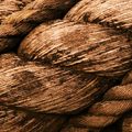
| 08/23/2006 09:56:41 PM |
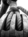
Knottyby StuckOnTheFarmComment: Decent composition, nice DOF that focuses your eye on the main strand there. The thing that I don't care much for in this shot is the metallic tone of the rope itself. I'm not sure if that is from PP or just the nature of the material, but it tends to kill some of the contrast in the shot and give it a washed out look. Otherwise, nice work. |
| Photographer found comment helpful. |
| 08/23/2006 09:55:16 PM |
all of a muddle....by fayebeeComment: I don't care much for desat shots but I think it works well here. Nice texture on the rope as well as the hand. Good composition and I like how you've filled the frame completely. Like the DOF you've chosen here as well. I actually had this at a 6 and was just rolling back through dropping comments but I'm going to bump this up to 8. I actually like it more each time I view it. Really nice work, good luck. |
| 08/23/2006 09:53:51 PM |
|
| Photographer found comment helpful. |
| 08/23/2006 09:53:41 PM |
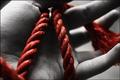
Boundby meo729Comment: I think the negative space works against you here as does the overabundance of middle gray tones. Some highlights, even if just light gray, would add some much needed contrast and spark to this shot. I also wouldn't be afraid of centering the subject here as I think it would work well. Nice work. |
Home -
Challenges -
Community -
League -
Photos -
Cameras -
Lenses -
Learn -
Help -
Terms of Use -
Privacy -
Top ^
DPChallenge, and website content and design, Copyright © 2001-2026 Challenging Technologies, LLC.
All digital photo copyrights belong to the photographers and may not be used without permission.
Current Server Time: 06/22/2026 04:42:03 PM EDT.