| Image |
Comment |
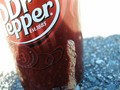
| 10/05/2006 06:06:08 PM |
Too Sexy For My Canby 100ProofComment: Too sexy for your can so you spit on the can? What is that? This idea isn't bad, and if the Dr Pepper logo were fully in the frame it would make a decent advertisement. Is the blue stuff at the bottom foam? Blue foam is probably not going to sell much Dr Pepper... Might have a whitebalance issue there. Good luck. |
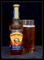
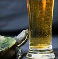
| 10/05/2006 06:04:39 PM |
Traditional & Dryby esdarbyComment: Not bad. Focus should have been on the big label though. It's blurred enough to be a distraction when it should be the highlight of the image. Reflections on the top of the glass should go (black sheet behind you?) Good job. |
 Photographer found comment helpful. Photographer found comment helpful. |
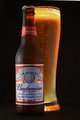
| 10/05/2006 06:03:31 PM |
Budweiserby JulieGComment: Nicely lit, well composed. 13% through voting and this is the first photo I've come across that acctually looks like an ad. I'm thirsty now. You've succeeded. |
| Photographer found comment helpful. |
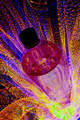
| 10/05/2006 06:02:48 PM |
Illuminatis™by glodaComment: What is this, bottled LSD? Composition is nice, the idea and background are equally bizarre. I think a label of some sort would have cemented the advertisement idea better. This really just comes across as some sort of bizzare bottle abstract. Good luck. |
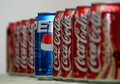
| 10/05/2006 06:00:53 PM |
Hello..... Let Me Inby norlitobgComment: Not sure how this works as an ad. 8 cans of the competition and 1 of your won eh? Setting that aside, the Pepsi label should be displayed in full (if you're making a Pepsi ad here). Composition would work better if cropped so there was no whitespace on the left side. DoF is nice though getting ALL the coke blurred out would have been even better. Overall not bad, good luck. |
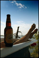
| 10/05/2006 05:58:53 PM |
Roughin' It!by derekmartinigComment: Tough shot, trying to display the bottle while not blowing out the sky. Should have used a refelector of some sort to bounce some light back onto that label because it is just about too dark to read - not a good thing for an advertisement. Idea here is nice, composition is good. Good luck. |
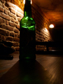
| 10/05/2006 05:57:38 PM |
Mafia Beerby secolibarComment: I'm probably the 10th person to leave you this comment, but here it is anyway: the bottle is too dark. Maybe that's the idea or something. Composition here is in dire need of improvement. Also, use Save for Web and submit your image at the max allowed size. The lighting in this shot is actually pretty nice. If the picture were a decent size and you had something like a pocket flash light aimed at the label of the bottle, you'd actually have a decent advertisement looking image here. Good luck. |
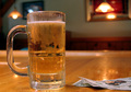
| 10/05/2006 05:55:46 PM |
Bud Light on Tapby David1411Comment: This isn't a bad ad shot. The lighting could be a little moodier, and I think you could have pulled that off in post-processing by playing with levels/curves. One thing about advertisements is they generally show a brand of some sort which you are being convinced to buy. That seems to be missing here. All in all not bad. Good luck. |
| 10/05/2006 05:54:09 PM |
Jax Beach...by surfwakeskateComment: Should be a girl in a bikini in this picture. You don't sell beer by showing a mostly empty beach. You sell beer by showing healthy, sexy people frolicking on the beach. Nontheless, this would work a lot better if the beer itself were standing straight up. Perhaps you'd been drinking it before taking the shot, eh? Admit it! |
| 10/05/2006 05:52:39 PM |
"Is it a longneck ?"by TajhadComment: On the one hand, this is a pretty lame ad concept. On the other hand, you've presented it like an ad which is great. The photo is well taken, and I could see this sort of thing being in a magazine with a little work. Nice job, good luck. |
| Photographer found comment helpful. |
Home -
Challenges -
Community -
League -
Photos -
Cameras -
Lenses -
Learn -
Help -
Terms of Use -
Privacy -
Top ^
DPChallenge, and website content and design, Copyright © 2001-2026 Challenging Technologies, LLC.
All digital photo copyrights belong to the photographers and may not be used without permission.
Current Server Time: 06/22/2026 09:17:14 PM EDT.