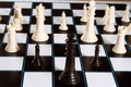
DPChallenge: A Digital Photography Contest You are not logged in. (log in or register
 
Browse Settings
Currently viewing:
Registered Userviolinist123

Show comments:

Per page:

Order:

Comments:


Comments Made by violinist123
Pages:   ... [212] [213] [214] [215] [216] [217] [218] ... [297]
Showing 2141 - 2150 of ~2965
Image Comment
Us & Them
12/25/2006 11:02:49 AM
Us & Them
by Geoffro

Comment:
The concept here isn't so bad. Besides the obvious interpretation of Us and Them that the chess board offers, there is also black verus white, male versus female, many against few, etc. So I think you started off with a decent concept.

Unfortunately your concept is then killed by a very poorly executed photograph.

First problem here is being able to see part of the table beneath the chess board in the upper right corner. That immediately screams "it's a sloppy shot and I just don't care".

I think the lighting could actually do ok as it is here. The way the shadows fall is sort of interesting, if they could be seen better. Increasing the contrast in the shot would help with this.

Focus is a big problem here. To me, you've not gone far enough with a limited depth of field. Either the white pieces should be more blurred or they should be in focus. Here, the foremost white pieces are just out of focus enough to look, well, out of focus. And not in a pleasing, fading-into-the-background sort of way. Just out of focus.

Angle this was shot at could also be changed and I think it would do the most towards really enhancing your shot as well as reinforcing the us verus the theme. If you got down a bit lower and shot this so the black king dominated the frame with a field of white enemies in the distance that would really look good. The angle used here just sort of looks like someone walked by a chess board and took a quick snapshot. Certainly any angle that hid the letters/numbers along the side of the playing area would be an improvement.

Again, I think you had a good idea here. You should spend some time shooting about a hundred different shots of it from different angles, change the lighting, change the setup of the pieces, etc. Find what really makes you go WOW and then that shot will probably make anyone else who looks at it go WOW as well. Well maybe. It is DPC after all heheh.

Good luck.
Money - Pink Floyd
12/25/2006 10:55:04 AM
Money - Pink Floyd
by rcatalano

Comment:
Very literal interpretation of the title of the song. Unfortunately this isn't a very interesting image to look at. It looks as if you tossed some money on a table and snapped off a quick shot.

Things that might make it better? Hard to say. Certainly adding any other element that would inject some action into the shot would be something to consider. The coins dropping into a hand, a shot of someone pulling the dollar out of a wallet or purse. The lighting here is also pretty touch. Looks like it was shot under a table lamp. Windows make for great lighting even on overcast days. Nice light coming from the side through a window, catching the coins as they fall into an outstretched palm - that might make for a well lit, interesting photo that better captured the theme of greed and avarice that Money was about.

Nice attempt. Good luck!
Photographer found comment helpful.
The Wall
12/25/2006 10:51:58 AM
The Wall
by NikonJeb

Comment:
Well, someone had to do it heheheh.
Photographer found comment helpful.
Hanging on in quiet desparation... "Time"
12/25/2006 10:50:48 AM
Hanging on in quiet desparation... "Time"
by meggiemoo

Comment:
Coming back to comment on this one. I think you really had a good subject here to represent the lyric you chose. The image itself is sort of lackluster, and that really holds it back. Personally I've found that when you think to yourself "I will point my camera down at this thing and take a picture of it" you should force yourself to stop, and investigate all possible angles of approaching the shot. Without fail, something is going to produce a better image than just pointing down and firing off a shot.

Here it looks like this might have looked very nice if you got down low, belly in the snow, and shot this from the side. The light would side light, or even back light, the leaves nicely. Also shooting closer up, or even just cropping much tighter so the plant is more dominant in the frame would really reinforce the 'hanging on in quiet desperation' feel of the image.

Good luck!
Photographer found comment helpful.
Lost for Words
12/25/2006 10:42:04 AM
Lost for Words
by Zoomdak

Comment:
This was all you could think of as an interpretation of Lost For Words? Have you even heard the song? Lost For Words is about letting hatred and animosity guide you and rule your life. How such a life leads nowhere. How in the end, ironically, an attempt at reconciling with the people you've hated is pointless.

So this shot of the ribbon winning purple-sky'd beach is an interpretation of the grudges that people hold in their hearts for years? Interesting. Because it almost looks like a shoehorn attempt at picking up a ribbon by submitting a landscape that has ribboned many times before.
Photographer found comment helpful.
Basking in the sunshine of a bygone afternoon
12/23/2006 02:24:28 PM
Basking in the sunshine of a bygone afternoon
by magnus

Comment:
I could see this being a floyd album cover. Looks like some exposure issues, but that's some tough lighting to deal with. Good effort, I think it fits the challenge well.
Photographer found comment helpful.
obscured by clouds
12/23/2006 02:23:34 PM
obscured by clouds
by tase

Comment:
Really nice recreation of the album cover.
"Another Brick in the Wall" meets "Dark Side of the Moon"
12/23/2006 02:22:29 PM
"Another Brick in the Wall" meets "Dark Side of the Moon"
by saiphfire

Comment:
Heh, nice eye. Really cool capture.
In Memory of Syd Barrett - Wish You Were Here
12/23/2006 02:19:53 PM
In Memory of Syd Barrett - Wish You Were Here
by Blackbox

Comment:
Love the concept. The orangeish cast sort of detracts from the shot. Did you shoot in raw? This is easily corrected. Like the reflection in the guitar. Nice, crisp focus throughout. Thinking a tighter crop would really have kicked this way up.
Photographer found comment helpful.
Waiting
12/21/2006 12:58:14 PM
Waiting
by fireserpent

Comment:
Very nice. I like the lighting and the overall mood. Only thing I wish was changed was to either lose the bikini bottom altogether or go with something else. The strings/knots just don't fit the shot and the shadows they cast on her hips are a little distracting. You've got it cropped to where she could just lose the bottom altogether without the shot going into full on nude mode. Well, assuming she was willing I guess.

Anyway, nice work.
Photographer found comment helpful.
Pages:   ... [212] [213] [214] [215] [216] [217] [218] ... [297]
Showing 2141 - 2150 of ~2965


Home - Challenges - Community - League - Photos - Cameras - Lenses - Learn - Help - Terms of Use - Privacy - Top ^
DPChallenge, and website content and design, Copyright © 2001-2026 Challenging Technologies, LLC.
All digital photo copyrights belong to the photographers and may not be used without permission.
Current Server Time: 05/07/2026 06:14:33 AM EDT.