| Image |
Comment |
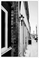
| 03/01/2007 12:31:09 PM |
Downtownby JeniYComment: I prefer black and white photography so you get my interest right off the bat. Couple issues with the shot that held it back. First, it is over sharpened. The little points showing up in the bricks and the jaggy along the edge of the wall lamp are signs of this. I would ease up a bit on the sharpening. Yes, in challenges people expect retina slashing sharpness, but there is a line there that you still don't want to cross.
Second thing is the composition. I do like the details of the wall and the leading lines. However everytime I look at this photo my eyes immediately move to the right side and my mind says 'wheres the rest of the photo'. I think a landscape crop would have worked better here as it would have presented a good chunk of the street along with the wall. Your eyes are naturally drawn to the brightest spot in the image and here that is the sky above the street, so you want to get something in that section of the photo for the eyes to feed on.
Really nice tones. Good job on the BW conversion. |
 Photographer found comment helpful. Photographer found comment helpful. |
| 03/01/2007 12:25:43 PM |
Preciousby faeryComment: Nice expression on the kids face. Her youthful curiosity balances well against the mood given off by the guy behind her.
There's a bit of a focus problem here, likely caused by the 1/80s shutter speed. That's just a bit too slow of being able to freeze motion and it looks like she was moving - just enough to blur her face slightly. Big, big no-no in DPC challenges and even outside of the challenge arena it does reduce the effect of this shot.
Also thinking a tighter crop that really focused in on the kid and the guy behind her would give the shot a bit more pop. |
| Photographer found comment helpful. |
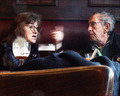
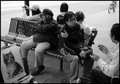
| 03/01/2007 12:22:48 PM |
Street Cafe Eavesdroppingby GreetmirComment: I'd agree about the texture. I think it's the sort of thing that can add an interesting effect for a piece on the wall, but it doesn't translate well to the web. Like the expressions on their faces. |
| Photographer found comment helpful. |
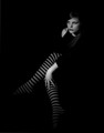
| 02/28/2007 12:43:55 AM |
Stripedby ShermyComment: I rarely comment anymore simply because engaging with others on this site generally ends up with me getting a headache - but I have to say this is a beautiful photopgraph. Love her expression, love the striped stockings, excellent lighting especially the highlight on the forearm/hand. Exquisite. I hope this wins. |
| Photographer found comment helpful. |
| 02/26/2007 12:20:22 AM |
OTOHby Rob OComment: Haha, very clever and a nice photo as well. Good luck. |
| Photographer found comment helpful. |
| 02/26/2007 12:13:50 AM |
|
| Photographer found comment helpful. |
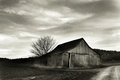
| 02/25/2007 02:10:08 PM |
barn3_toned.jpgby oravsky123Comment: Very nice. Personally I like the grain - adds a bit of texture. Of course it is anathema on dpc. |
| Photographer found comment helpful. |
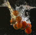
| 02/19/2007 11:47:03 AM |
The Tomato Invasionby dreamyComment: This would look better if something in it were sharp, preferably the vegetables. Lowering your aperture would allow you to increase your shutter speed and freeze the motion. This would certainly sharpen things up.
Losing the yellow tint in the air bubbles on the left side would also help. The picture would have much more impact with just the color of the vegetables, the white of the water, and the black background.
Really the big issue here is not freezing the motion.
Hope that helps. You asked for comments. I'm afraid the ones you received in challenge did you a disservice. |
| Photographer found comment helpful. |
| 02/15/2007 09:13:58 PM |
|
| Photographer found comment helpful. |
| 02/14/2007 06:16:17 PM |
I'm on the other line, leave a message after the tone.......by IvoComment: I didn't get it until I read the comment about suicide.
Nice setup shot. I think for those dolts out there like me, it might work even better if there was a shadow on the wall showing the rope or something else making the connection a bit more literal to the viewer.
Personally, I would up the threshold on your unsharp mask. The grain in the back wall is oversharpened and a bit of a distraction. Picture size is a big no-no. Always submit full size. All in all, not bad. I think it scored right about where it should in my mind. Nice work! |
| Photographer found comment helpful. |
Home -
Challenges -
Community -
League -
Photos -
Cameras -
Lenses -
Learn -
Help -
Terms of Use -
Privacy -
Top ^
DPChallenge, and website content and design, Copyright © 2001-2026 Challenging Technologies, LLC.
All digital photo copyrights belong to the photographers and may not be used without permission.
Current Server Time: 06/23/2026 09:51:00 PM EDT.