| Image |
Comment |
| 06/28/2007 05:53:47 PM |
|
 Photographer found comment helpful. Photographer found comment helpful. |
| 06/28/2007 05:37:42 PM |
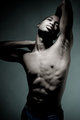
IMG_1560.jpgby GeocideComment: I find myself liking how the right arm shoots out of frame. At the same time, the open space on the right side of the photo between arm and frame doesn't sit so well. I think this would look better if he were jutting up against the frame on both sides, as he is already boxed in on the other three edges.
Background is quite nice. Lighting is nice, though the brighter parts of the body look a bit washed out. Would like to see more definition on the torso.
Good overall. Something I would try to mimic did I not have the body of homer simpson. |
| 06/27/2007 10:59:13 PM |
Hickey Wedding 3by TCGuruComment: Her face makes this picture. You could get a nice portrait out of this by cropping accordingly. The white background makes it very hard to see that wisp of veil (or laceor whatever). You could probably do some photoshop magic to salvage that side of the photo. Might also crop out that bit of dress showing at the bottom, or go the other way and show more of the dress (at a glance it almost looks like a nude). |
| Photographer found comment helpful. |
| 06/27/2007 10:56:47 PM |
Hickey Wedding 4by TCGuruComment: Great capture - possible to crop it so the shot is mainly him and the garter? |
| Photographer found comment helpful. |
| 06/27/2007 10:56:09 PM |
Hickey Wedding 1by TCGuruComment: Also a decent shot. Might look better by leveling out the top of the cake and centering it in the frame. |
| Photographer found comment helpful. |
| 06/27/2007 10:55:20 PM |
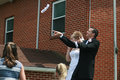
Hickey Wedding 5by TCGuruComment: This isn't bad, but I would like to see the bottom of them rather than the bricks above. |
| Photographer found comment helpful. |
| 06/27/2007 10:54:37 PM |
|
| Photographer found comment helpful. |
| 06/26/2007 04:29:02 PM |
|
| Photographer found comment helpful. |
| 06/25/2007 01:06:01 AM |
_MG_0087.JPGby MK153Comment: You really hate this poor girl's foot. ;)
Good call going with the other shot. |
| Photographer found comment helpful. |
| 06/25/2007 01:05:08 AM |
|
| Photographer found comment helpful. |
Home -
Challenges -
Community -
League -
Photos -
Cameras -
Lenses -
Learn -
Help -
Terms of Use -
Privacy -
Top ^
DPChallenge, and website content and design, Copyright © 2001-2026 Challenging Technologies, LLC.
All digital photo copyrights belong to the photographers and may not be used without permission.
Current Server Time: 06/24/2026 06:44:23 PM EDT.