| Image |
Comment |
| 04/30/2007 03:29:32 PM |
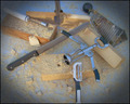
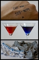
Resourceful Woodworkingby GreetmirComment: I like the original way of using the kitchenware, and the layout is interesting. It's missing a little pizazz, though. Try bumping up the contrast and the other things that stdavidson suggested. I would've been torn between a 5 and 6, so 5.6 sounds about right. |
 Photographer found comment helpful. Photographer found comment helpful. |
| 04/30/2007 02:42:41 AM |
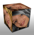
Color my Worldby BrianRComment: Interesting take on the challenge. It's a little disconcerting to see gray hair on such a young face! |
| Photographer found comment helpful. |
| 04/30/2007 02:40:17 AM |
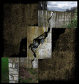
Crack'dby posthumousComment: Interesting! So many details, and I like how you have the crack continuing through different versions of itself. My only suggestion would be to crop the lower left shot so the left side is within the stone wall. Because the wall's right side is so vertical, it took a bit for me to understand that it was all one pic showing both sides of the wall - my eye saw the grass and stone wall as one pic and the crack section as a different shot. |
| Photographer found comment helpful. |
| 04/30/2007 02:37:20 AM |
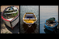
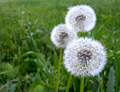
~ Diversity ~by gocComment: I like the multiple variations - size, color, placement. Nice! |
| Photographer found comment helpful. |
| 04/30/2007 02:35:42 AM |
|
| Photographer found comment helpful. |
| 04/30/2007 02:35:05 AM |
|
| Photographer found comment helpful. |
| 04/30/2007 02:33:41 AM |
|
| Photographer found comment helpful. |
| 04/30/2007 02:31:41 AM |
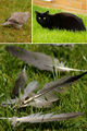
Landmark for the Lostby theSajComment: Hi Jason. Nice subject, isn't it? The trick is to find unique ways of presenting it.
This composition isn't bad, but I'm guessing the soft focus and underexposure hurt your score. I find it best to expose Washington's monuments and memorials at the lowest possible ISO and typically 4-6 seconds wide open. |
| Photographer found comment helpful. |
| 04/30/2007 01:37:17 AM |
Lawn bubblesby gattamartaComment: I'm back to change my mind about not meeting the challenge. I'll give you credit for thinking very differently. :) |
| Photographer found comment helpful. |
| 04/30/2007 01:36:40 AM |
Bubbles in the Hazeby kjhunter2250Comment: A little too dim and there's basically no detail outside of the model, making too much empty space. Also, the bubble in front of her face detracts from what she can add to the image. |
Home -
Challenges -
Community -
League -
Photos -
Cameras -
Lenses -
Learn -
Help -
Terms of Use -
Privacy -
Top ^
DPChallenge, and website content and design, Copyright © 2001-2026 Challenging Technologies, LLC.
All digital photo copyrights belong to the photographers and may not be used without permission.
Current Server Time: 07/16/2026 03:54:24 PM EDT.