| Image |
Comment |
| 05/06/2007 03:52:27 AM |
|
 Photographer found comment helpful. Photographer found comment helpful. |
| 05/06/2007 03:51:12 AM |
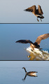
The Landingby AgaerisComment: I like the story and the shots. For a little more visual interest, try it where the goose completely crosses the frame, so the middle shot's in the middle and the bottom one's on the left. |
| 05/06/2007 03:51:06 AM |
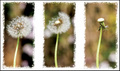
Losing its seedsby kevip6Comment: As with the other dandelion triptychs, I like the idea. I also like your rough frame. However, the center head is blown out and the overall focus in each picture is soft. Look at the others to see alternatives. |
| Photographer found comment helpful. |
| 05/06/2007 03:50:28 AM |
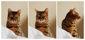
Tigressby SiggavComment: I would like there to be 3 different poses. The left and right ones are nice, but the middle one seems to be just repeating the left one. |
| Photographer found comment helpful. |
| 05/06/2007 03:50:23 AM |
"To every thing there is a season"by faeryComment: Nice to see your family growing! :) The lighting seems a bit off, though - maybe too yellow? I'm not very good at describing color casts, but I see something there. |
| Photographer found comment helpful. |
| 05/06/2007 03:50:02 AM |
|
| Photographer found comment helpful. |
| 05/06/2007 03:49:43 AM |
Firelight Fantasiaby purpleflutterby13Comment: Interesting choices. I like the lower left one best, mostly for the lighting. Actually, the nudity seems a bit pointless given the fire and reflection.
The placement of the lower left shot is a bit problematic - it seems to me that it should either overlap the one on the right by a lot more or not at all. The small overlap strikes me as accidental. |
| Photographer found comment helpful. |
| 05/06/2007 03:48:51 AM |
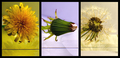
More Than A Weedby ltlmschrisssComment: I like the sentiment and the shots. The colors are putting me off, though. I like the strong contrast between subject and background in the middle, and would suggest finding similar contrasts for the others. |
| Photographer found comment helpful. |
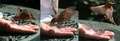
| 05/06/2007 03:48:40 AM |
Hold you Hatby B74AComment: Hey, that's great timing! Did she find it later? I'd suggest adding some vertical white or black strips to help separate the frames. |
| Photographer found comment helpful. |
| 05/06/2007 03:48:09 AM |
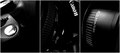
rebelliousby k4ffyComment: I like the idea, the title, and the framing. I'd just like the middle part to show a little more detail - it's very dark. |
| Photographer found comment helpful. |
Home -
Challenges -
Community -
League -
Photos -
Cameras -
Lenses -
Learn -
Help -
Terms of Use -
Privacy -
Top ^
DPChallenge, and website content and design, Copyright © 2001-2026 Challenging Technologies, LLC.
All digital photo copyrights belong to the photographers and may not be used without permission.
Current Server Time: 07/17/2026 06:20:04 AM EDT.