| Image |
Comment |
| 08/28/2007 11:33:20 PM |
|
 Photographer found comment helpful. Photographer found comment helpful. |
| 08/28/2007 11:32:53 PM |
|
| Photographer found comment helpful. |
| 08/28/2007 11:32:37 PM |
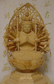
Guan Yin of a Thousand Armsby ecpicaComment: Nice composition. I would try increasing the contrast and correcting what appears to be a yellow tint to enhance visual interest. |
| Photographer found comment helpful. |
| 08/28/2007 11:31:48 PM |
|
| Photographer found comment helpful. |
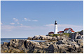
| 08/28/2007 11:31:07 PM |
The Environmentby brimacComment: Here, here! :) Pretty scene. Try it with about half of the blue cropped out so the lighthouse is larger and not centered vertically. It doesn't always help, but often it adds more interest. |
| Photographer found comment helpful. |
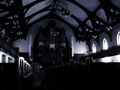
| 08/28/2007 11:30:05 PM |
Intimidation by HaneckComment: Too dark. If you use PS CS2 or CS3, try exploring the image->adjustments->shadow/highlights tool, which will bring out details in the shadows (and highlights, but the shadows are the issue here).
Aside from that, it might help the composition to crop out the left side stuff so the large arch is on the left side of the picture. |
| Photographer found comment helpful. |
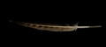
| 08/28/2007 11:27:38 PM |
sacred featherby pnfComment: Try angling it for a more interestesting presentation instead of right through the middle. Also, brighten it quite a bit so that the stem is white instead of gray. |
| Photographer found comment helpful. |
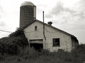
| 08/28/2007 11:26:56 PM |
Sacred No More: Family Farmsby juliejoldComment: I'm okay with the concept for this challenge, but I think it'd look better with the blacks more intense. It kind of washes out right now. Not overblown except in the sky, but just not really deep either. |
| Photographer found comment helpful. |
| 08/28/2007 09:56:34 PM |
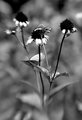
fade awayby krnodilComment: Gives me a vintage feel. :) I like the deep blacks and strong contrast. While the stuff below the bottom of the stems adds some context, I'd suggest trying it with the bottom cropped up to there. |
| Photographer found comment helpful. |
| 08/28/2007 09:55:09 PM |
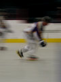
Day-27-No-1-Son.jpgby JerseyGenieComment: He looks like he's flying down the ice! So that's a case where my knowing how hockey looks fools me, since he's really on wheels. I suggest bumping up the brightness, though. I suspect the brightest part of his uniform is white, not gray. |
| Photographer found comment helpful. |
Home -
Challenges -
Community -
League -
Photos -
Cameras -
Lenses -
Learn -
Help -
Terms of Use -
Privacy -
Top ^
DPChallenge, and website content and design, Copyright © 2001-2026 Challenging Technologies, LLC.
All digital photo copyrights belong to the photographers and may not be used without permission.
Current Server Time: 06/25/2026 10:14:08 PM EDT.