| Image |
Comment |
| 07/07/2008 12:04:40 AM |
E=H2O by NeilComment: Woo hoo! Congrats big time, Neil! :) |
 Photographer found comment helpful. Photographer found comment helpful. |
| 07/04/2008 11:40:34 AM |
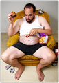
Plates? Never heard of 'em.by timfythetooComment: I just wish I had your creativity, Tim. But, as a photo, well, clearly it deserved a 1. I mean:
- there's a visible hot spot on your forehead
- one of the beer cans isn't crushed
- the ketchup smear should've been tilted 2.8 degrees further to the right for maximum effect
- your mouth is closed; what a wasted opportunity
- the chair's shadow greatly distracts me
- there's a mark on the wall on the right side
- your shirt is blown out
- you're not a sexy, scantily clad, young woman
So although we're friends, had I been voting, I woulda nailed ya.
(Note to the humor-impaired: this is a JOKE) |
| Photographer found comment helpful. |
| 06/27/2008 01:08:28 PM |
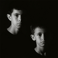
Almost Twinsby bassboneComment: Fantastic, Peter! Now I have another idea I need to steal for a portrait of my girls. I'll wait a decent interval, but you'll know it when you see it. :) |
| Photographer found comment helpful. |
| 06/27/2008 01:06:27 PM |
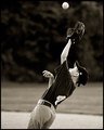
The Final Out by brownsmComment: Woohoo! Congrats, Steve! Perfect timing and use of B&W.
And I think Man_Called_Horse's reaction is funny. I mean, he's basically saying "how dare the voters not adhere strictly to firm guidelines and look at this image without knowing what to look for." It's the same reaction as others who spend more time worrying about the "rules" of portraits, landscapes, or you name it instead of deciding whether they like an image or not. :) |
| Photographer found comment helpful. |
| 06/22/2008 10:31:53 AM |
|
| Photographer found comment helpful. |
| 06/20/2008 01:09:40 AM |
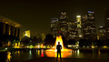
Overtimeby zackdezonComment: In response to your thread asking for comments, I would've scored this a 6 or 7, which is a good score from me. I like the yellow color, the skyline, and the pure silhouette. The skyline's seems a little soft, so try F/8 or F/11 next time. Also, and this just my preference, I like photos where the subject's either dead center or well away from it. Here, the composition feels like there's too much on one side or the other. |
| Photographer found comment helpful. |
| 06/20/2008 12:01:53 AM |
|
| Photographer found comment helpful. |
| 06/20/2008 12:01:18 AM |
|
| Photographer found comment helpful. |
| 06/19/2008 11:29:11 PM |
Too Person Portraitby timfythetooComment: Ah, yes, the toos. What a perfect opportunity for a punny title! I commend you for the guts to enter this pose. I had an option like this, but worried it'd be seen as "a portrait has to show both people equally." Those eyes are something else! |
| Photographer found comment helpful. |
| 06/19/2008 08:49:49 PM |
|
Home -
Challenges -
Community -
League -
Photos -
Cameras -
Lenses -
Learn -
Help -
Terms of Use -
Privacy -
Top ^
DPChallenge, and website content and design, Copyright © 2001-2026 Challenging Technologies, LLC.
All digital photo copyrights belong to the photographers and may not be used without permission.
Current Server Time: 06/20/2026 12:48:14 AM EDT.