| Image |
Comment |
| 11/17/2004 12:37:19 AM |
Portraitby _wu_Comment: There are a lot of people who like this high-key style of shot. I'm not really a fan of it personally. I do like how the background splits between black and white. I cant really see anything technically wrong with this, it just doesnt have the visual impact for me. |
 Photographer found comment helpful. Photographer found comment helpful. |
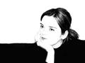
| 11/17/2004 12:34:12 AM |
Birds in the fogby sblair2146Comment: Unfortunately the fog in this image just comes across as a very low contrast shot, although there are the foreground leaves to counter that. The image is also fairly soft. The birds are so small compared to the rest of the image that they are not really the focal point that the title suggests. |
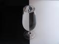
| 11/17/2004 12:30:51 AM |
Estographyby ArnarpComment: The focus on the glass is a little soft and the white looks quite grey. A levels/curves enhancement or more light in the setup would make a significant improvement. |
| Photographer found comment helpful. |
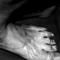
| 11/17/2004 12:28:40 AM |
Layersby FotowereldComment: I'm sure you are going to receive a lot of comments concerning the attractiveness of the image. There is certainly a good amount of texture in the image. I find the choice to have a lot of negative black space at the top and the foot to be cropped an interesting one, but it doesnt really do much for me personally. I'm sure it would be considered an artistic shot but it doesnt have much of an impact on me. |
| Photographer found comment helpful. |
| 11/17/2004 12:24:28 AM |
Living Statueby GraciousComment: It's an interesting shot but I find my interest is on his face and so find the vast amount of shirt to be a little excessive. If getting closer or cropping tighter around the face wasnt an option then at least cropping off some of the bottom may have helped. |
| Photographer found comment helpful. |
| 11/17/2004 12:21:40 AM |
Graceby hanlombaComment: When I first opened the image I thought there was some nice soft lighting and an interesting pose but after looking for a while I find it a little awkward. Her position on the floor and the sheet over her lower half just doesnt look natural and I dont think it adds anything to the shot. Personally, I would rather see a closer shot with the image cropped to the middle instead of there being a lot of negative space around the focal point - her. |
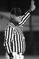
| 11/17/2004 12:18:55 AM |
Refereeby jimmyn4Comment: You've certainly captured black and white in black and white! The highlights on the pants are a little bright and the shadows make the eyes a little too dark. The fingers could do with a little more space above them also. It's an OK shot but doesnt have much impact. |
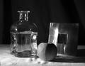
| 11/17/2004 12:14:35 AM |
B&Wby LongComment: It's a good idea and you have various shapes and textures but there are a few technical issues that let the image down. The highlight on the metal frame is blown, and there are some distracting light reflections on the bottle too. The sheet the items are on is ruffled near the apple and that is a little distracting also. Overall the image is a little static. |
| Photographer found comment helpful. |
| 11/15/2004 11:49:48 PM |
September by moodvilleComment: Originally posted by gruvin:
Congrats!
Can you tell us, was there any type of lens filter used for this shot? Thanks. |
I used a cokin G2 graduated neutral density filter. |
| 11/15/2004 08:56:30 AM |
Hard dayby BullpupComment: I find my personal interpretation of this image interesting and am curious to see if that was the intended message or not. The drink has bad connotations for me as in s/he has been driven to alchol as a result of the job, but the cigar has a celebratory feel or one of relaxation. There is a clear duality present in the image. Photographically it looks good, but the placement of the cigar looks a little odd. |
| Photographer found comment helpful. |
Home -
Challenges -
Community -
League -
Photos -
Cameras -
Lenses -
Learn -
Help -
Terms of Use -
Privacy -
Top ^
DPChallenge, and website content and design, Copyright © 2001-2026 Challenging Technologies, LLC.
All digital photo copyrights belong to the photographers and may not be used without permission.
Current Server Time: 06/10/2026 09:52:32 PM EDT.