| Image |
Comment |
| 09/24/2003 09:48:55 AM |
Relaxationby HomunculusComment: The dark and light contrasts well, and her face has a daydreamy quality too. I find her looking at the camera to be a draw, as if she is encouraging the viewer to lay down and rest too. Her face is a little too central, perhaps putting her to one side could emphasis the 'come lay down with me' feel by showing a roomy space for the viewer to fall into. I like it. |
 Photographer found comment helpful. Photographer found comment helpful. |
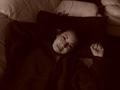
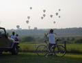
| 09/24/2003 09:43:51 AM |
Stop in my wayby coloradatxComment: In shots were the focus is in the sky it is usually disappointing to have an overcast day and/or have the sky blown out. That said, the repetition of the balloons is interesting enough for the sky to not be too bad. Cropping a little more on the left would have removed the excess branches that distract a little. |
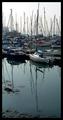
| 09/24/2003 09:39:09 AM |
Resting At Mooringby paynekjComment: The reflection in the water is good and helps lead the eye to the boats, but I find with the narrow crop that the vast many boats of varying color combinations just seems too chaotic to be calming. There is nothing there for my eyes to rest on, other than back at the mast reflection, which seems to be my focal point. |
| Photographer found comment helpful. |
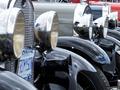
| 09/24/2003 09:31:47 AM |
Classics at restby Dim7Comment: The repetition is good, the crop is a little soso, but probably the best out of the options without cropping out too much. Not a subject I immediately associate with 'at rest' but I suppose technically they are. I cant see any obvious photographer reflections so that's always good too. |
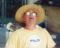
| 09/24/2003 09:28:04 AM |
Dad's beauty restby Debbie99Comment: The image has humor value, although the resolution doesnt seem the best and so some of the details (like with the cucumbers(?)) are lost. The dog bowls in the background also distract a little. There is also a small line of white near the bottom, possibly due to cropping? The idea is good, the execution could have been better. |
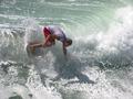
| 09/22/2003 12:05:25 AM |
Off The Lip by ScottKComment: Wow an A40 winning the sports challenge! Great shot, and to do it with a 1.9mp low-end camera is just amazing! Congratulations! |
| Photographer found comment helpful. |
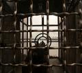
| 09/17/2003 11:39:13 AM |
The Voice of Freedomby ellamayComment: I find the message (or at least the one I envision I see) to be kinda interesting. Here we have a picture representing freedom and it's in a cage! Of course the 'voice' also seems to be a weapon, which I also find curious. This photograph makes some quite bold statements. That said, I do like the sepia tones, and although it may lack any 'wow' factor, I think the message is what stands out from this photograph rather than being visually 'pretty'. |
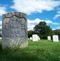
| 09/17/2003 11:33:34 AM |
Freedom.......At what cost? by christyrackComment: What I love most about this shot are the colors - they are so clean and vibrant. The lush grass and the wonderful sky almost makes you want to be in the picture, but then the actual topic of the shot brings it all back into perspective. That said, it does show a positive feeling and not a black and white, gloomy shot that is often associated with gravestones or cemeteries. Coupled with the challenge of freedom, I think showing this brighter side honors the memory of what these people fought and died for. Without their efforts we wouldnt have the lush grass and bright skies that sometimes we take for granted. I also really like the composition of this shot. There isnt really anything I would change. Great shot! |
| Photographer found comment helpful. |
| 09/16/2003 12:45:08 PM |
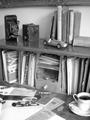
Times of the Pastby Lee31Comment: What a great collection of old things! I think the coffee cup adds 'life' to it, making it more 'now' than then. I'm not really sure about the angle, though. A straight-on shot could be boring, and I'm not sure if you tried and dimissed it, but this angle crops out so much. The coffee cup needed to have more cropped (possibly half) or else be fully in the frame, the frame at the top seems awkward but if you had cropped lower with this angle it seems it would crop out some of the books too. I think having slightly more contrast, which is so important with black and white images, could have improved it some too. It's a good image, I just feel the composition isnt as strong as it could have been. |
| 09/16/2003 12:37:35 PM |
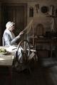
Once upon a time, there were Quality Clothesby GrziComment: This era is a little before my time so I dont have too many nostalgic feelings coming from the image, but I'm sure some people do. At first it seemed a little dark, but other than the woman the rest of the room is just background and so it's good that it's a little darker so as not to distract. I really like the fact that she is lit by the light coming from the window, it helps support the feeling of age. I'm also glad you decided to keep it in color instead of black and white or sepia. In a way it's a shame the table is there, it distracts a little and I think the angle of that coupled with the angle of the door frame makes the image look a little tilted. However, I understand you can only work with what you have, and what you have makes a good photograph. |
| Photographer found comment helpful. |
Home -
Challenges -
Community -
League -
Photos -
Cameras -
Lenses -
Learn -
Help -
Terms of Use -
Privacy -
Top ^
DPChallenge, and website content and design, Copyright © 2001-2026 Challenging Technologies, LLC.
All digital photo copyrights belong to the photographers and may not be used without permission.
Current Server Time: 06/11/2026 08:10:49 AM EDT.