| Image |
Comment |
| 02/17/2008 10:23:43 AM |
|
| 02/17/2008 10:20:02 AM |
|
 Photographer found comment helpful. Photographer found comment helpful. |
| 02/17/2008 09:57:19 AM |
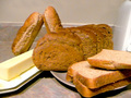
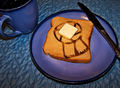
What's For Breakfast?by S7RA7USComment: Most of the positioning of the bread (the slices) is appealing - but the two loaves standing on end making an "A" frame is unnatural and a bit of a distraction to your image. The item in the upper right could be one of several things - a gallon of milk, an appliance? My mind wants to know for sure. This object and the butter dish are blown out and a bit distracting as well. I think the image might benefit from a basket or something in the background to help with the wall & back splash. |
| 02/17/2008 09:44:51 AM |
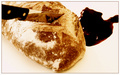
Time of Death : 7:00 AMby tormentorComment: Whimsical & fun. The "blood" is OOF & this detracts from your theme. Great texture on the bread. Nice high key image. |
| 02/17/2008 09:40:42 AM |
One For The Birdsby libertyComment: Great idea. I even think the centered composition works. Unfortunately it appears the bread is just slightly out of focus. |
| Photographer found comment helpful. |
| 02/17/2008 09:38:53 AM |
Breakfast Brainwashingby elizadebComment: Clever idea! I would have thought the ribbon pattern was burned onto the toast were it not for the material (paper?) coming off in the bottom RH corner of the toast (& slight shadow.) |
| Photographer found comment helpful. |
| 02/17/2008 09:34:51 AM |
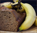
Banana Breadby NobodyComment: This is a great shot. Nice DOF. Good lighting that shows off the texture of te bread. Good composition. The shadow on the right banana is barely there and a bit distracting. I might have tried to bring out more of the yellow in the pp. |
| Photographer found comment helpful. |
| 02/17/2008 09:32:09 AM |
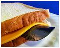
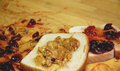
Shoehorn on whiteby Yo_SpiffComment: Technically this is a very good shot. Great DOF. Great lighting that shows off the texture of the bread vs the cheese. I am frustrated by only one thing, though - I feel like I have missed the pun or the joke with the inclusion of the shoehorn...What does it mean???!!! |
| Photographer found comment helpful. |
| 02/17/2008 09:28:09 AM |
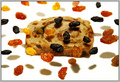
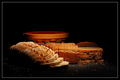
Bountifulby ArcanistComment: The darkness really helps show off the textures and warm colors of the breasd and basket. I think you could get away with even less negative space up top, thereby bringing the subject into a more prominent position. I also like the effect the crumbs have on this composition. Very nice job on this challenge. |
| Photographer found comment helpful. |
| 02/17/2008 09:24:31 AM |
|
| Photographer found comment helpful. |
Home -
Challenges -
Community -
League -
Photos -
Cameras -
Lenses -
Learn -
Help -
Terms of Use -
Privacy -
Top ^
DPChallenge, and website content and design, Copyright © 2001-2026 Challenging Technologies, LLC.
All digital photo copyrights belong to the photographers and may not be used without permission.
Current Server Time: 07/21/2026 02:12:36 PM EDT.