|
|
|
Showing 641 - 650 of ~8163 |
| Image |
Comment |
| 11/23/2016 07:42:11 PM | Max and Gracie from the Hipby CyrildaComment: Greetings from the Critique Club!
Lovely dogs, not a bad shot at all for a shoot-from-the-hip entry. Good lighting, very good exposure, and considering that this was a Minimal challenge where you can't even crop, let alone do selective editing like straightening or cloning, a very decent entry.
The bulk of both dogs' bodies is in focus, but the head blur (esp noticeable on the chocolate Lab) shows the slow shutter speed...it may have been better to go with a higher ISO and a faster shutter in order to freeze head movement, as no animal that is awake is going to hold still, let alone take direction! :-)
Another suggestion would be to ensure that there are no reflective surfaces when shooting for a challenge under the Minimal ruleset; surfaces like that are tricky enough for pros to shoot, let alone amateurs! The green wedge of bright light above the Lab's hip is very glarey and painfully obvious, as are the smudges on the glass.
Remember too that you can still shoot as many pics as you like. Then you have the luxury of a large assortment to choose from.
Hope this helps,
Susan |  Photographer found comment helpful. Photographer found comment helpful. |
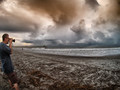
| 11/23/2016 07:23:14 PM | Capturing the moments before Hermineby WonderDudeComment: Greetings from the Critique Club!
Overall this is a very good, well-exposed capture of a nice angry storm coming in. Love the colours in the clouds, you can see the strength and energy in them and as the tide is out a little, the waves look they're almost cowering in anticipation, and the jetty to the left with that teeny little shack (lifeguard station?) on the end just reminds us how small we are...the surfers are pretty much an afterthought at this point, with the weather looming...this is the kind of shot that, with a judicious amount of pp, ends up on the front page.
But then...Daniel, dude! There's this photog coming in from the left and his presence immediately draws all the attention away from Hermione and all that beautifully played-out drama in the waves and sky. Now, I can see that you wanted to use a photog to document the storm coming in, but there are other ways to do it. Usually as a silhouetted figure in the distance, with a tripod helping to establish their presence. Up close and personal, in this fashion, just isn't the way to go.
I want you to try this exercise: cover up the photog (and figure walking on the sand, too) with your left hand. Got it? Now, cover up the bottom third of the pic with your right hand. See the difference between the original and this hand-cropped version? Keep in mind that you will lose nothing by doing exactly this in pp, before you enter: put the best two crops of an entry, side by side, and see which one captures your attention more. And why.
Hope this helps, feel free to pm me (esp as I was having a Yoda moment in the last couple sentences)
Susan
|
| 11/23/2016 07:07:29 PM | Coming of Ageby SeanranneyComment: Greetings from the Critique Club!
I do like the furtive nature of this shot...even if he is holding the cigarette backwards :-) The lighting is basic but very effective, and the bike in the background helps emphasize his youth. I like the stark shadow behind him, the comp, the use of b/w and your settings show that you know what you're doing.
This reminds me of the book covers of SE Hinton, who wrote gritty teen novels, often about kids growing up in hard circumstances. Google her name and you will see what I mean. There is definitely a flicker of defiance there in his eyes and the way he's looking up at you helps convey the 'So whaddaya gonna do about it, Dad?' rebelliousness. Maybe not quite James Dean, but not a bad start!
Unfortunately, in terms of an Emotive Landscape, this isn't quite what was expected. I do think that this could have made a very emotive portrait though.
Hope this helps, please continue to shoot and enter!
Susan |
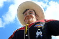
| 11/23/2016 07:00:09 PM | Howdy Folksby firefighter271Comment: Greetings from the Critique Club!
Wow, that is some big dude...must be Texas ;-)
This is a pretty decent shot, I'm a fan of low angles and I'm sure this big guy towered over you and family. Composition is very basic, the lighting is quite strong, looks like sun is at high noon, and you've compensated for a low depth of field with a super-fast shutter speed...would have made more sense to go with a much smaller aperture and a much slower shutter.
The main problem here is, there is no sense of scale. And in a Landmarks challenge, you want to indeed show that yes, this IS a landmark...a large, prominent feature easily seen for a good distance around. I don't know what lens you used, but even a basic kit lens usually wides out at about 18mm or so, which would have helped get in all of the big guy and the fair around him to give that sense of scale.
Hope this helps, feel free to pm me
Susan
|
| 11/23/2016 06:42:12 PM | Death's Pretty Colorsby posthumousComment: Greetings from the Critique Club!
Ah, Posty, so we meet again...I see that I gave this a 6 in voting because I too see Death's Pretty Colours, in an overall pleasing photo of backlit fall leaves. So technically, yes, you did meet the challenge description and like most entrants, used the initials DPC to construct your film title. All fine and dandy, though I do wish that oof limb wasn't there approx halfway up - I find it distracting and it serves no purpose but to cut off the nice downward flow of the leaves.
But what I didn't see was a serious attempt to meet the challenge criteria of making this a poster suitable for a cinema poster, which is meant to entice the public into parting with their hard-earned $$. So in addition to a very powerful image, you need to reel them in with the name of the film, perhaps a handful of credits (ie 'Directed by M. Knight Shyamalan', 'starring Brangelina', studio affiliates etc. I noticed that many entries even had the ratings box.
Hope this helps,
Susan Message edited by author 2016-11-23 18:50:17. | | Photographer found comment helpful. |
| 11/23/2016 06:35:54 PM | Marketing Photoshootby doodoohead2016Comment: Greetings from the Critique Club!
I gave this image a 6 during voting, and that's because this is a very good shot that I wish had done better in voting. Though not crazy about the tilted background, at least your subject is in turn tilting slightly the other direction. The b/w is a very good call for anything with an urban background, I find; the profusion of strong, bright colours in many cities only detract from the subject.
Your subject definitely looks like he has a story to tell, and I wish you hadn't touched his face in pp. He's barely in his 20s, far too young imnsho to ever retouch the skin of anyone unless they have something that they truly wish to hide, like really bad acne, a port-wine stain, scars, tats etc. Let the character in a person's face, via their lines/wrinkles etc, show and tell us the story of their lives - please, do NOT get in the habit of pp'ing them to the extent that they look like a figure in a wax museum (or on the cover of People magazine)!
Lighting and comp are good, but once again I am wondering why you choose to use such a high ISO (and risk creating noise/grain, which you then have to remove...so avoid the hassle and shoot as low an ISO as possible) and needlessly fast shutter speeds for subjects that are hardly moving. This could have been easily caught at ISO 100 and a shutter speed of 1/200....max.
Overall, a very good shot, please keep up the good work in terms of concept and execution...but perhaps move out of your pverly high ISO, warp-speed shutter button comfort zone. Shoot slower and with less ISO. Experiment. Learn.
Feel free to PM me with any |
| 11/23/2016 06:15:14 PM | MY BEAUTIFUL WIFEby doodoohead2016Comment: Greetings from the Critique Club!
This is indeed a lovely woman that you've captured. The mood is light and playful, the composition is acceptable with the tilt of her head and the bi-coloured hair adding interest and some dynamism to the shot. The light is a bit strong, almost bordering on flat as it was probably shot somewhere during the hours of 11am and 3pm. Be careful of that!
The settings you use mystify me. Why such a high ISO when shooting on a sunny day? And why such a fast shutter speed for essentially a stationary subject? I shoot rodeo at 1/1250 and that's plenty to capture a beast or cowboy in full flight, in crisp detail. Even shooting handheld, I'd be pressed to shoot a subject like this at any faster than 1/200.
But, as pointed out already, the post-processing work is far, far, far too obvious. Nobody's teeth are that white, no matter how much professional work they have had done. And as a result of so much skin-smoothing, she looks waxy, which also affected the bark of the tree. Though I can understand wanting to remove or minimize some lines and wrinkles, in here your model looks like a high-school senior. Surely she is older than her late teens!
I would strongly suggest that,if you are interested in portraiture, that you study the portfolio of  Librodo Librodo His many portraits, which often ribboned with scores in the stratosphere...to illustrate, this one scored in the 8s, which is quite an accomplishment 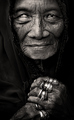 show lines and wrinkles in the face of his subjects...and that is what brings them to life.
Hope this critique has been helpful, feel free to pm me
Susan Message edited by author 2016-11-23 18:24:05. |
| 11/23/2016 06:14:29 PM | |
| 11/18/2016 01:38:34 PM | Canada - Change is Goodby KarenNfldComment: OMG a Japanese maple leaf! I could've sent you bags full of sugar maple leaves! Still a nice image and the red is nice and strong, so I'll forgive you this time...
Sunny ways, my friend, sunny ways :-) Message edited by author 2016-11-18 13:39:40. | | Photographer found comment helpful. |
| 11/16/2016 05:44:30 PM | | | Photographer found comment helpful. |
|
Showing 641 - 650 of ~8163 |
Home -
Challenges -
Community -
League -
Photos -
Cameras -
Lenses -
Learn -
Help -
Terms of Use -
Privacy -
Top ^
DPChallenge, and website content and design, Copyright © 2001-2026 Challenging Technologies, LLC.
All digital photo copyrights belong to the photographers and may not be used without permission.
Current Server Time: 07/24/2026 01:04:36 AM EDT.
|