| Image |
Comment |
| 01/30/2009 06:54:51 PM |
sweet dreamsby teranbComment: This is a lovely shot. (Helps too that I am a cat person, lol!)
Great use of thirds, the light is diffused well, the b/g colours complements the cat's coat. Foreground leg looks a tiny bit oof (out-of-focus) but am not on home computer, so can't be 100% sure. Many dpc'ers don't like quiet backgrounds, without much happening; I think they are fine for this challenge, as quietude of some sort is what is asked for.
Flaws...crop on right side and top looks very tight. Include entire ear and some space above it, so kitty can twitch his/her ear while dreaming and not slam it into the perimeter :-) Light on blankie towards left could be seen as glare.
If I were shooting I'd leave more room around cat's head and foremost leg. Easier to crop in from too big a shot, and resize, than shoot too close and not have any room to manuever.
I'll give this a 6 as is, but with a little work could easily go up a notch or two. Nice work! :-) |
 Photographer found comment helpful. Photographer found comment helpful. |
| 01/30/2009 01:58:12 PM |
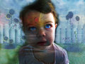
w a i t i n gby JessiComment: I like this picture a lot. The b/w works well, use of thirds is good, whited-out b/g draws attention to him, and the snow on his hair and clothing makes it look like he's coming forward out of the b/g, so gives it a sense of story. The lighting is good, no glare-y areas that I can see. There is a sense of expectancy in his eyes and his lips are parted just right...any more open and he would appear to be about to speak, but fully closed could make his face look tense.
The main criticque here is the tight-ish crop at the top of his head. The b/g may turn off some of the purists here, but I like it.
I have a confession to make...I don't yet know how to do keyboard voting so until a fellow dpcer enlightens me, I am leaving *real* scores for now, which sadly I will have to change to avoid accusations of friend voting. This cute guy gets a 7. |
| Photographer found comment helpful. |
| 01/30/2009 01:43:05 PM |
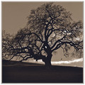
Nostalgiaby DigiFotoBuddyComment: I like the use of what seems to be a dark sepia filter to add to the sense of an old photo; the tree is a great subject and both setting and light are pleasingly eerie and emotive.
However, this does look like an outtake from Single Tree. The tree dominates the shot; the swing is secondary, you have to look for it and most of the dpc populace like to see details like that front and centre, for it is the swing hanging from the tree evoking the nostalgia. I am not a huge fan of borders, and here the double border accentuate a very tight crop, which is probably what is hurting your score the most.
If this were my shot, I'd've used the wonderful shape, esp the curve of the trunk, and of the tree limbs over and around the swing to frame it. My vote would probably have been 5.
Hope this helps! :-) |
| Photographer found comment helpful. |
| 01/25/2009 07:43:00 PM |
|
| Photographer found comment helpful. |
| 01/25/2009 07:40:14 PM |
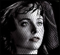
Transitions by IvoryComment: Wonderful shot, a classic beauty of a woman and great care taken in the pp. Terrific work Susan! |
| Photographer found comment helpful. |
| 01/19/2009 07:22:34 PM |
|
| Photographer found comment helpful. |
| 01/11/2009 07:21:40 PM |
|
| Photographer found comment helpful. |
| 01/11/2009 07:15:56 PM |
|
| Photographer found comment helpful. |
| 01/11/2009 10:01:50 AM |
Seriously!?by LonzComment: I like this variation on a theme much better than the others, because you set up the lighting really well and added a sense of drama with the had. Well done! 8 |
| Photographer found comment helpful. |
| 01/11/2009 09:54:42 AM |
|
Home -
Challenges -
Community -
League -
Photos -
Cameras -
Lenses -
Learn -
Help -
Terms of Use -
Privacy -
Top ^
DPChallenge, and website content and design, Copyright © 2001-2026 Challenging Technologies, LLC.
All digital photo copyrights belong to the photographers and may not be used without permission.
Current Server Time: 06/21/2026 01:36:03 PM EDT.