|
|
|
Showing 3901 - 3910 of ~8163 |
| Image |
Comment |
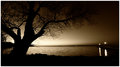
| 05/07/2009 08:40:20 PM | Island Crossingby scruffComment: Greetings from the Critique Club!
Initial impression: Very pleasing to the eye, restful, the sepia tone works well. Managed to catch that sunset-to-twilight phase very well.
Technical: Great use of ambient light, composition has tree foremost and helping frame rest of shot so works well that way. The lights to the right add interest, and would draw attention away from a lesser tree.
Artistic: Love the calmness and strength in this image. Perfect example of KISS at work.
FWIW: Wouldn't change a thing. And you finished in the top 20 so well done, that's an accomplishment for any challenge! Very good work, keep it up.
Feel free to pm me with any questions,
Susan |  Photographer found comment helpful. Photographer found comment helpful. |
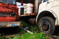
| 05/07/2009 08:27:19 PM | recycled trucksby mrgooseComment: Greetings from the Critique Club!
Initial impression: Find it difficult to tie into the idea of this challenge's version of Green - reduce, reuse, recycle. Had I voted, I would've given this a 5 or 6.
Technical: Very strong shot in this regard, like the light and comp. Dof risky, could be soft in places, but I don't mind risk. Almost but not-quite glared out on the right-hand truck.
Artistic: I am very fond of the low pov and like the crop, like the feeling of the white truck going somewhere with the way the leadig lines follow the bed. The lost headlight on the red truck gives a sense of something being awry, but needs a little bit more...maybe if you'd been allowed to remove the license plate, may have conveyed the idea a little more strongly.
FWIW: Don't be afraid to interpret challenges literally esp if you are new here. I think you have a good idea of what to look for and how to shoot it, you just need to get across the concept more clearly. You don't mention any post-processing but a run-through with unsharp mask may have given the shot a little more definition.
Feel free to PM me with any questions,
Susan |
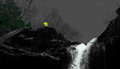
| 05/07/2009 11:02:31 AM | Waterfall Kaaterskill Mountain Trailby Gabe1211Comment: Greetings from the Critique Club!
Initial impression: A good in-focus shot, but the yellow shirt really detracts from the waterfall...and both waterfall and shirt detract from the trees.
Technical: Like the pov, clean shot, the shadows help lead the eye up. And there the wheels fall off, because the eye is zinging around from the yellow shirt to the waterfall and finally, to the trees. Not sure if the bright, somewhat flat colours used in trees and shirt help the shot at all.
Artistic: I would say you're trying to do too much here. This is a good shot of a waterfall, so the fact it was entered in Trees makes it look like a bit of a shoehorn. The tree is an afterthought, clinging for dear life to the the far edge of the frame. Interpretation of challenge subjects tends to be quite literal. If need be, go for a fill-the-frame shot.
FWIW: The desat does work well, but having two spots of strong, opposing colours simply doesn't work, and a more natural colour to the trees would have helped. The challenge subject is what we want to see.
Overall not a bad attempt. Read tutorials on this site on composition, or if nothing else, try this: choose a challenge, start at the LAST page, and scroll through to the first page. You'll see the pictures getting stronger in terms of composition and greater use of the KISS principle.
Feel free to PM me with any questions,
Susan | | Photographer found comment helpful. |
| 05/06/2009 07:23:24 PM | Center of Attentionby photomill31Comment: Greetings from the Critique Club!
Initial impression: Love the post-processing, but too much sky, not enough tree.
Technical: Lighting ambient and good use of it; dof seems quite shallow but still works; again pp basically not noticeable apart from b/w conversion.
Artistic: Most entries in this challenge were very centred, including mine, so can hardly fault you for that. Like the low symmetry of trees in front/flanking main tree. You had a good-sized lens, could've got in a little closer.
FWIW: If this were my shot...I'd get as close as physically possible to the tree, gone for a more fill-the-frame type shot. But, if need be, go to the nearest house and politely enquire if the tree is on their land, and if it is, explain that you would like to get pix of the tree for a competition. Stress that pic is not for sale, be polite and they'll likely say yes, may even offer you even closer access. If tree is not theirs, ask if they think owner would mind tree being photographed, and go from there.
Overall a good try, not a bad shot, just needs more of the tree and less of the sky. Keep shooting!
Feel free to PM me with any questions,
Susan | | Photographer found comment helpful. |
| 05/06/2009 06:55:54 PM | Ascendby CuttoothComment: Greetings from the Critique Club!
Initial impression: Basically a good shot, just too much building and too little bird.
Technical: Basially good concept and shot, used ambient lighting, would have scored much higher if bird's feet were in view, maybe some building undeneath bird feet. Glare on wings may have hurt too.
Artistic: I like this shot in terms of POV, dof good but probably a little soft. Looks too much like a snapshot. Next time, just take a deep breath, relax, and hold down the shutter release button. Catch the bird climbing upwards. If you have time, set camera to continuous mode (check manual) and try that.
Overall: a very good attempt at a fairly tough challenge, cause voters want to see a clear shot of the subject but an oof background. You gave them both, but it's simply too low in the shot to make an impact.
FWIW: Keep shooting. Don't just shoot one shot of anything, shoot at least a dozen. Then look at them carefully, individually, and find the one that keeps cropping up and resonates with you as the best shot, the best capture. Then enter it.
Feel free to PM me with any questions,
Susan | | Photographer found comment helpful. |
| 05/05/2009 05:24:09 PM | | | Photographer found comment helpful. |
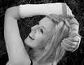
| 05/04/2009 08:21:49 PM | Clarissa's Wristsby JimiRoseComment: Greetings from the Critique Club!
Initial impression: Love the composition here, reflects a vibrant, cheery, energetic nature barely contained by her injuries. I bet she'll be back snowboarding (or whatever other adrenaline sport she enjoys when there isn't any snow) as soon as those bandages come off! She's probably the sort who has the nurses in stitches when they're trying to treat her.
Technical: Compostion pleasing, the pov is different (and thus good), like the crop and the contrast, the dof is good, the lighting is better on the face and eye catchlights are good, but almost gives a flat aspect to her arm.
Artistic: Though the b/w doesn't necessarily harm this shot, I wonder if it does the original any justice. Have to agree with comments pointing out the waxiness of the skin, though I see it more on her arms than her face, and lack of lips, especially as she looks to have a lovely smile.
FWIW: I probably would have gone with colour, and had Riss bring along a couple of lipsticks to experiment with and help frame her mouth.
Feel free to PM me with any questions,
Susan | | Photographer found comment helpful. |
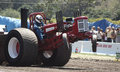
| 05/04/2009 08:06:18 PM | Out of Controlby RustyGComment: Greetings from the Critique Club!
Initial impression: Never saw a tractor pull like THAT before! Very funny, and had to look to see what was going on with the front tires. Maybe he was gunning for you!
Technical: Focus a little soft, may have wanted to go to 400 or higher ISO to get the tires; they'd have to be pretty luggy, and here they look too smooth. As you couldn't clone out the power lines behind, a tighter crop may have helped strengthen your shot. Basic composition not bad and lighting was ambient, more could have been made of it. Some glare on tarps.
Artistic: Lots of fun to shoot! Don't know if you set out to get this shot, or it just happened, but I enjoy it.
FWIW: No editing details are listed, so I would suggest getting either a freebie editing program (see recent dpc threads) or, if you have one, playing with the tutorials and getting comfy with it. Some use of (in Photoshop) curves, brightness/contrast, and unsharp mask would help punch the image up a little more.
All in all a good effort, keep shooting and entering challenges!
Feel free to PM me with any questions,
Susan
| | Photographer found comment helpful. |
| 05/04/2009 07:27:48 AM | Brandedby SoulComment: good concept but shot is cluttered and oof |
| 05/04/2009 07:26:54 AM | | | Photographer found comment helpful. |
|
Showing 3901 - 3910 of ~8163 |
Home -
Challenges -
Community -
League -
Photos -
Cameras -
Lenses -
Learn -
Help -
Terms of Use -
Privacy -
Top ^
DPChallenge, and website content and design, Copyright © 2001-2026 Challenging Technologies, LLC.
All digital photo copyrights belong to the photographers and may not be used without permission.
Current Server Time: 06/20/2026 10:24:32 AM EDT.
|