|
|
|
Showing 3771 - 3780 of ~8163 |
| Image |
Comment |
| 09/02/2009 08:48:01 AM | |  Photographer found comment helpful. Photographer found comment helpful. |
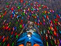
| 08/30/2009 07:34:11 PM | Dirt Devil in Hyperdriveby Alex_EuropaComment: Greetings from the Critique Club!
Initial impression: Made me smile because it looks like something I'd do, both in terms of shot and returning appliance next day once it served its purpose :-)
Technical: Yes, a little glare on the DD, composition not too exciting but the blur helps make up for it. All your camera settings make sense for a shot like this. Lighting looks ambient, which is fine, seeing it was shot in a hotel room!
Artistic: The carpet pattern isn't that distracting imho. The craft beads look tossed on the floor at random, just as though you were a vacuum salesman demonstrating to housewives how well your product works.
Overall: You finished in the top 20, nothing to sneeze at, and you got 5 10s. Even if your shot falls a little short on the technicals, it made people smile, and that goes a long way here.
Feel free to PM me with any questions,
Susan | | Photographer found comment helpful. |
| 08/30/2009 07:22:06 PM | Innner secretsby tinkie2010Comment: Greetings from the Critique Club!
Initial impression: Saw and it and thought, 'Oh yeah, it's an orchid'! Very distinctive flowers. Very easy on the eye, no glaring flaws.
Technical: Composition is straightforward, used ambient lighting. I do like the way the white petals frame the inner part of the orchid. Would like a little more dof; I don't really see any blur but some petals are oof.
Artistic: Again, a very pretty shot, but also a very safe shot in terms of how you shot. You maximized the symmetery of the flower's parts to help with the comp. A little more saturation may help.
Overall: Looking at the details, wondering why you shot so fast on a tripod! 1/320 when you have morning light and a tripod at your discposal seems a little hasty. Stopping down a bit would have increased your dof and slowing shutter should help result in much more rich colours, and possibly less shadows.
Still, you finished well and have a fave, nothing to complain about there! Good work. Just try to think of your tripod as something to hold your camera steady for slow work. Look forward to seeing more of your shots.
Feel free to PM me with any questions,
Susan | | Photographer found comment helpful. |
| 08/25/2009 06:51:04 PM | | | Photographer found comment helpful. |
| 08/24/2009 09:02:02 PM | Hummingbirds Mealby pedrobopComment: Greetings from the Critique Club!
Initial impression: Nice macro of a sunflower, but doesn't quite scream 'circle'! as the voters here like to see.
Technical: Very nice lighting, great colours, no hotspots, good dof. In terms of compostion, a bit too centred, plays safe in that there is no pov, use of thirds, leading lines etc to add interest.
Artistic: Yes, it basically is circular in shape...but it's not a perfect circle, and that's why you were punished in terms of votes. Even so you only just finished below 5, so it isn't THAT bad! :-)
Overall: Keep shooting. Pay heed to the comments, learn, and keep shooting.
Feel free to PM me with any questions,
Susan
| | Photographer found comment helpful. |
| 08/24/2009 08:51:19 PM | Saturated Candyby nicoleangelComment: Greetings from the Critique Club!
Initial impression: Very, very heavily saturated and shot at far too high an ISO. If you bothered to shoot it in a lightbox, presumably in a studio setup of some sort, then let us see it instead of burying it under layers of saturation!
Technical: Tying in with the above...the first thing you must do is take a good photo. Show that some thought went into it. Give us an interesting POV, some leading lines, framing, use of the rule of thirds, a focal point - then go to town with the pp, but no amount of extreme pp will make up for the fact that a bad photo is a bad photo. Yes, it really is that simple. I have brown ribbons too to prove it.
Artistic: Yes, I did read the comments both commending you and blasting you for the pop-art approach. It is too easy to embrace the positive comments and ignore those that are more critical.
Overall: I am sure there are pop-art sites out there where people would love this shot. Find them and enter these shots, but this is probably the toughest competitive photography site in the world. Enter photos!
Feel free to PM me with any questions,
Susan | | Photographer found comment helpful. |
| 08/24/2009 08:34:50 PM | Just Don't!by oanacotuComment: Greetings from the Critique Club!
Initial impression: Interesting sign, wish there was more here in shot to explain it. Are those the actual colours of the sign?
Technical: Very centred, grainy, shallow dof, lighting poor; composition does not compel viewer to linger and see more in the shot. It was obviously shot in the evening. I can understand an f-stop of 3.2, but why such a fast shutter speed? This is the time to get out the tripod (or any other kind of level, stable surface) and slow the shutter down to probably 1 second, for starters. See what you have with that, then go up or down from there to get the desired effect.
Artistic: Tantalizing, that hint of a horizon in the background. That's what I want to see more of, I want to get drawn into the shot. I get the feeling that you felt rushed and tried to do too much, too quickly. Slow down! :-)
Overall: Not a bad effort (feel free to look at my earliest entries, it'll make you feel better) but you need to play around more with shutter speed. I do agree that a tighter crop may have helped.
Feel free to PM me with any questions,
Susan | | Photographer found comment helpful. |
| 08/24/2009 08:22:52 PM | Two Circlesby Dave914Comment: Greetings from the Critique Club!
Initial impression: I feel for you because I've often tried to pull off similar material. Everything is just too centred and bland.
Technical: Composition plays very safe...no framing or leading lines, a little nod to rule of thirds. But shot is simply that of a water bottle top, nothing more. You need more. Focus is off and I do agree that the circles should be super-crisp to stand out from the background. Ambient lighting is OK. Why such a high ISO? Leaving the shutter open longer, even at a speed of 25 or so, at an ISO of 200 or even lower may have resulted in a more interesting shot. If you used a high ISO because you shot handheld, invest in a tripod, even if it's a cheap $25 one from Wallyworld. I did! :-)
Artistic: Again, I can see what you tried to do here - please take a look at my early stuff! - but you must have strong execution (technicals) to carry off the concept (artistic). There has to be a level of interest - a crooked blind, use of perspective, a ray of light, a blast of colour - to help awaken this shot and draw the eye to it and keep the viewer looking at it.
Overall: Not a bad idea in terms of basics. Experiment with shutter speeds. The only way you can learn to do well is by doing whatever-it-is - in this case, photography - by going out there and shooting. A lot.
Feel free to PM me with any questions,
Susan |
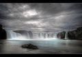
| 08/11/2009 07:57:03 PM | Waterfall of the Godsby JohannesFrankComment: Greetings from the Critique Club!
Initial impression: Hmm how do you find fault in such a beautiful picture?
Technical: Light is just stunning, composition is beautiful, dof works well...hmmm...Aha, found a couple of teeny little things (trees?) on the cliffhead on the right that could have been cloned out.
Artistic: That amazing infinite sky and almost-magical light screams Iceland to me. How else could you do so little post-processing and have it look so good? Love it.
Overall: I really don't know what else to say. A top 10 finish in a Free Study is nothing to sneeze at, you could have easily ribboned with this shot.
Feel free to PM me with any questions,
Susan |
| 08/11/2009 07:46:52 PM | The Dam in Mid-Summerby davidwComment: Greetings from the Critique Club!
Initial impression: Very well-shot dam, very safe, not taking any risks here. Inoffensive.
Technical: Good use of the ambient light. Interesting use of multiple shots with only changing the shutter speeds. Composition plays a bit safe, being so centred, but I like the bridge in the bg and it being slightly offset. I am not overly familiar with Topaz and how it works, but recognize that it has been used here to add a painterly effect esp to the foam on the water.
Artistic: Would have loved to see a different pov here, to give a sense of the size of the dam and the power of the torrent, something to draw the viewer in a bit more. Good capture of the textures.
Overall: Not a great shot, but a good one. Again, would have love to have seen more done to convey the power here, but nothing outstandingly bad either.
Feel free to PM me with any questions,
Susan | | Photographer found comment helpful. |
|
Showing 3771 - 3780 of ~8163 |
Home -
Challenges -
Community -
League -
Photos -
Cameras -
Lenses -
Learn -
Help -
Terms of Use -
Privacy -
Top ^
DPChallenge, and website content and design, Copyright © 2001-2026 Challenging Technologies, LLC.
All digital photo copyrights belong to the photographers and may not be used without permission.
Current Server Time: 06/21/2026 05:04:40 AM EDT.
|